EDNA Forum
I hope this email finds you all well.
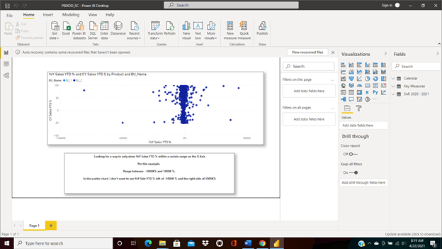
Looking for a way to only show YoY Sales YTD % within a certain range on the X Axis
Per this example,
Range between -1000K% and 1000K %.
In the scatter chart, I don’t want to see YoY Sale YTD % left of -1000K % and no more than 1000% on the right side
Thank you in advance for your time
Screen Shot attached
Hi @ambidextrousmentally,
A simple solution would be to wrap your measure in an IF statement to blank out all values outside of the desired range.
Scatter chart value =
    IF(
        [myMeasure] >= -100 && [myMeasure] <= 100,
        [myMeasure]
    )
I hope this is helpful.
2 Likes
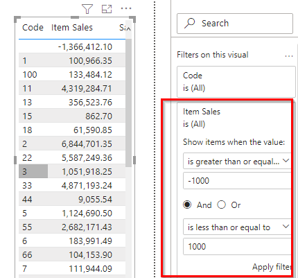
I believe you have only two choices:
- create a new version of your YOY measure which shows a blank for anything outside of your desired range
- filter the visual (by clicking on the visual and then going to the filter pane) to not include values outside of your range
Mellissa
Per your solution, how can I modify the measure to show the % sign? I received an error - red line when I tried to put the % sign in the measure.
Scatter chart value =
IF(
[myMeasure] >= -100 && [myMeasure] <= 100,
[myMeasure]
)
Heather
Your second option worked for me. My YoY Sales YTD % measure is in %, so to get 25% for example, I have to use the decimal form .25. The results on the X Axis showed a range of (25%) - 25%.
Melissa/ Heather
Much appreciate your help!
Thank you
1 Like
Hi @ambidextrousmentally,
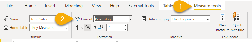
Showing a measure as percentace is just a format you apply to the numeric value
In your logical test you don’t have to account for that because 1 = 100%