Hi, I have run into a bit of a problem on my powerbi dashboard. I am tracking completion dates on number of projects against a data date column which happens to be a monthly progress status check. See the mock up image below which I did in excel (this is only an example).
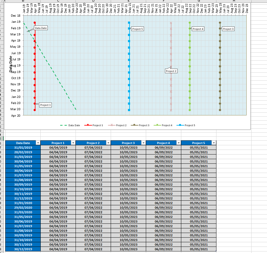
In this image, the dates up the top represents completion dates of projects and on left hand is the data dates (ie monthly review date). In the graph, the “green dash line” represents the data date movement overtime (ie. it goes left to right and will continue to grow and move sideways overtime). The other 5 lines represents projects which goes top to bottom representing the completion dates. Basically this graph shows change in project completion date over time if it happens to change.
I am trying to replicate this in Power BI dashboard and I have tried all possible avenues with different types of charts and graphs without success :(. Can anyone please provide a solution and enlighten me? I greatly appreciate your help.
Cheers