Hi All
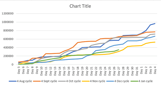
I’m back with another issue I just cannot get right. I need to display running total sales figures for a few cycles on one line graph, with current partial cycle, to see how it tracks against previous cycles. I’ve watched some of Sam’s videos and put some measures in. I need this to be dynamic for the last 6 cycles (or more). This is an example of what the graph should look like (just nicer).
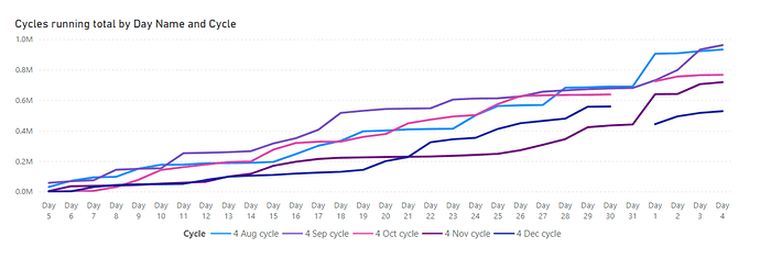
But my effort returns this.
I think I’m misunderstanding which dates to use, cycle date vs date vs day of the month. The cycles run from 5 of each month to the 4th of each month. Noting of course that some months only have 30 days, but with a running total should react correctly.
I’ve attached the pbix, the excel data, on the excel is the example of what I’m trying to achieve on sheet 2.
I’m wondering if there is a way for the legend to show the cycle date reflecting in the graph, but in my experience, I don’t think that it’s possible.
The axis does not need to say Day 5 etc, but just 5 is correct, I just added it in order for sorting to be correct.
I have not marked the date table as a date table, I am aware, the reason is that in my actual report I have 2 date tables as I report on different countries with different cycle dates, so I’m not sure of the implication should I mark 1 as a date table.
Please ask any questions. Hoping my issue is clear enough. I saw other posts similar, but couldn’t quite get it aligned to mine.
Thanx
Annamarie
Sales example.pbix (117.5 KB) Sales Example.xlsx (71.0 KB)


