I completely agree with @hafizsultan about paring down what is displayed. I would go with something like a “top 5 and others” approach. This is quite difficult to do from scratch, but in the thread below @nick_m wrote a really elegant DAX measure that should be relatively straightforward for you to adapt to your data.
From there, I really like the MAQ treemap bar chart for this type of visualization.
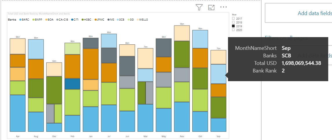
Just for the sake of illustration, here’s what it looks like with your data with a simple top 5 ranking approach (as opposed to the better “top 5 and others” approach discussed above). With the relevant detail info in the tooltip well, I think you now have a really attractive visual that provides a lot of information.
I hope this is helpful.
- Brian
eDNA Forum -Bank Rank solution.pbix (2.9 MB)