Ranking order by Each Months to display in Chart

I have Bank that has Date, Total Sales and I need to rank them by each month dynamically by selected year.

I tried below formula, but its working fine but I am not able to use it other than Matrix Visual.

But I wanted to present this in a line chart so that I can showcase the movement of rank for each month and year.

Please advise the best way.

RANKX(ALL(‘Trade Detail’[Provider], ‘Trade Detail’[TDMonthNumber]),
CALCULATE(SUM(‘Trade Detail’[USD SIZE]),
DimDate[Fiscal Year] IN {2017, 2018, 2019, 2020}),DESC,Dense)

Let me know if you need any further details.

Thanks in Advance

Hello putturps,

Can you provide a pbix sample and perhaps a more detailed explanation of what you’re trying to accomplish?

Thanks for your response.

my requirements are showing monthly wise ranking for each bank based on the year and where ever the dates do not exist it should show blank.

In the attached .pbix file I have used in Matrix Visual, but I need to present in a better way is there any other visual I can use this to present it?

I would like line chart or similar chart Y-axis (Banks), X-axis (Months) and Line items ( values)

Let me know if you need any further details.

TEST - Copy.pbix (2.7 MB)

Thanks
Putta

Hi @putturps,

You can see line chart below with your sample data:

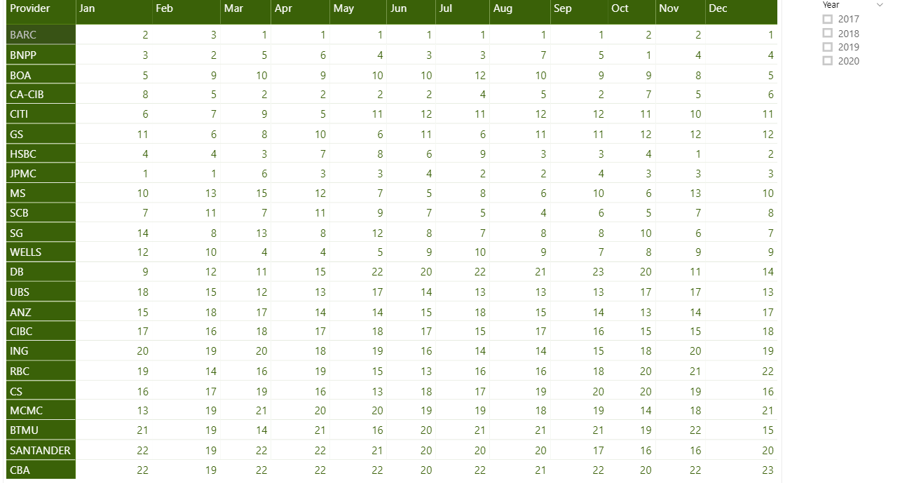
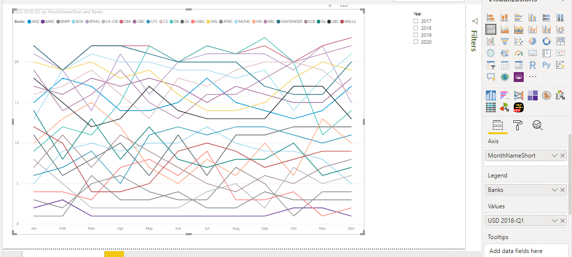
I think you have so many data points and that is why line chart is not giving good information. May be you can select top 5 banks etc to show in line graph.

Yes agree, but requirement is better visuals so that everyone can understand when its been presented.

Is there any custom visuals available to project it in better way. Please suggest.

@putturps,

I completely agree with @hafizsultan about paring down what is displayed. I would go with something like a “top 5 and others” approach. This is quite difficult to do from scratch, but in the thread below @nick_m wrote a really elegant DAX measure that should be relatively straightforward for you to adapt to your data.

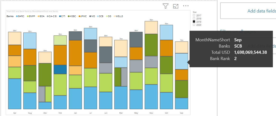
From there, I really like the MAQ treemap bar chart for this type of visualization.

Just for the sake of illustration, here’s what it looks like with your data with a simple top 5 ranking approach (as opposed to the better “top 5 and others” approach discussed above). With the relevant detail info in the tooltip well, I think you now have a really attractive visual that provides a lot of information.

I hope this is helpful.

1 Like

Thanks Brain for input and suggestion. This will help me to present my visuals in better way.

@putturps,

Great – glad that was helpful to you. Shout out to @nerminayoub1, who turned me onto that tree map custom visual which I like a lot, and use in my own reports now.

  • Brian
2 Likes