Hi DNA Enterprise
Is there a way I can add multiple gridlines in my deneb radar chart, heres my code
{
“description”: “A radar chart example, showing multiple dimensions in a radial layout.”,
“width”: 500,
“height”: 400,
“padding”: {
“left”: 75,
“right”: 75,
“top”: 25,
“bottom”: 25
},
“autosize”: { “type”: “none”, “contains”: “padding” },
“signals”: [
{ “name”: “radius”, “update”: “width / 2” },
{ “name”: “tooltip”, “value”: true }
],
“data”: [
{
“name”: “dataset”
},
{
“name”: “Response”,
“source”: “dataset”,
“transform”: [
{
“type”: “aggregate”,
“groupby”: [“Response”]
}
]
}
],
“scales”: [
{
“name”: “angular”,
“type”: “point”,
“range”: { “signal”: “[-PI, PI]” },
“padding”: 0.5,
“domain”: { “data”: “dataset”, “field”: “Response” }
},
{
“name”: “radial”,
“type”: “linear”,
“range”: { “signal”: “[0, radius]” },
“zero”: true,
“nice”: false,
“domain”: { “data”: “dataset”, “field”: “(Response)-All Users Percentage” },
“domainMin”: 0
},
{
“name”: “color”,
“type”: “ordinal”,
“domain”: { “data”: “dataset”, “field”: “Images” },
“range”: { “scheme”: “category10” }
}
],
“encode”: {
“enter”: {
“x”: { “signal”: “radius” },
“y”: { “signal”: “radius” }
}
},
“marks”: [
{
“type”: “group”,
“name”: “Images”,
“zindex”: 1,
“from”: {
“facet”: { “data”: “dataset”, “name”: “facet”, “groupby”: [“Images”] }
},
“marks”: [
{
“type”: “line”,
“name”: “images-line”,
“from”: { “data”: “facet” },
“encode”: {
“enter”: {
“interpolate”: { “value”: “linear-closed” },
“x”: { “signal”: “scale(‘radial’, datum[‘(Response)-All Users Percentage’]) * cos(scale(‘angular’, datum.Response))” },
“y”: { “signal”: “scale(‘radial’, datum[‘(Response)-All Users Percentage’]) * sin(scale(‘angular’, datum.Response))” },
“stroke”: { “scale”: “color”, “field”: “Images” },
“strokeWidth”: { “value”: 1 },
“fillOpacity”: { “value”: 0 }
},
“tooltip”: {
“signal”: “{ ‘Response’: datum.Response, ‘(Response)-All Users Percentage’: datum[‘(Response)-All Users Percentage’], ‘Images’: datum.Images }”
}
}
}
]
},
{
“type”: “rule”,
“name”: “radial-grid”,
“from”: { “data”: “Response” },
“zindex”: 0,
“encode”: {
“enter”: {
“x”: { “value”: 0 },
“y”: { “value”: 0 },
“x2”: { “signal”: “radius * cos(scale(‘angular’, datum.Response))” },
“y2”: { “signal”: “radius * sin(scale(‘angular’, datum.Response))” },
“stroke”: { “value”: “black” },
“strokeWidth”: { “value”: 0.5 }
}
}
},
{
“type”: “text”,
“name”: “key-label”,
“from”: { “data”: “Response” },
“zindex”: 1,
“encode”: {
“enter”: {
“x”: { “signal”: “(radius + 5) * cos(scale(‘angular’, datum.Response))” },
“y”: { “signal”: “(radius + 5) * sin(scale(‘angular’, datum.Response))” },
“text”: { “field”: “Response” },
“align”: [
{ “test”: “abs(scale(‘angular’, datum.Response)) > PI / 2”, “value”: “right” },
{ “value”: “left” }
],
“baseline”: [
{ “test”: “scale(‘angular’, datum.Response) > 0”, “value”: “top” },
{ “test”: “scale(‘angular’, datum.Response) == 0”, “value”: “middle” },
{ “value”: “bottom” }
],
“fill”: { “value”: “black” },
“fontWeight”: { “value”: “bold” },
“tooltip”: {
“signal”: “{ ‘Response’: datum.Response, ‘(Response)-All Users Percentage’: datum[‘(Response)-All Users Percentage’] }”
}
}
}
},
{
“type”: “line”,
“name”: “outer-line”,
“from”: { “data”: “radial-grid” },
“encode”: {
“enter”: {
“interpolate”: { “value”: “linear-closed” },
“x”: { “field”: “x2” },
“y”: { “field”: “y2” },
“stroke”: { “value”: “lightgray” },
“strokeWidth”: { “value”: 1 }
}
}
}
],
“view”: { “stroke”: null }
}
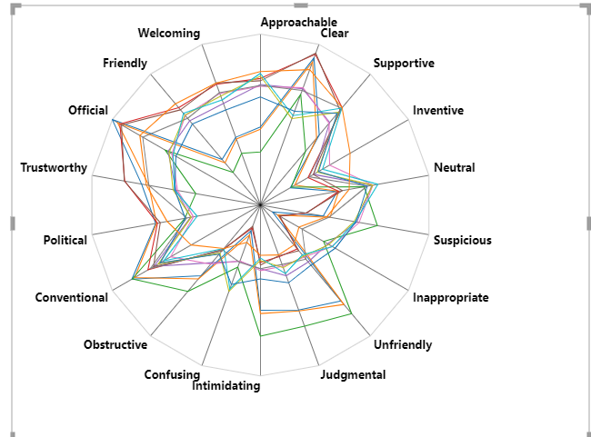
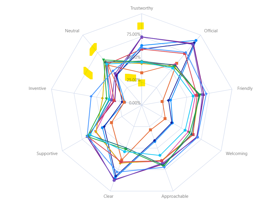
want to achieve something like this with percentage label