The goal of this task is to manipulate the data set in such a way that:
- Each variable corresponds to a column.
- Each observation is a row.
- Each value is a cell.
Raw dataset:
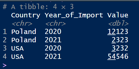
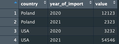
Expected result:
Tasks:
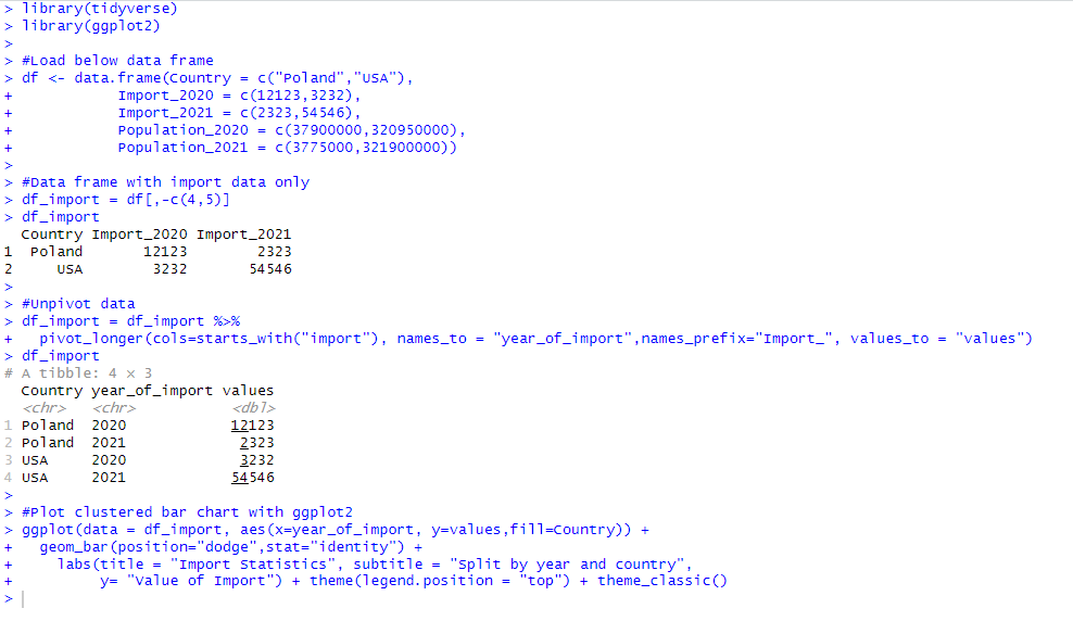
1.Leave only headers which refers to country and import
2.Transpose the table so that the “Country” column remains unchanged, and the other columns are gathered into rows.
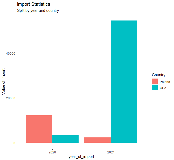
3.The second column should be called “Year of import” and contain the headers of the pre-existing table.
4.The “Value” column should contain numeric values.
-
The “Year of import” column should contain only 4 digits indicating the year
-
Sort values in ascending order by country and year
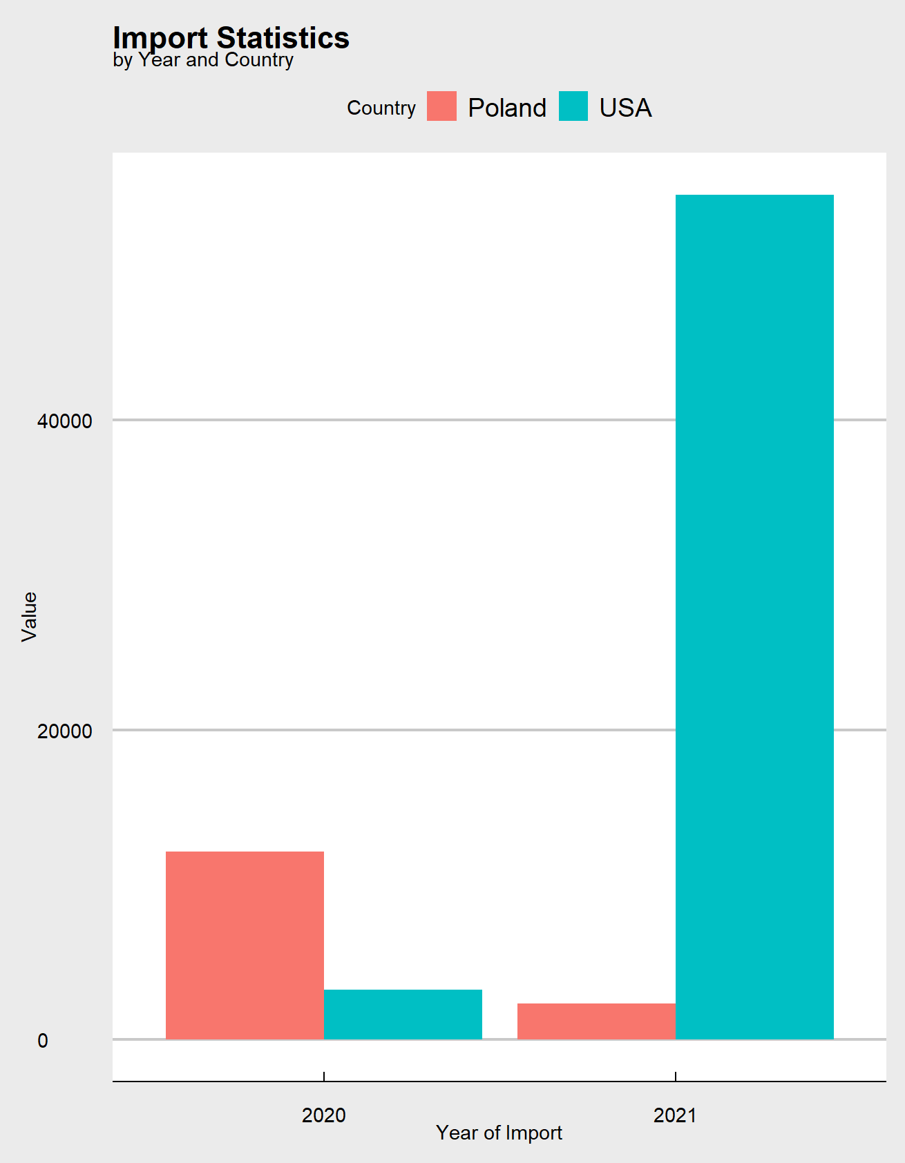
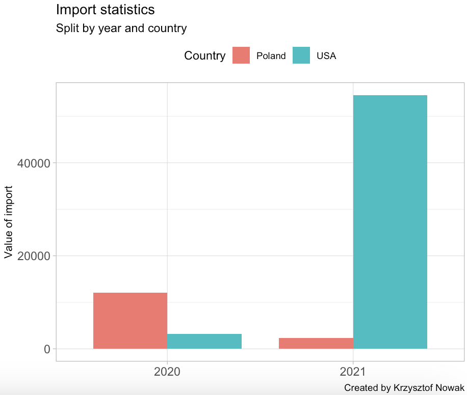
Extra task: use ggplot2 library to create a clustered bar chart like one below:
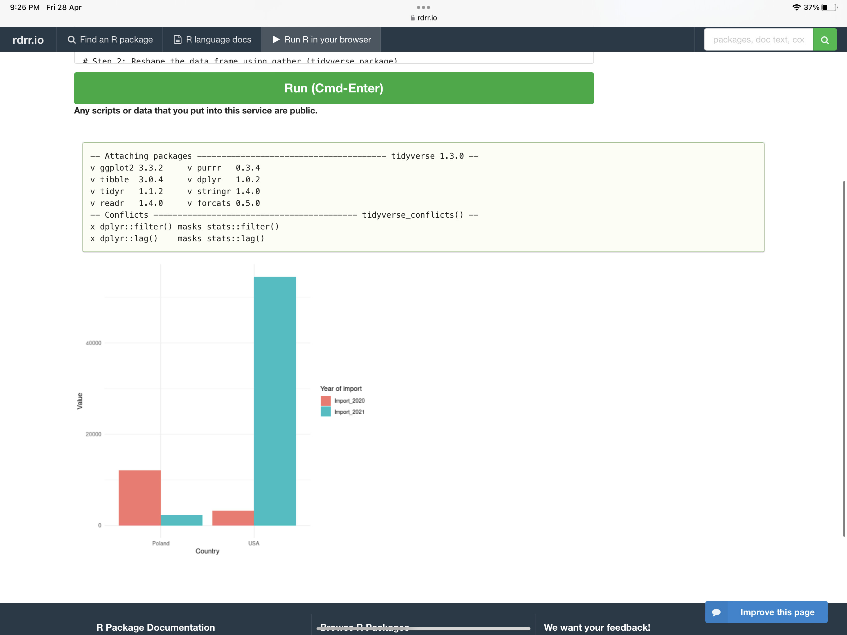
Tip: Use https://rdrr.io/snippets/, the online R editor, if you don’t have the R environment installed.
Submission
Simply post your code and a screenshot of your results.
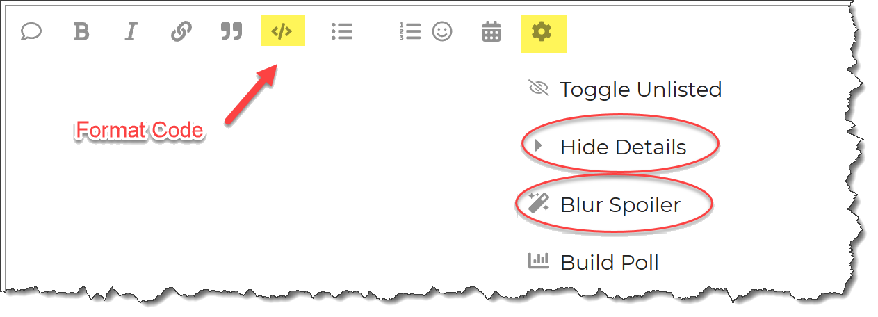
Please format your R code and blur it or place it in a hidden section.
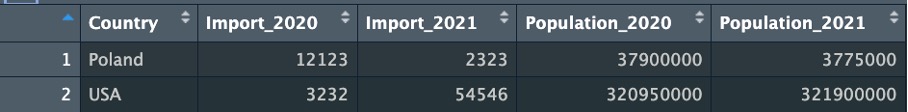
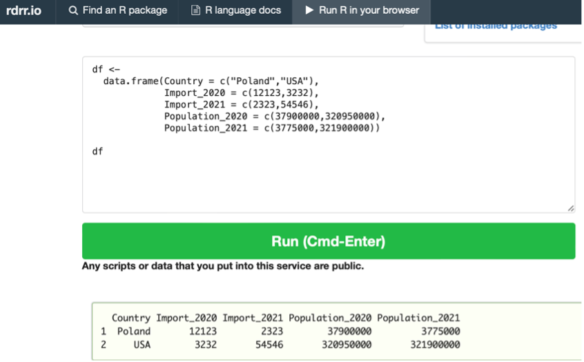
Dataset:
#Load below data frame
df ←
data.frame(Country = c(“Poland”,“USA”),
Import_2020 = c(12123,3232),
Import_2021 = c(2323,54546),
Population_2020 = c(37900000,320950000),
Population_2021 = c(3775000,321900000))
tibble::view(df) #Preview of dataset
Tip: Use https://rdrr.io/snippets/, the online R editor, if you don’t have the R environment installed.
This workout will be released on Monday April 24, 2023, and the author’s solution will be posted on Sunday April 30, 2023.