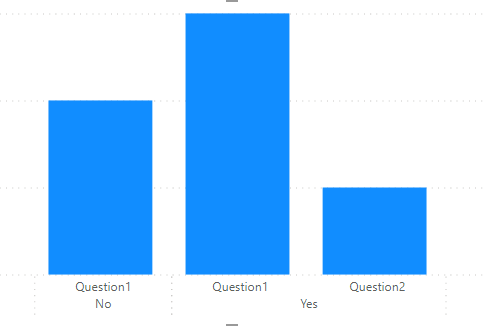
Sorry - as @Greg says “the penny is not dropping for me” on this one yet. I can’t figure out how you got from the matrix above to the bar chart. Which is Q2? Are the blanks "no"s? And if so, how far down? If you can just provide a bit more info on how to interpret the data above, I’m sure we can get to a solution on this. Sample data would also be helpful.
Can you please be more elaborate with your request:
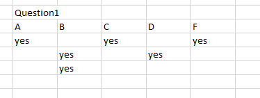
I would like if you can fill the question table with the NO as you have already filled YES in some cases or is it assumed that every black column means NO.
Because in the Visual you share I can see Yes and No under Question 1
Hi @supergallagher25, did the response provided by the users and experts help you solve your query? If not, how far did you get and what kind of help you need further? If yes, kindly mark as solution the answer that solved your query. Thanks!
Hi @supergallagher25, we’ve noticed that no response has been received from you since July 24
We just want to check if you still need further help with this post? In case there won’t be any activity on it in the next few days, we’ll be tagging this post as Solved.
Hi @supergallagher25, due to inactivity, a response on this post has been tagged as “Solution”. If you have a follow question or concern related to this topic, please remove the Solution tag first by clicking the three dots beside Reply and then untick the check box.