Python Workout 016 - Dive into Basic Plotting with Matplotlib

Title: Python Proficiency: Dive into Basic Plotting with Matplotlib

Description:

Matplotlib is Python’s premier library for creating static, animated, and interactive visualizations. In this workout, grasp the essentials of crafting simple plots and kickstart your data visualization journey with Python.

Scenario:

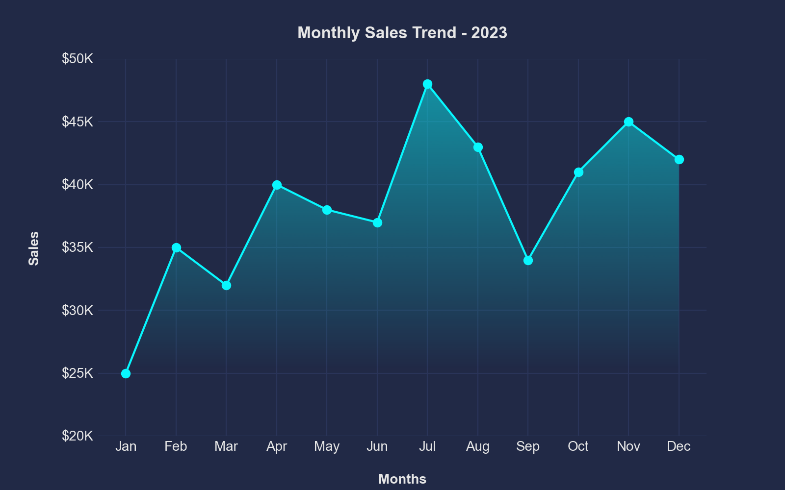
Imagine you’ve been given a series of data points representing monthly sales figures for a year. Using Matplotlib, how would you visually represent this data to discern patterns and trends?

Objectives:

By the end of this workout, you should be able to:

  1. Set up and customize basic plots using Matplotlib.

  2. Understand the anatomy of a Matplotlib plot.

  3. Visualize data effectively to convey insights.

Interactive Task:

Given your understanding of Matplotlib, answer the following:

  1. If you want to create a line plot to visualize the sales trend over months, which Matplotlib function would you start with?

    • Your Answer: ________________________
  2. How would you add a title to your plot, say “Monthly Sales for 2023”?

    • Your Answer: ________________________
  3. To save your plot as an image file, say “sales_plot.png”, which function would you use?

    • Your Answer: ________________________

Questions:

  1. In Matplotlib, which function is commonly used to show the plot after it has been defined?

    • i) display()

    • ii) visualize()

    • iii) plot()

    • iv) show()

  2. If you want to create a scatter plot instead of a line plot, which Matplotlib function would you use?

    • i) scatter()

    • ii) point()

    • iii) dot()

    • iv) spread()

Duration: 20 minutes

Difficulty: Beginner

Period :
This workout will be released on Wednesday, September 20, 2023, and will end on Thursday, October 05, 2023. But you can always come back to any of the workouts and solve them.

Hi @EnterpriseDNA ,

Here is my solution to this workout:

Interactive Task:

  1. If you want to create a line plot to visualize the sales trend over months, which Matplotlib function would you start with?

Answer:
import matplotlib.pyplot as plt

Sample data representing monthly sales figures

months = [‘Jan’, ‘Feb’, ‘Mar’, ‘Apr’, ‘May’, ‘Jun’, ‘Jul’, ‘Aug’, ‘Sep’, ‘Oct’, ‘Nov’, ‘Dec’]
sales = [10000, 12000, 11000, 13000, 14000, 16000, 18000, 17000, 19000, 21000, 22000, 24000]

Create a line plot

plt.figure(figsize=(10, 6)) # Adjust the figure size as needed
plt.plot(months, sales, marker=‘o’, linestyle=‘-’)
plt.title(‘Sales Trend Over Months’)
plt.xlabel(‘Month’)
plt.ylabel(‘Sales Amount’)
plt.grid(True)

Show the plot

plt.show()

  1. How would you add a title to your plot, say “Monthly Sales for 2023”?

Answer:
import matplotlib.pyplot as plt

Sample data representing monthly sales figures

months = [‘Jan’, ‘Feb’, ‘Mar’, ‘Apr’, ‘May’, ‘Jun’, ‘Jul’, ‘Aug’, ‘Sep’, ‘Oct’, ‘Nov’, ‘Dec’]
sales = [10000, 12000, 11000, 13000, 14000, 16000, 18000, 17000, 19000, 21000, 22000, 24000]

Create a line plot

plt.figure(figsize=(10, 6)) # Adjust the figure size as needed
plt.plot(months, sales, marker=‘o’, linestyle=‘-’)

Add a title to the plot

plt.title(‘Monthly Sales for 2023’)

plt.xlabel(‘Month’)
plt.ylabel(‘Sales Amount’)
plt.grid(True)

Show the plot

plt.show()

  1. To save your plot as an image file, say “sales_plot.png”, which function would you use?

Answer:

Save the plot as an image file (PNG format)

plt.savefig(‘sales_plot.png’)

Questions:

  1. In Matplotlib, which function is commonly used to show the plot after it has been defined?

Answer:

  • iv) show()
  1. If you want to create a scatter plot instead of a line plot, which Matplotlib function would you use?

Answer:

  • i) scatter()

Thanks for the workout.
Keith

Answer:

Interactive Task

  1. plot()
  2. ax.set_title(“Monthly Sales for 2023”)
  3. fig.savefig(‘sales_plot.png’, dpi=200, orientation=‘landscape’)

Questions

  1. iii) show()
  2. i) scatter()

Objective

"""
Monthly Sales Visualization Script
==================================
Author: Udit Kumar Chatterjee
Email: quantumudit@gmail.com
==================================

This script creates a visual representation of monthly sales data for the year 2023.
It uses Matplotlib to generate a line plot of sales figures for each month and applies
the 'Cyberpunk' style for a unique visual effect. Sales data is provided in thousands of 
US dollars (USD) and is formatted with tick labels displaying the values in thousands 
with a '$' sign (e.g., "$35K"). The resulting plot is customized with titles, labels, 
and axis limits for clarity. Additionally, a gradient fill is added to enhance the visual impact.
"""

# Import necessary libraries
import matplotlib.pyplot as plt
import mplcyberpunk
from matplotlib.ticker import FormatStrFormatter

# List of months and corresponding sales numbers (in thousands USD)
months = ["Jan", "Feb", "Mar", "Apr", "May", "Jun",
          "Jul", "Aug", "Sep", "Oct", "Nov", "Dec"]
sales = [25, 35, 32, 40, 38, 37, 48, 43, 34, 41, 45, 42]

# Apply the Cyberpunk style
plt.style.use("cyberpunk")


# Create a figure and axis
fig = plt.figure(figsize=(8, 5))
ax = fig.add_subplot()

# Plot
ax.plot(months, sales, marker="o")

# Create a FormatStrFormatter for Y-axis labels
tick_fmt = FormatStrFormatter("$%dK")
ax.yaxis.set_major_formatter(tick_fmt)

# Customize the plot
ax.set_title("Monthly Sales Trend - 2023", pad=15, fontweight="heavy")
ax.set_xlabel("Months", labelpad=15, loc="center", fontweight="bold")
ax.set_ylabel("Sales", labelpad=15, loc="center", fontweight="bold")
ax.set_ylim(20, 50)

# Add a gradient fill to the plot
mplcyberpunk.add_gradient_fill(alpha_gradientglow=0.5)

# Save the figure
fig.savefig('./sales_trend_2023.png', dpi=200, orientation='landscape')