I have done exactly what you want to do in SSRS using a range bar chart. SSRS explicitly allows the creation of a custom series definition that includes a start date/end date defined as a duration in much the same way as the custom Gantt chart visual.
Power BI does not appear to have that capability with any of the standard visuals, specifically because each series only supports a numeric aggregate value in the Values well.
I did get things to the point where individual items can be displayed on the Y axis (i.e. projects, devices, etc.) and a relative horizontal spacing is created for the duration bar. However, I lost the ability to colorize the data bars based on a field value (no Expression function for that) and can only display the numeric count of days on the X axis rather than dates.
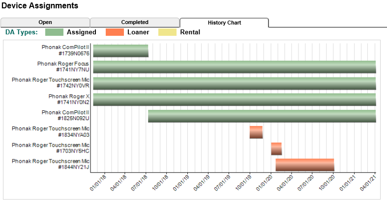
Here is the original SSRS range bar chart implementation for the usage of audiological devices over time (FYI, report is embedded in an iframe in a web app and has incredibly informative tooltips per bar  ):
):
Here is how far I got it in Power BI using a stacked bar chart:
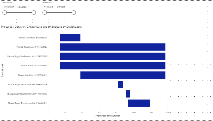
I didn’t take it any further because key items you asked for were not possible. My tricks included:
- Calculating a Precursor column per device assignment: Precursor = DATEDIFF(MIN(Dates[Date]), DeviceHistory[DAStartDate], DAY).
- Calculating a Duration column per device assignment: Duration = DATEDIFF(DeviceHistory[DAStartDate], DeviceHistory[DAEndDate], DAY)
- Setting the Data Color for Precursor to white so it is “invisible” on the chart.
- The slicers work as expected on each of the applicable dates.
Here is the PBIX, which includes the actual data with no PII included: Range Bar Chart Test.pbix (75.2 KB)
It looks like one of the available Gantt chart custom visuals is the way to go.
John C. Pratt