Hello,
I have been tasked with a challenge to create price demand curve graphs in power bi. I have my pricing and percentage change but cannot get the smooth line on my charts. Is this something that can be done? I am wanting to show how the demand curve changes with price change.
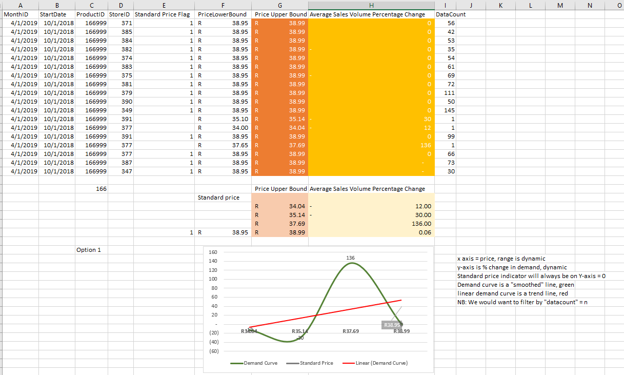
This is the excel graph version of what i need to create:
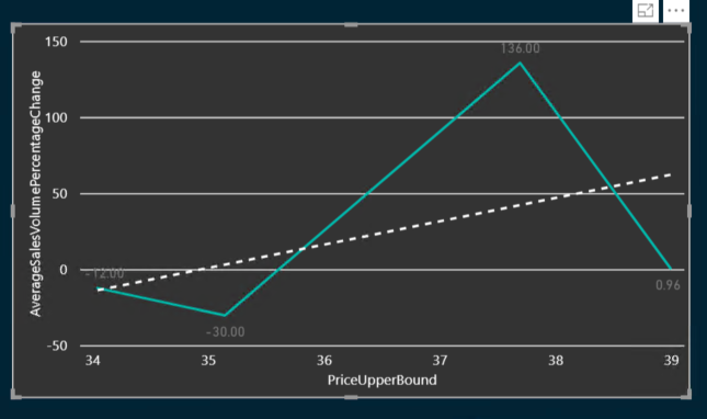
This is the Power Bi graph that i have created. Not quite the same
Any help on Pricing demand curves will be greatly appreciated.
Claire
It’s an interesting one. I can only really guess a solution here because I don’t have an example to work on.
I think the reality is here you probably want to create some type of moving average to smooth out the line, but to do that you will require more data points between point here to make it work.
I’ve completed some research on this also and can’t find anything where this is possible with the general visualization palette available other than using the technique I described above.
Seems like there’s is an idea out on this currently. See below
https://ideas.powerbi.com/forums/265200-power-bi-ideas/suggestions/14831643-advanced-trend-lines-in-charts-polynomial-expone
Thanks
Sam
1 Like