Problem with ALLSELECTED Context

My actual scenario is very complex and involves data that I cannot share, so I will try to boil this down to a simplified presentation of the issue that is at the heart of it all…

I have a measure that is normalizing a series of values using a 0-10 scale. In the attached PBIX file, the measure look something like this:

Normalized Value from Table Column using ALLSELECTED = 
    VAR MinValue = CALCULATE(MIN('Random Numbers'[Value]), ALLSELECTED('Random Numbers'))
    VAR MaxValue = CALCULATE(MAX('Random Numbers'[Value]), ALLSELECTED('Random Numbers'))
    VAR CurrentValue = MAX('Random Numbers'[Value])
    VAR NormalizedValue = DIVIDE(CurrentValue - MinValue, MaxValue - MinValue, 0)
RETURN
    NormalizedValue * 10

The measure works as designed in that anytime the selected rows change, the normalized values are recalculated based on only those rows that are selected.

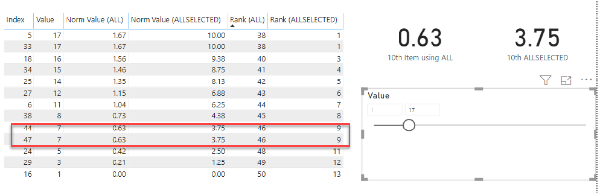
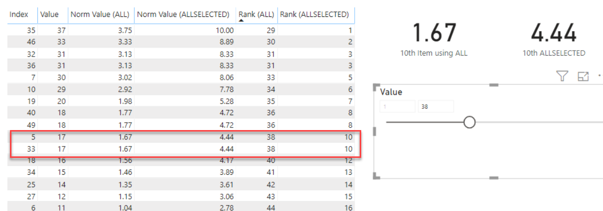
Where I’m running into problems is with another measure that is supposed to show me the value of calculated by the measure above for 10th row of the selected rows when sorted in descending order by the normalized values (or “0” if there are less than 10 rows selected).

10th Item using ALLSELECTED = 
    VAR Top10 = TOPN(10, ALLSELECTED('Random Numbers'), [Normalized Value from Table Column using ALLSELECTED], DESC)
RETURN
    IF(COUNTROWS(Top10) < 10, 0, MINX(Top10, [Normalized Value from Table Column using ALLSELECTED]))

The value returned by this measure is always “0”. If I’m understanding the situation correctly, this is because the context for ALLSELECTED() is the single table row that is being evaluated by the MINX() formula as it iterates through the rows of the table being passed to it. My problem is that I need that 10th value, and I don’t know how else to go about getting it. I tried changing ALLSELECTED() to ALL() in the first measure above (the one that normalizes the series), but then the value returned by the second measure (the one returning the value of the 10th row) always returns the same value regardless of which rows are selected because it’s calculating its result based on the context of the entire table.

Any ideas on how to fix this would be greatly appreciated. I have attached a sample PBIX file that shows the difference between using ALL() and ALLSELECTED(). If it’s not self-explanatory enough, let me know, and I’ll try to provide additional explanation.

Thanks in advance!

Test Case 3.pbix (43.0 KB)

@DaveC,

I’m away from my computer at the moment, so I’m not able to test this in the PBIX, but from your explanation it seems that if you switched your overall approach from using TOPN to RANKX it would greatly simplify this problem.

Doing a RANKX of ALLSELECTED would allow you to dynamically always access the 10th value directly, rather than iterating over the virtual table to find the minimum.

  • Brian

@BrianJ,

Thanks for the recommendation. I have attached another version of my PBIX in which I show my attempt at using RANKX(). I had tried this before and had the same problem with row context. In addition, RANKX() suffers from the problem that, under the right/wrong conditions, there is no row with a rank value of 10. This occurs in some instances when there are one or more multi-way ties for rank values lower than 10. I actually ran into that by accident, but was glad I did.

When you get a chance to take a look, I’d love for you to see what I’ve done in the PBIX, and let me know if you see anything I could do differently.

Thanks again!

Test Case 3.pbix (43.1 KB)

@DaveC,

OK, I think I’ve got a good solution on this one using one of my favorite DAX toys - TOPN(1) . I checked it and it works both when there is no 10th value:

And when there is more than one 10th value (tie):

Here’s how I constructed the measure:

  1. via ADDCOLUMNS, created a virtual table variable which tacks the normalized ALLSELECTED value measure onto the Random Numbers table

  2. created a second virtual table variable, which uses TOPN(10) to filter the top 10 normalized ALLSELECTED values in descending order from the table created in 1) above

  3. created a third one-row virtual table variable, which takes the virtual table in 2) and filters it using TOPN(1) in ASCENDING order to pull out the bottom (i.e., 10th) value

  4. checks the number of rows in the second virtual table - if less than 10, returns zero, otherwise returns the 10th value.

    10th ALLSELECTED =

     VAR vEvalTable =
         ADDCOLUMNS(
             'Random Numbers',
             "Norm AllSelect", [Normalized Value from Table Column using ALLSELECTED]
         )
    
     VAR vTableTop10 = 
     TOPN(
         10, 
         vEvalTable,
         [Normalized Value from Table Column using ALLSELECTED],
         DESC
     )
    
     VAR vTable10thItem =
     TOPN(
         1,
         vTableTop10,
         [Normalized Value from Table Column using ALLSELECTED],
         ASC
     )
    
     VAR Item10 =
     MAXX(
         vTable10thItem,
         [Norm AllSelect]
     )
    
     RETURN
     IF(
         COUNTROWS( vTableTop10 ) < 10,
         0,
         Item10
     )
    

Hope this hits the mark for you. Full solution file attached.

1 Like

@BrianJ,
Thanks! It sounds like a great solution. Once I get a chance to get back to the computer, I’ll try it out and report back.

Worked like a charm after I made two small modifications which you can see below. After making those edits, I have successfully ported the logic into the actual report I’m working on, and it works great!

Thanks again!

1 Like

@DaveC,

I think this problem has some really interesting aspects to it, and I’m thinking of turning it into a training example. I’m wondering if you can give me a little background that would make the example of bit more “real world”. What were we evaluating here, and why was picking the 10th value important to you?

Thanks much.

  • Brian

The actual use case had to do with creating a dynamic chart on which I plot my company’s various manufacturing locations on a scatter chart using values that represent various aspects of a location’s safety performance.

The reason for normalizing the values was to take the numbers reported for each location and scale them in a way that large and small operations can be compared to each other on a 0-10 scale despite the numbers they report being very different based on the size of the operation. There are separate calculations for the X and Y axis values, and then these two values are multiplied by each other to give an overall score for each location. The locations are then ranked from highest to lowest overall score.

The reason all of these calculations are performed in PowerBI using measures instead of being performed elsewhere and importing the final values as my dataset is that the normalization of the values means that each time I (a) change the selection to include/exclude different locations, or (b) change the date range on the historical data I’m using for the calculations, the calculations have to run again so that I always have a normalized set of numbers with the lowest being 0 and the highest being 10.

With regard to the 10th value, I actually use this logic to identify both the 5th and the 10th locations in the overall ranking in order to draw two curves. One curve represents the line above which the Top 5 locations are located on the scatter chart, and the other curve is for the Top 10. Since my overall values can change dynamically as described above, the position of the Top 5 and Top 10 sites will move around based on selected locations and date range, so the curves have to be redrawn based on the scores for the 5th and 10th locations.

I have not found a certified PowerBI visual that lets us draw lines on a scatter chart (and our IT security does not allow the use of non-certified custom visuals), so I have used a line chart visual for the curves and superimposed the scatter chart with a transparent background. The two charts both have set 0-10 scales on both their X and Y axes, and they are lined up perfectly so they look like one chart.

I have a partially finished test case PBIX that shows the general concept with the visuals without disclosing any of my actual data. I will try to finish it up during the week and share it.

Thanks again for your help, and I hope this provides some helpful context regarding the need!

1 Like

@DaveC,

Wow! Thanks so much for the detailed, thorough explanation. This context makes the example I’m prepping much richer and more relevant. Would love to see the final visual when you can share it.

Thanks again - really enjoyed working with you on this one.

  • Brian
1 Like

@BrianJ,
Here you go… Attached is my demo PBIX based on the discussion above. The data is completely fictitious (randomly generated numbers using Excel), and the mathematical calculations behind the scenes are not the same as I use in my real use case, but the concepts are all the same. It’s a little more involved that what I described previously in terms of the various user selections that will affect how the chart is drawn, the use of bookmarks to hide/show visuals based on user selections, etc., so if anything isn’t readily obvious, feel free to ask if needed.

Hope it’s helpful!

eDNA Demo.pbix (1.3 MB)

2 Likes

@DaveC,

This is phenomenal. It’s a fantastic visualization, with some really creative techniques (it took me a minute or two to figure out how you’d gotten the curves onto the scatter chart). I was looking back to some of our earlier conversations on the forum, and was blown away to see that you just started working in Power BI in October of last year.

Two questions:

  1. from our initial exchange, I thought high scores indicated high safety performance, but in looking at your visual it seems it’s the opposite – high risk, correct?

  2. any objection if I use this visual at the end of my video (with full attribution, of course) to show how the analysis we worked out comes together in a real-life application?

Thanks again for taking the time to put this example together, and your generosity in sharing it. Great stuff!

  • Brian

@BrianJ,
Thanks for the kind words. I did indeed just start working with PowerBI, but I have had so much fun with it that it has become a bit of an obsession. :smiley: Kudos to Sam and folks like yourself on the forum. Enterprise DNA has been my primary learning resource on my PowerBI journey.

To answer your questions…

  1. That is correct–high score is high risk. In theory, the locations sitting above the curves should be top priority when it comes to taking action to improve performance. It is worth noting, however, that the normalized scores on a 0-10 scale mean that the scores are always relative to other locations. Thus, a high score means higher risk than the other locations in the dataset, but it does not necessarily mean high risk in absolute terms.

  2. Feel free to share the visual in your video.

It’s been a fun project to work on, and I appreciate your help working out the one piece I was stuck on!

UPDATE: I just reworked the demo as follows:

  • Fewer measures and charts required.
  • It no longer uses bookmarks to show/hide objects on the report page.
  • It now uses IF() statements in the measures to determine whether it needs to scale based on ALL() or ALLSELECTED().
  • Got rid of the buttons and associated images for selecting the rescaling option. It now uses a one-item slicer and ISFILTERED() to determine whether rescaling is selected or not.
  • The trickiest part was the “ghost” chart that shows the faint dots for the non-selected sites when “rescaling” is unchecked. That was a fun one to work out.

eDNA Demo 2.pbix (1.2 MB)

3 Likes

@DaveC,

This is one of the awesome things about this forum - I initially responded to your question, but ended up being the one who learned by far the most. You’ve got techniques in this report (e.g., the automatic re-scaling, the ghost plotting, etc.) that I have never seen before. I’ve read over 6,000 posts on this forum, and in terms of creative thinking and flawless execution, this is one of the ones that really stands out. Amazing work, and thanks again for taking the time to mask the confidential information in order that you could share it with us.

  • Brian
1 Like