Problem in The Range Of Numbers in Line Chart

Dear Experts
I have a measure that calculates the churn rate (Churn Rate%), I have no problem in the calculation but I have a problem in the Numbers when I put it on the line chart as it shown on the picture:

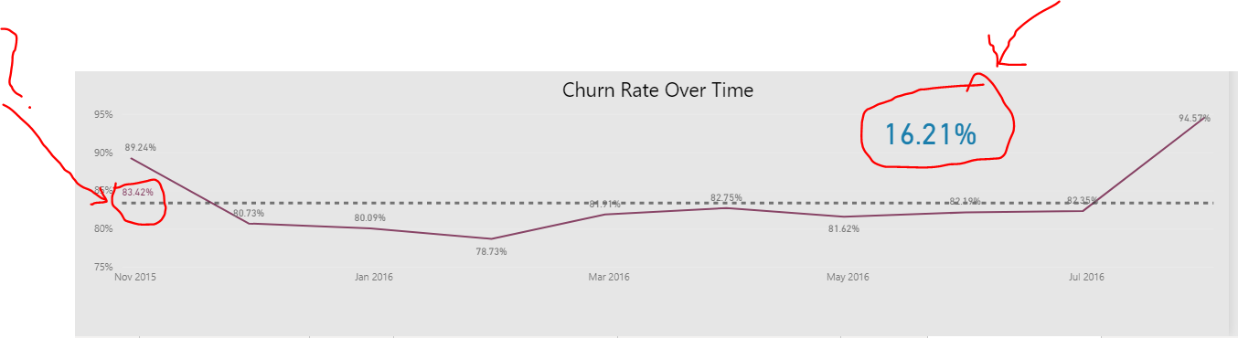
As you see in the picture the correct calculation of the average churn rate = 16.21 % but the average line on the line chart shows a wrong number (83.42%), to make sure that the calculation is correct I do the same thing but against the Age range inside clustered bar chart as it shows in the picture below:

Barchart

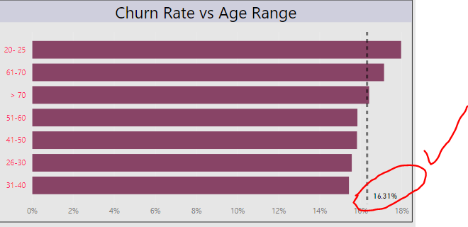
The average churn rate is correct in the clustered bar chart as you see in the picture, can any one help me how to solve this problem in the line chart?

Note : I attached the resource file with this post , the problem in the report titled (Churn Rate statistics).

Tahnk you

Customer Data 1.0 EDNA.pbix (1.6 MB)

Hi @MAAbdullah47,

Instead of using the Average line within the Line chart visual, create a separate Measure for the Average churn rate %

Something like:

Avg Churn rate % = 
CALCULATE( [Churn Rate%], ALLEXCEPT( Dates, Dates[Date] ))

Place that on the Secondary axis…
.

I hope this is helpful.

Thank you @Melissa
Ok fine but what about the (Y) range axix in the line chart not changed to be e.g: 1%-30% ?

You can change the Secondary axis settings through the Format option, when you have your line chart selected.

@Melissa
I think there will be a problem Everything will disappear (0-0.4) Kindly could you try it from the file I was sent it yesterday?

Sure thing.
Note I also set you Primary axis to start from 0

Customer Data 1.0 EDNA.pbix (1.6 MB)

1 Like

THNX I accepted your solution.