Hi Fellow Power BI Users -
Another question but this time about visualisations. 
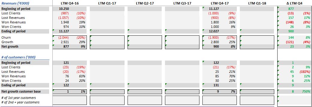
Our management wants a report that has to look like the photo below:
In the first column there are several measures we’ve calculated in PBI.
Can you give me an advice to build a similar “Excel”-report in PBI?
Do I have to make several “cards” to put the measures in the first column and then for every value a separate “card”?
Hope to hear from you soon,
Thanks in advance,
Cor van Dalfzen
In the August summit hearing, Sam did a training on financial reporting templates. You could use that similar concept here.
Yep the only way to complete custom table setups is to use the template idea I recently shared at the lastest learning summit.
This really is the only way.
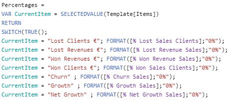
You will need to create a table that has the template of the particular table setup that you want. Then use the SWITCH function to pass through the correct information at every row.
I plan to complete some more sessions on this technique in the near future.
The video link above though explains the idea clearer and how to implement it.
Here’s a link to the entire session
This is absolutely brilliant, Sam and Avalon, you can use this technique for several purposes, thank you very much!
Hi Sam, a question about the “template”-technique. I’ve made a template and I want to see the underlying data with Drillthrough but it isn’t working. Do you also have a solution for this problem? 
That’s really great. Nice one.
Yes, there’s a bit more to it for the drill through.
I’m still working on these techniques myself, and will be running through them at the next member only event that’s coming up.
https://enterprisedna.lpages.co/financial-reporting-templates-sm2-member-only-registration-page/
My initial recommendation is to maybe setup up different table or report pages to drill through. This would honestly be the easiest.
Just have this one table as stand alone.
To create drill throughs will create an ever increasing complexity to the model.
As mentioned though I am looking to work on many ideas for this, just haven’t nailed down an exact strategy that could scale across many different scenarios.
All ideas I do come up with though I’ll be sharing as soon as I can.
Thank for your reply, Sam, I have another small question:
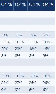
I use percent in my report and they all aligned to the left. Is there a solution to align them on the right?
Greetings from The Netherlands,
Cor
I think that’s just something you can fix in powerbi under formatting. Refer to the pic below:
Yep Avalon, has it correct. You can adjust it within the formatting area.
It works, thanks Avalon and Sam! 

1 Like