@Mohammed_ali hit the nail on the head in terms of keeping your structure “narrow and long” (relatively few columns, lots of rows) as opposed to the way Excel is typically structured as “wide and short” (lots of columns, relatively few rows). He’s also spot on in terms of building a proper star schema. I work with a lot of survey data myself, and here’s a basic sketch of a starting structure that may work really well for you:
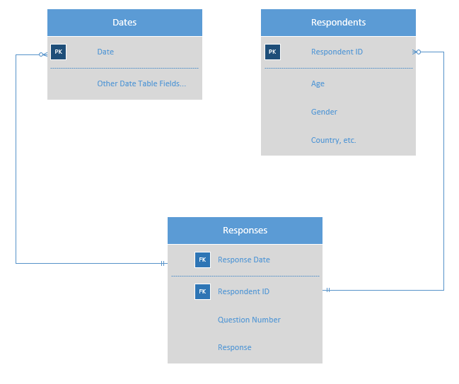
This structure will let you slice on any attribute in your data related to respondents, as well as on date.
If you look down the road at the calculations you’ll likely want to do, this sort of “narrow and long” structure makes them really simple. For example,
CALCULATE(
     AVERAGE( 'Responses" [Response] ),
     'Responses'[Question Number] = 10
)
Will give you the average response to question 10. You can add more complex filter conditions to generate more precise results by gender, age, etc, and also leverage the evaluation context of your visuals to calculate across many questions at once. The key is developing a strong data model from the outset that will support the calculations and analyses you want to do.
In addition to the course that @kkrj.ankit recommended, I think the following course will be extremely important for you to work through in building that proper data model and structuring your data correctly within it:
Finally, you may want to take a look at this thread which provides links to a number of other discussions on the forum about the advantages of a “narrow and long” structure.
I hope this is helpful. Good luck with the very valuable work that you’re doing.
- Brian