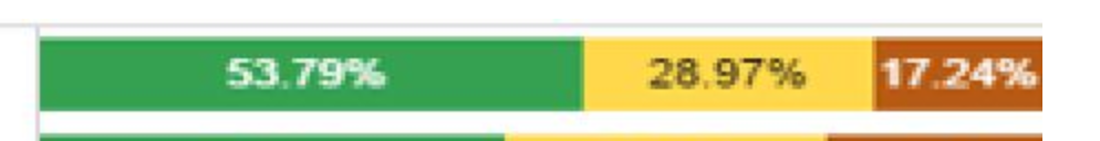
What graph visualization can I select to have a similar appearance as my attach file

What graph visualization can I select to have a similar appearance as my attach file
You can achieve this with the 100% stacked bar chart visual already in Power BI
David
Since you want the % involved, David is correct the 100% Stacked Bar Chart is the best visualization for the picture you have above.
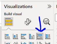
You will need to move the Assessment result from the Axis and into the Legend field.
DJ
Hello @mjmcs13 …
As suggested by @DavieJoe , you will need a 100% stacked bar chart to achieve the results indicated in your image.
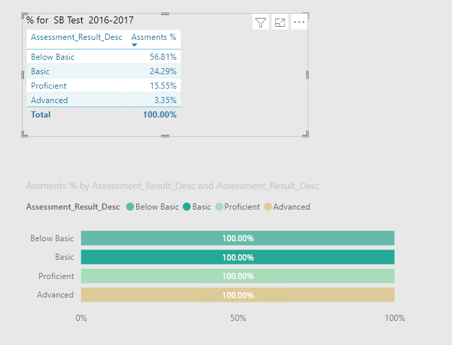
I think you will need two dimensions (one on Axis and one on Legend) besides your Values (Assessments) to complete this.
If you put the dimension in the Axis and in the Legend he will get one row per dimension and 100% in each row as @mjmcs13 did in his post, see image below.
Just have the dimension, Assessment_Result_Desc in the Legend field and this will work
Thank You. It works
No problem, happy to help.