Hello EDNA Form
I would like to create a cover sheet/summary page within my model to assist end users with understanding the data and visuals with my model. Please provide some direction and reading material to help me accomplish this task.
Thank you
Regards
1 Like
As is almost always true in Power BI, there are a number of different approaches you can use here. My recommended path would be to create your cover page in PowerPoint (just much easier to manipulate text and visuals there than in Power BI). When you have your page looking the way you want it to, just save it as a .PNG file and import that as the background to your Power BI cover page (@JarrettM has an excellent video on creating PowerPoint backgrounds if you need additional instruction here). Be sure to use the “Fit” option for the background to get it to scale properly.
Then, once in Power BI, insert blank buttons with no fill and no border (basically everything turned off except for the “Action” option) over each clickable area. For each button, set the action option to “Page Navigation” and then select the page you want it to navigate to if clicked. You also have the option to add tooltip text to the button to provide additional instruction to the users.
This is basically the approach that I used in Data Challenge #4 for my cover page. Here’s the publish to web link, and you can download the PBIX file from the Data Challenge Showcase to see exactly how I implemented the page navigation features.
I hope this is helpful. Please give a shout if any of this is unclear or you have additional questions.
– Brian
PS – while not specific to your particular navigation question, here is an excellent video that @sam.mckay put together on generally how to construct an excellent page navigation structure.

1 Like
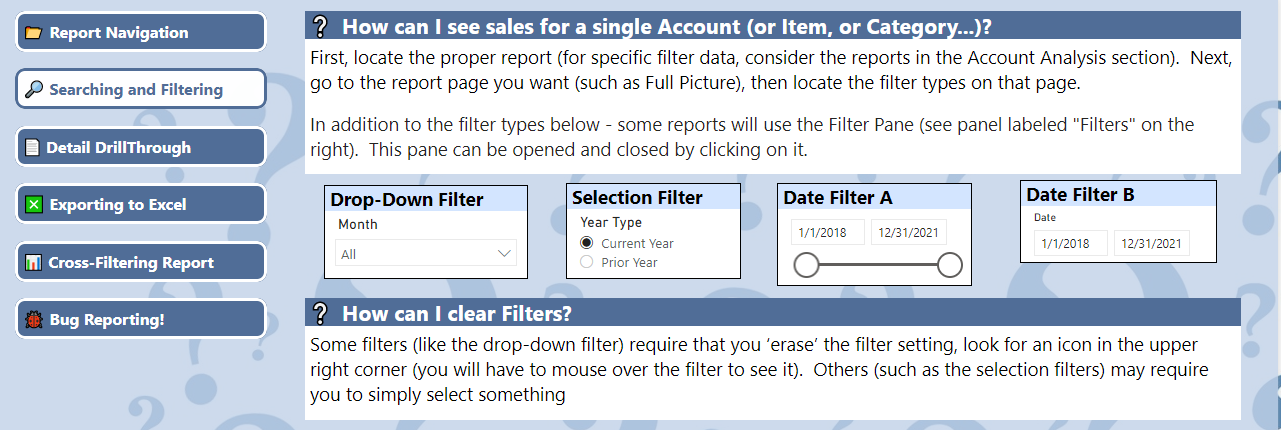
adding to @BrianJ’s great advice, here are some screenshots of the FAQ page I created that appears at the front of the App that my sales team uses. A similar approach could be taken to the front page of a report:
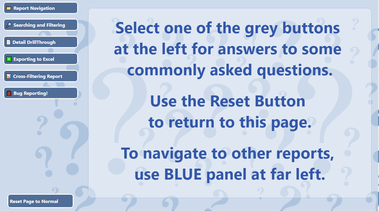
Clicking on one of the buttons to the left brings up a Q&A view about that topic, such as “Searching & Filtering” As you can see, in this section, I actually include a practical (and usable) example of the various filters for the user to test out.
There are similar practical examples for the user to work with for Exporting data to Excel, Cross-Filtering, etc. And my final button informs them on the procedure for bug reports.
2 Likes
@Heather’s excellent example above brought to mind another way I’ve done this, mixing and matching all the different types of actions you can link to a blank button. For example, in the icon sidebar below, clicking on Instructional Videos triggers the blue framed window to open via a bookmark action, and then within that bookmark the two video choice buttons are tied to web URLs. Similarly, other buttons trigger bookmarks that contain page navigation buttons. Just other possibilities to consider in crafting your UX…

– Brian
1 Like
Hi there !
I hope you are doing great. I had the same situation and I am grateful to have the help of UI/UX designers to build my reports. Here are some valuable tips :
1. Consider your audience : focus on the understanding of the metrics wanted, will the dashboard be used, on what type of monitor will the dashbord be displayed?
2. One story on one screen :
Because dashboards are mainly meant to show the most important information at a glance, having all the focus on one screen is better. Avoiding scroll bars on a dashboard is a must.
3. Accent the most important information :
For example, card visualizations are a powerful feature to highlit an important measure.
4. Place the information by their importance :
People read from top to bottom and from left to right, your tactique will be like below :
left-to-right, top-to-bottom.
5. Use the right visualization for the convenient data : these are my top 4 :
- avoid visuals that look pretty but are hard to read
- pie charts, donut charts, gauges, and other circular chart types aren’t a data visualization best practice (only if they have fewer than 8 categories)
- be sure to encode quantitative data nicely
- avoid cluttering charts with unneeded data labels
Good luck !
1 Like
Hi @ambidextrousmentally , did the response provided by the users and experts helped you solve your query? If not, how far did you get and what kind of help you need further? If yes, kindly mark the thread as solved. Thanks!
Hi @ambidextrousmentally, we’ve noticed that no response has been received from you since the 14th of January. We just want to check if you still need further help with this post? In case there won’t be any activity on it in the next few days, we’ll be tagging this post as Solved. If you have a follow question or concern related to this topic, please remove the Solution tag first by clicking the three dots beside Reply and then untick the checkbox. Thanks!
A response on this post has been tagged as “Solution”. If you have a follow question or concern related to this topic, please remove the Solution tag first by clicking the three dots beside Reply and then untick the check box. Thanks!