Power BI Clustered Column Chart X-axis Display Different for Fiscal Year Vs Fiscal Quarter

Hello Fellow Power BI Users -

I have created two bar chart and the difference between the two is X-Axis. One is for Fiscal Year and another is Fiscal Quarter.
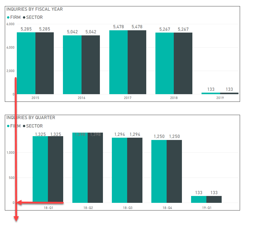
.

Question:
The Bar chart for fiscal year “2015” start from Y-axis while the Bar chart of Fiscal Quarter for “18-Q1” is some space away from Y-axis. I am wondering why this happen and how to fix to make the two chart layout the same. Thank you.

1 Like

I believe this will be to do with the year being seen as a number and the quarter and year as text. The chart seems to treat theses differently, which is less that ideal.

Have a go changing the year to text and see if it makes any difference.

1 Like

Thank you, Sam. I update the Fiscal Year data type to “text” and all fixed.