Just a quick run through from me today.
This was quite a unique challenge with the data set being something that I personally have never really dealt with.
Even though that was the case it wasn’t a very challenging data set.

The model itself was very simple and there weren’t many changes to work through in the query editor.
Where I spent the most time was working out how to represent the information so that it fulfilled all of the stakeholders requirements within the brief of the challenge.

This can sometimes be a challenging aspect of report development. It really depends on what sort of raw data you’re working with.
I did create a number of measures, but I would say that I only used a small amount of these actually within my report visualizations. None of these were particularly difficult to execute on as well.

I will say though that my creative juices weren’t flowing as well as they had in previous challenges. On reflection looking at some of the other submissions to the challenge I’m amazed at what you could do with the data set, and I haven’t really done it justice if I was being completely honest with myself.
In any case this can sometimes happen and the great thing about Power BI is that you can always iterate overtime. And this is actually very easy to do.
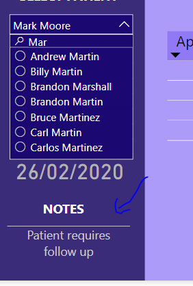
In terms of my visualization the main thing I wanted to do on one of my report pages, which was the patient details page, was to really highlight all of the key information about a particular patient at any point in time.
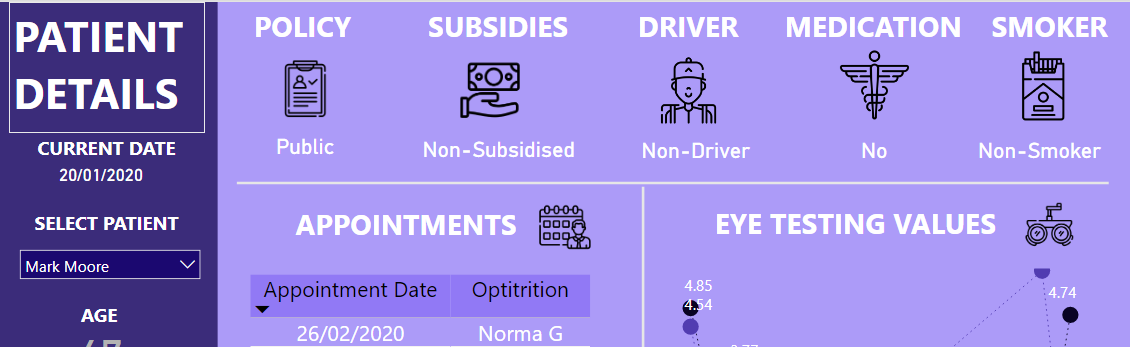
How I imagined this would work is you might get a phone call in from a patient and you want to be able to quickly select that patient’s name so that you can see their entire history and all the details about that particular person.

I also created some custom logic for the notes section. This was to highlight if there was anything important that was automatically logged to the customer’s name so that you could bring this up in a phone conversation or with any conversation that you might have with one of your customers.
On the 2nd page for patient scheduling, I’ve created a simple table of information. This would be the part of the reporting application where you might have some daily tasks where you need to follow up a group of patience regarding Sid and notifications on there follow up appointments etc.
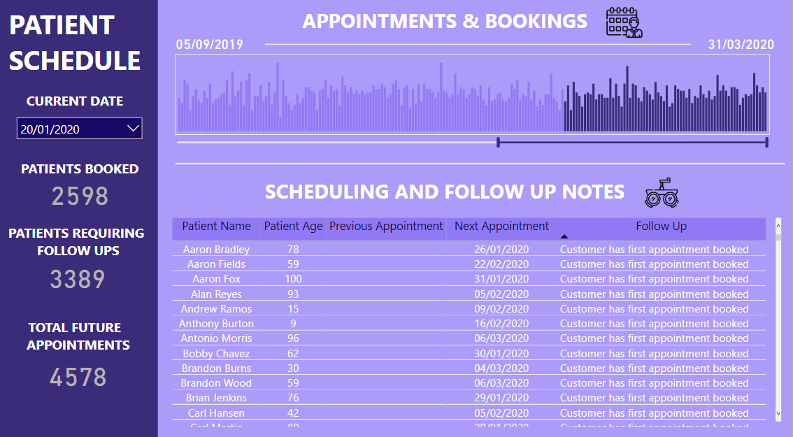
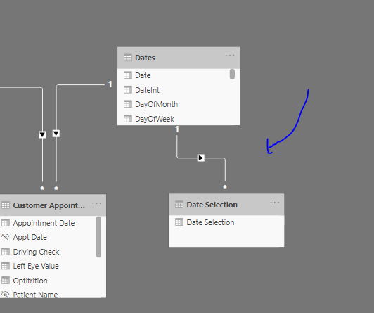
Also one of the unique things I did here was I used a slider to determine what you would show within the column chart. Then I used a different date table to highlight which dates were before an after a certain date.
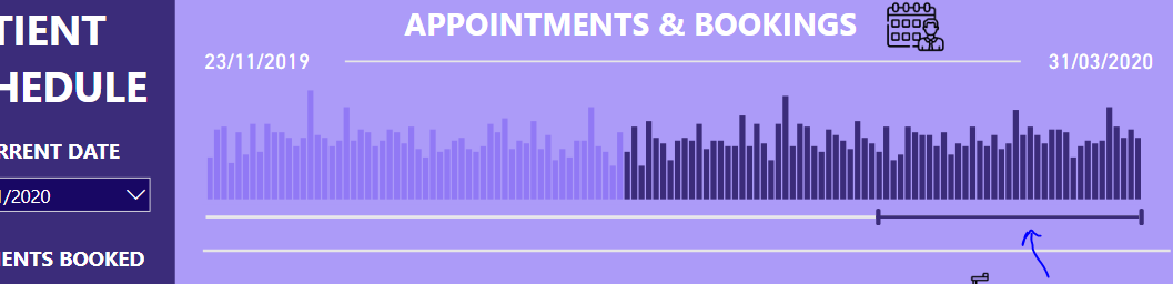
The main reason I did this is that ordinarily you would maybe have a current day when you were looking at the reporting information here come up, but because this was historical data I had to almost make up what the current date was via providing a selection so that you could as a consumer see what was prior to today and what were the bookings from today onwards.
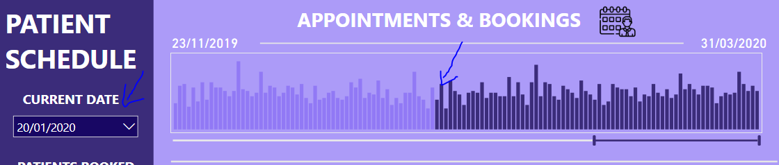
To do this I used a easy technique within the data model of adding a new date table and then I used some custom conditional formatting within the chart visualization. Nothing too difficult but a nice little trick to create a more visually appealing report page.
That’s all I really have for this particular challenge right up. Certainly not my best work but still happy with the way that I was able to answer all of the stakeholder requirements in the challenge.
Web link here to play around with report
There have been some phenomenal entries this time round in the challenge and I’m really looking forward to stepping things up another level 4 whatever comes next.
Thanks all.
Sam