Hi @sam.mckay @haroonali1000
Sure can. So this was my firsst ever challenge and I hugely enjoyed it. Already can’t wait for the next one!! For this report I didn’t actually use too much DAX.
My first challenge was to identify a future recommended date for each patient. I decided to add a column in the query editor instead of a dax measure. I used
if [Age] > 55 then Date.AddMonths([Appt Date],3) else if [Age] > 25 then Date.AddMonths([Appt Date], 6) else if [Age] < 26 then Date.AddYears([Appt Date], 1) else “”
I then did numerous replace values to turn 1s to Yes and 0s to No.
Once that was complete, I created my Masterdate table. I now had a data set with two relevant dates included, being previous and recommended dates. So for this, I used USERELATIONSHIP
Latest Apppoint Date Ref 7 Days =
CALCULATE( [7 days Latest Appointment Volume],
USERELATIONSHIP( Masterdate[Date], Opticaldta[Estimated Next Appointment] )
)
This just helped me reference my masterdate table regardless of date…
The other significant piece of code I needed was to review latest version for the profile page. This helped filter lastest appointment and ensure I grabbed the latest version of IsSmoker and columns that had a chance of changing from previous appointments. So I used the below DAX
Latest Version =
IF( Opticaldta[Appt Date] = CALCULATE( MAX( Opticaldta[Appt Date] ),
ALLEXCEPT( Opticaldta, Opticaldta[Patient Name ] )),
“Y”, “N”
)
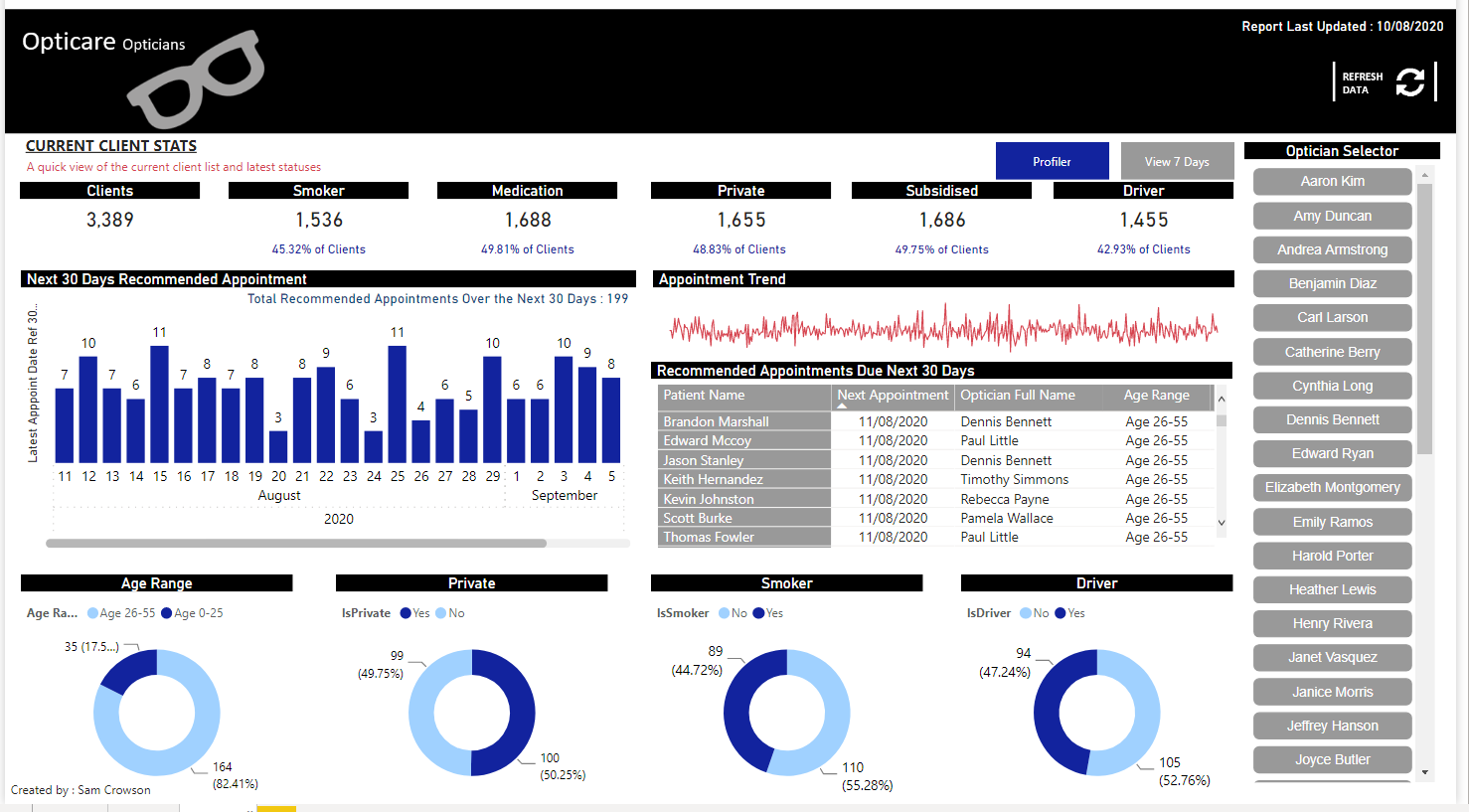
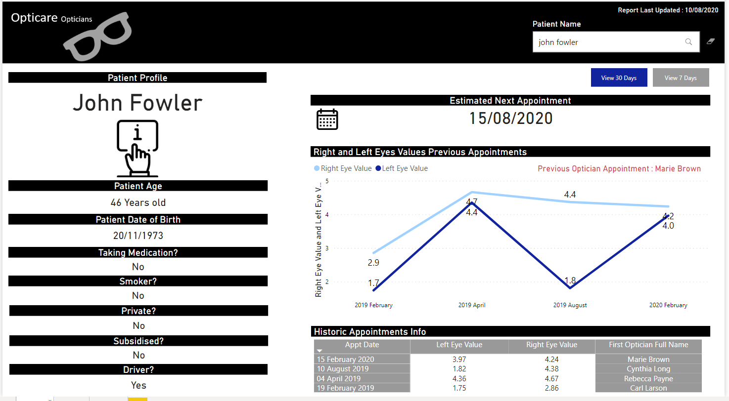
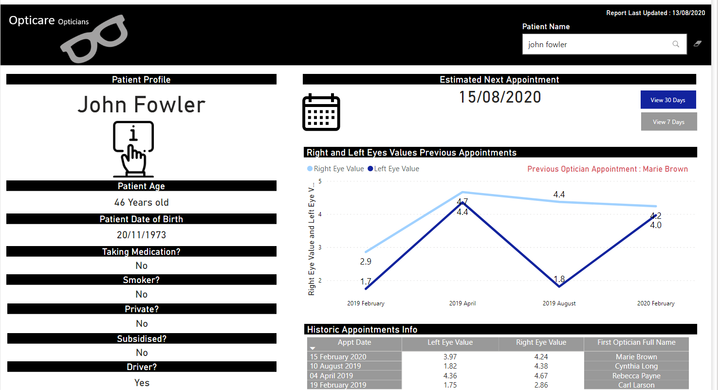
Once the above was done, I had everything I needed to filter my views the way I wanted. So then it was just deciding on design. Page one I wanted to achieve a profile page with the theory if you wanted to review any of the recommended appointsments due, you could then search the profile page to get everything I felt you needed. On a personal level, I wasn’t particulary happy with the design of this page and wish I had spent more time to try and neaten it up. I did make one small change since my orginal post. I moved the navigation buttons to the side of the page, and aligned the top two visuals.
I just felt that made it look a little neater. Not my favourite page I’ve ever completed…
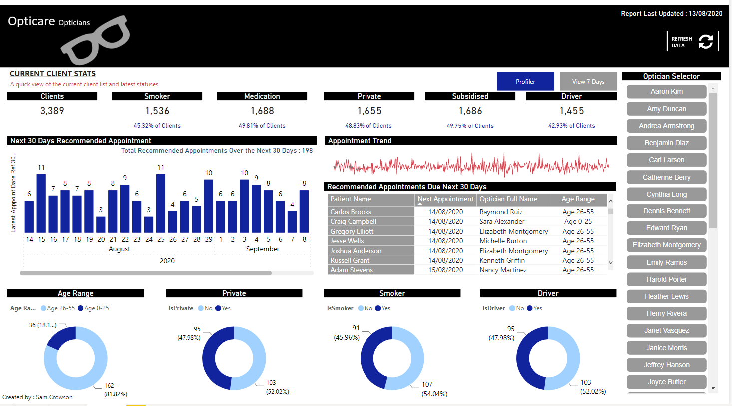
Then second page, I just wanted to get as much on as possible. At the top, I created the headline figures to show how many patients the opticians currently had on their books. But also the ability for the optcian to see how many of those patients currently sat under them (based on previous appointment). Then it was just creating some views solely based on upcoming appointments.
I dont think there is anything else in regards to this one. Please see attached the PBIX report to view
Challenge5DataEnterprise.pbix (1.3 MB)
Thank you,
Sam