Here’s Nebiyu’s entry for Power BI Challenge 5. @Neba, would you like to share how you built this dashboard and what your inspiration is in building it?
Dear @sam.mckay , @haroonali1000 and the EDNA team,
First of all I want to thank you for this challenges which I am learning a great deal. Being a member of EDNA is an invaluable experience and I recommend it for any one who is interested in making sense of any Data.
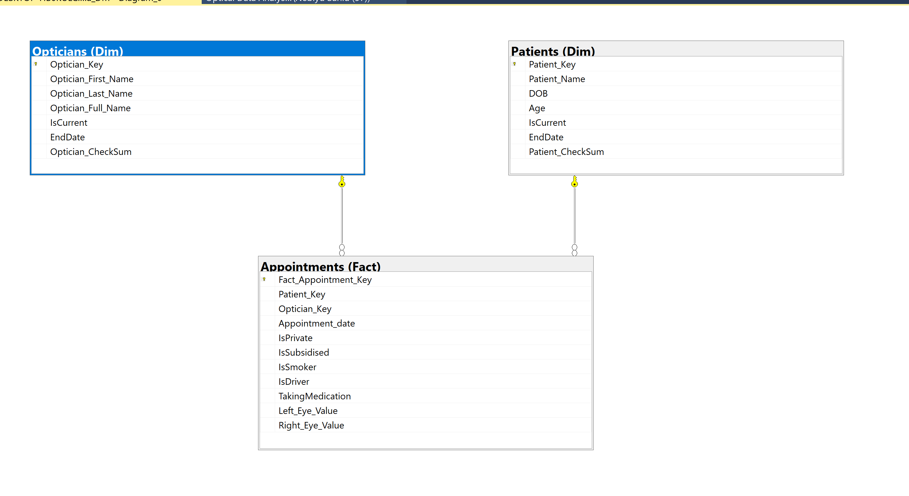
For this challenge, ( Tbh I do that for most challenges as I have a SQL back ground and I hope it is fine ) , created a Data Mart based on the requirements asked by the clients.
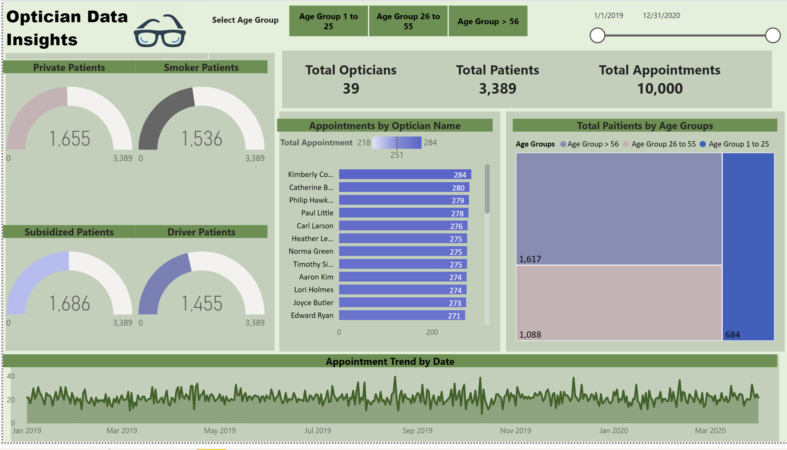
The measures I had to create for the report were challenging for me. There were some general and easy calculations, but some of the answers needed by the clients was more challenging to answer.
There were some inconsistencies from the source, but that is part of the challenge because there will never be a clean data, someone some where will enter a wrong data in any organisation.
Challenges I faced creating this report :-
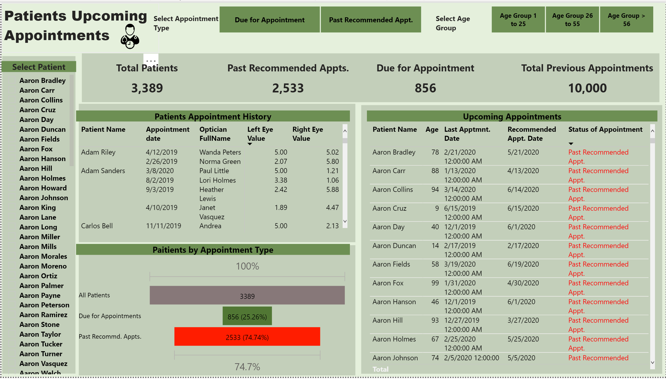
I tried using DATEADD to figure out the the next appointment date, after creating a measure that
shows the last date of each patient"s visit, I tried Dateadd and it didn’t work. So I had to google and
use a function called EDATE( (Datemeasure) or (any date) , Months).
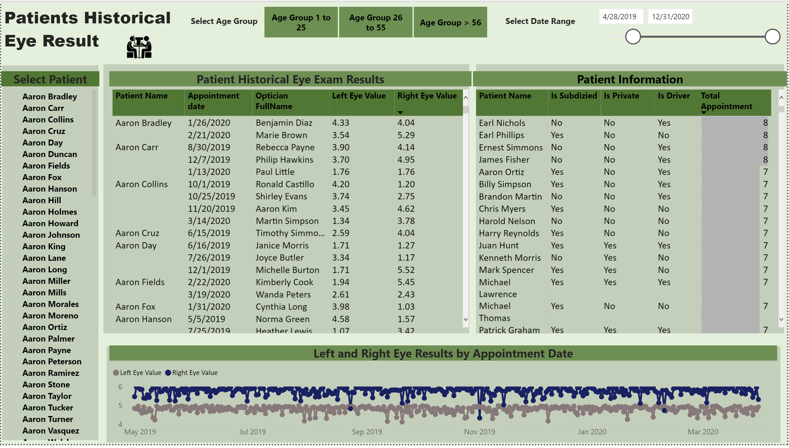
I wanted to create a measure that shows the change of each eye value by date ( how the
prescription of each eye changed by exam date ) . But I could’t figure out how to calculate current
each eye’s result versus previous exam results. hopeful someone will figure it out.
When it comes to Visualizations, after looking at some of the reports submitted by some talented
people, I am certainly learning how and when some visuals work.
Well done on your submission, you’ve definitely covered the brief in quite a lot of detail here so well done on that.
A couple of things that I noticed that would be a good thing to have a look at.
The first one is a really easy fix around your grids within your report. A lot of these don’t seem to line up and to me it detracts from the value you have presented with the visualisation’s and calculations. So just simply making sure your rectangles and squares representing your grids are in line will make the dashboard more compelling.
Also just with your colour palette, it’s great to hear that you’re using the colour theme generator, but just make sure that the palate is consistent. Sometimes there is beauty in simplicity of colours. So don’t feel you have to use a lot of different colours for your insights. Simplifying things down a bit I think will add a bit of value to your presentation.
I like how you have looked to create a calculation around when the next appointment is, so you’ve got to think outside the box which I think is great.
Really well done overall, just a couple of really small tidy ups and I think you’ll have a really professional looking report that would make any consumer very engaged in your insights.
Hi @Neba. I’m a SQL guy as well and completely understand … I think your experience is actually invaluable. I had similar questions about getting the previous row value and, as it happens, posted an article about that earlier today:
Dear @sam.mckay,
Thank you so much for taking the time from your busy schedule to review my report and for your feedback.
I definitely need to improve on my visualization technique to make it compelling for consumers of the report. By looking at some of the other entries, I can see how these kind of data needs to be visualized differently versus say some sort of transaction data.
Regarding all the alignments, Yes, you are right. I get flustered sometimes I guess because I am not used to working with this kind of awesome visuals except some SSRS.
I will be working all of those and I can’t wait for the next challenge.
Hey @Greg,
Wow thank you so much. I was thinking to calculate it in SQL Server using a window function like Row_number() or something and create a view and load the view to Power BI. But, I wanted to do it using DAX.
I am going to try your both of your methods in DAX.