@sam.mckay Thanks a lot for your feedback and appreciative comments. Frankly speaking, when I though about this design, i didn’t know that people will like it but I did it anyways because I wanted to master bookmarks and my report used every type of bookmark possible. Now I am very comfortable around implementing different techniques in bookmark.
Visualization
What I think the key to good colors is to find an image or wallpaper which you find appealing, go to EDNA theme color Generator option “Image to Colors” and generate your theme. On the report I feel using more than two or three colors can make the report look unattractive. At first, I used an info-graphic style report but the style looked like as if the Optician’s company is related to children only so I abandoned the style (but it looked good though).
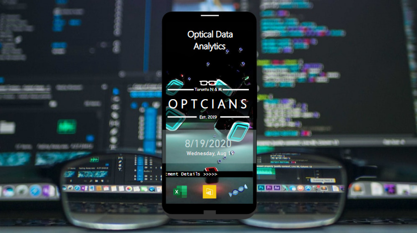
It occurred to me that one thing that everybody know how to use, is mobile phones and you can’t find better navigation and menus than mobile phones. For e.g. to watch anything on you tube, going to google and typing the web address isn’t required anymore instead almost all the essential menus are on the home screen. So i started my report with mobile phone design as Penny & Co. isn’t Tech Savvy.
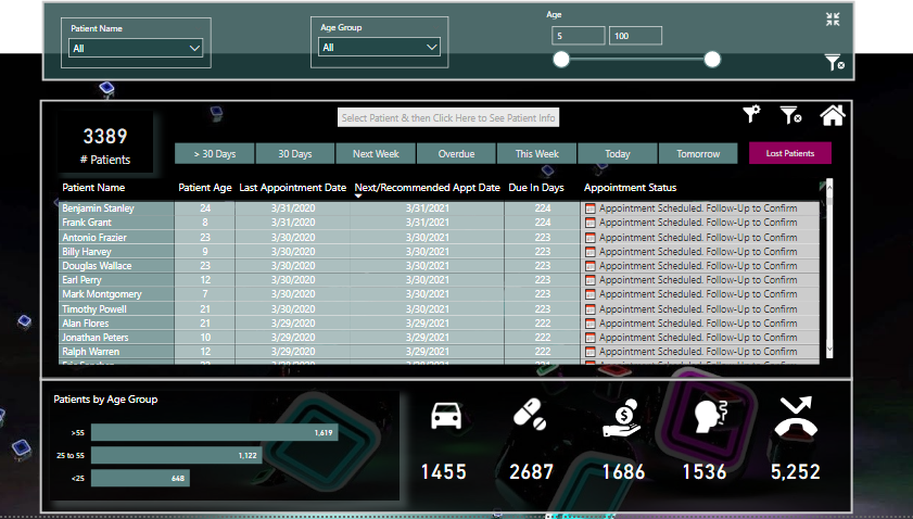
Designing a mobile phone was the hard part as I had to adjust many shapes to make one. Then I wanted the client to access everything from the home page for easier navigation. First, I provided the option to filter the data by due/overdue category like appointments due in 30 days, today,tomorrow e.t.c. which can be accessed by the appointment icon next to you tube icon. Granted that slicers are very convenient to use but I tried to make it easier by incorporating filtered data in icons like Call,Follow,Red Alert so client can just click on one icon rather than selecting different slicers to filter the data. Just to have a quick overall summary, the client can get it by clicking Q&A bar and 30 sec Go To summary Icon and from that icon can get access to the patient’s list due for today that can also be drilled down to personal details.
On the welcome screen, excel icon gives access to data source directly (hyperlinks like excel don’t work in Power BI so I put the file in drop box first and linked it with URL) so if the client wants to update/edit the data source, that can be done conveniently.
Power BI Visualization Limitations:
I wanted to use tool tips in different ways but limitations in Power Bi didn’t let me.
- Tool tip should have the option to be static even when we hover away the pointer like Show/Hide comments in excel for better overall view/analysis of a particular component.
- There is only one tool tip per visual,icon or table.
- We can’t select anything on visual header tool tip? If I wan’t to see the hidden data by using the drop down on the visual header tool tips, I can’t.
DAX/Logic
DAX was the hardest part for me as I am a newbie to DAX. I learnt SUM function just two months ago but I am a quick learner and got the concepts pretty quickly. Now I have bought The definitive guide to DAX 2nd edition but watching EDNA channel to grasp advanced concepts quickly. That’s why you can see the DAX measures in my PBIX file is messy because I was trying to learn, validate and then implement the measures and it cost me a lot of time but it was worth it for the learning sake.
First calculated patients today’s age in the query by linking the date of birth with DateTime.LocalNow() function to get the latest age. Used IF/Switch functions to calculate periods (due/overdue) and used the given criteria to calculate the next appointment by age category. Then calculated Missed Appointments by calculating the number of days since last appointment and comparing it with the appointment frequency. Rest of the analysis is the same as everybody else.
When I read on the instructions about compliance framework, I knew that a good tracking is required to ensure that the opticians are carrying out the due diligence but I was held back due to incompetency in DAX and now scratching my head after looking at @Melissa calculation on Flagged measurements.
For the next challenge, I will spend more time in analysis and on DAX measures as I know that visualization is my strong point.
Thanks again for giving me this opportunity to learn and showcase my talent. This community is AWESOME!