Here’s Michael Sampsonidis’ entry for Power BI Challenge 5. @michaelsampsonidis, would you like to share how you built this dashboard and what your inspiration is in building it?
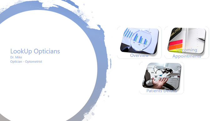
To learn about the real-life scenario presented for the challenge, be sure to click on the image below.

2 Likes
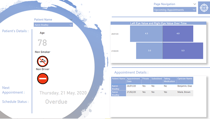
Super work on your submission here, and I really like how you thought outside the box around your visualisations. I like how you have tried to make this look like a full on reporting application by embedding your visuals within a creative background.
This is quite a unique take on reporting and power BI. But really just shows the versatility of report designs and also just the immense possibilities you have with even just a standard visualisation palate. It just takes a bit of creativity doesn’t it.
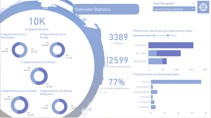
I also think the colours work really well. I’m not sure if you’ve used the colour theme generator but well done if you did.
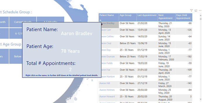
Also some of the icons and images you’ve used worked really well. I also really like the pop-up box when you select a patient. I really like this idea and I’m going to look to incorporate something like this in a follow-up challenge in the near future.
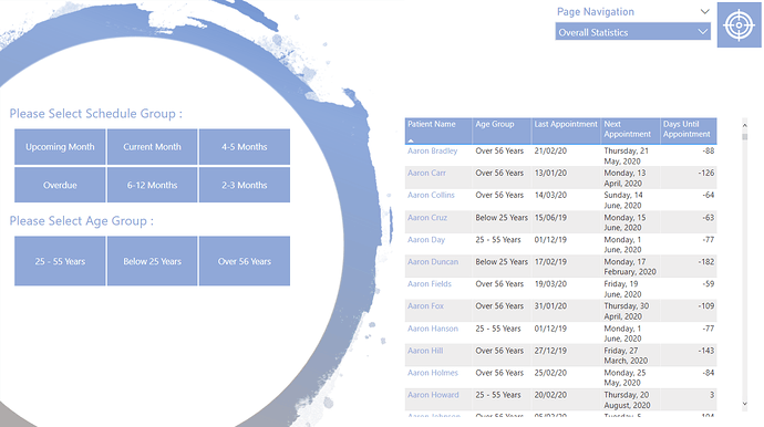
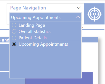
I also really like the navigation features you’ve embedded. They work well also. I guess just one thing maybe I think that is missing is some clear labelling or titles for each different page. Just a small thing but I think would make it easier for a consumer to know exactly where they are at when they are working through the analysis.
Awesome work.
Sam