Here’s Lam Vo Nhat’s entry for Power BI Challenge 5. @NhatLam, would you like to share how you built this dashboard and what your inspiration is in building it?
Optical.zip (2.6 MB)
To learn about the real-life scenario presented for the challenge, be sure to click on the image below.

1 Like
Nice work on your submission here. I love how you’ve been big and bold with your visualization on the first few pages.
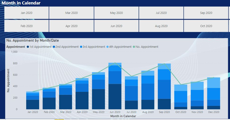
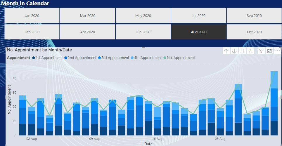
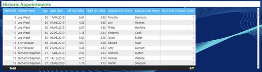
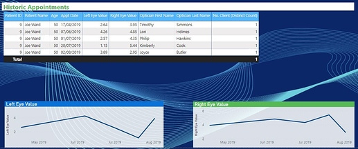
I also noticed you have showcased an insight that not many others have within your larger column charts. And that is breaking down a first appointment then a second appointment etc.
I like this out of the box thinking and is something that I personally didn’t think about but does actually add value to the overall insights that a consumer would take from this analysis.
I also like the flow of the report we have started off with some more important information then in later pages showcased the more granular information.
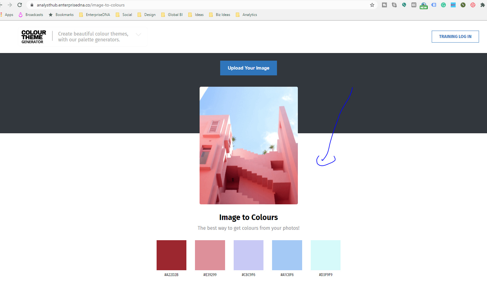
Couple of things to have a think about is I think the background colors don’t work very well with the colors you’ve incorporated into your visualizations. It’s important to make sure these contrast really well. You can make sure you get the right color palette by utilizing the below feature in the color theme generator.
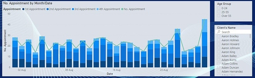
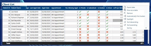
Also maybe for next time challenge yourself to get a little bit more creative than just showing a table of information. Maybe there’s a more compelling way to break out some of the values within that table into different visualizations.
There’s a lot of great ideas embedded into many challenge submissions over the last few rounds. So definitely review those to get many many ideas.
Let us know who you went about creating this submission.
Nice one
Sam
Dear Sam and EnterpriseDNA team,
I’m very happy to receive your feedback. 
I’m quite busy now with my BI project in company, so I will reply you soon.
I’m very sorry for my late respond and this inconvenient.
Thanks & Best Regards.
Nhat Lam
Dear @sam.mckay, @EnterpriseDNA,
The first thing this Power BI Challenge is interested in me because Penny requires are seemingly simple but it’s is not easy to do.
And the second, as a person in charge of developing the BI report system. I found your Power BI Challenge is crucial to me for testing and improving my skill so keep going and I will arrange my schedule to submit my solution.
I also give my appreciation to @sam.mckay with your comment on my dashboard. As I shared your comment with my team and we are very interested in the color theme generator because it will help us to bring new experience to our user. So if you can share with us some best practices from this tool, we will appreciate it a lot. 
Nhat Lam
This link on enterprise dna should help you get started
https://forum.enterprisedna.co/t/check-out-a-new-colour-theme-generator-tool-by-enterprise-dna/7768
This is another link where someone like me who is color challenged use as inspiration from time to time to get started