Hello Fellow Enterprise DNA Rock Stars,
I really enjoyed this challenge from start to finish. My goal in this challenge was to create a model that was visually appealing, and easy to understand. I create Power BI reports mainly for people in the Construction Industry. One of the biggest requests that I get from clients is to make sure that the report is easy to understand, and do not make the report feel like we are drinking water from a fire hose! Here is the step by step process of how I put my report together.
Company Logo & Colors
Choosing the color theme for your report is a pivotal step that you cannot overlook. I do not care if you are new to Power BI, or you have been doing this for years, you only get one chance to make a first impression! You can have the best report ever made, but if the color scheme is off, that will be the focus of the end user. This is very easy to do. The first thing I do in each of my models for these challenges is find an image online that fits the feel of the challenge. I did a google search for Optician Company Logos and came across a logo for a company that was based in Ireland. I really like the name of the company, mainly because we share the same last name.

Once I had the image picked out, I went to 2 different sites to pick out my color scheme:
-
https://analysthub.enterprisedna.co/colour-theme-generator
-
https://imagecolorpicker.com/
Then I go to https://themes.powerbi.tips/ and enter the hex codes that I got from the 2 previous sites, and download my JSON color theme file that it provides.
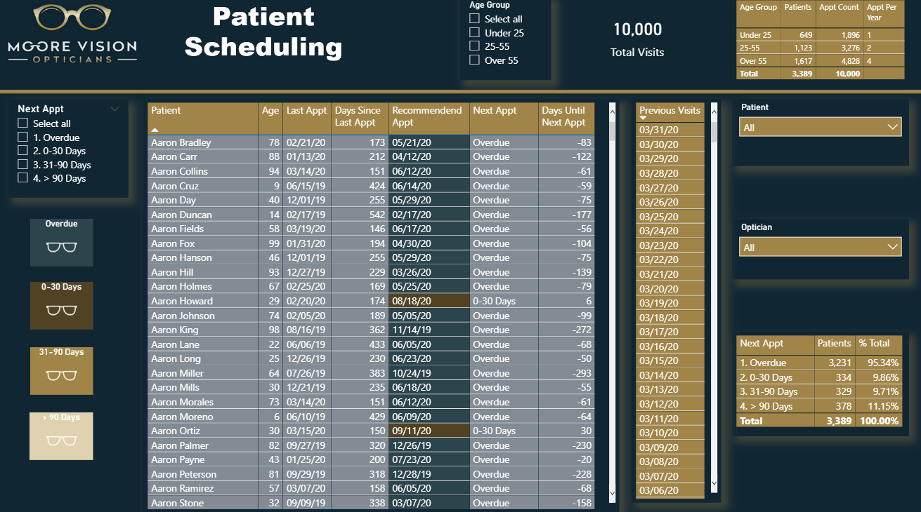
The next step I do is go over to Microsoft PowerPoint and design each of my slides. Once I have that completed, I then use each one of those pictures as the background for each of my slides. Here are the finished products of each of the slides:


Data Model
My approach to this was to keep it as simple as possible.
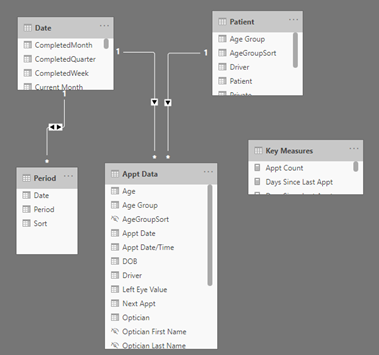
This structure did not take long to put together. The next step that I did was create most of my measures that were needed for the Key Measures Table.
Measures Involved
I used quite a bit of DAX in this challenge, as compared to any of the other challenges. I have a lot of experience in creating time intelligence measures based of off Date fields. In the Construction Industry, there are many key dates that are used for each job to track key metrics. I use Sam’s technique of measure building whenever going through this process. First create the basic measures needed, then build the other measures based off those. One of the best ways to create advanced measures is to use variables so that you can break the measure down in chunks, and see what results populate for each variable.
Putting the Model together
This was the very last thing that I did. My goal in putting together each slide was to make it easy to understand, and not overcrowd the page with information overload. My thoughts in this process was that I had 3 slides, and I wanted to separate the data so that the end user would have a screen for Patient Scheduling, Medical Records & Age Group Stats. I think it creates a huge problem for the end user if we combine to much of this information onto one slide. One strategy that I try to implement in each of these challenges, is to keep it simple. If you want to challenge yourself to do things that you have never done, I am all for that, but for most it is probably best to stick to the basics. Sometimes people try to go way over the top in creating a complex model to try and keep up with the other models that are being posted.
Conclusion
Overall, this was probably one of my favorite challenges so far. I enjoyed seeing all the different submissions for this challenge. One bit of constructive criticism before I sign off. Try to keep your submission as your own, do not be overly influenced by the early submissions. Looking forward to the next challenge already!
Cheers
Jarrett
EDNA Optical Data Review- Jarrett Moore.pbix (2.4 MB)