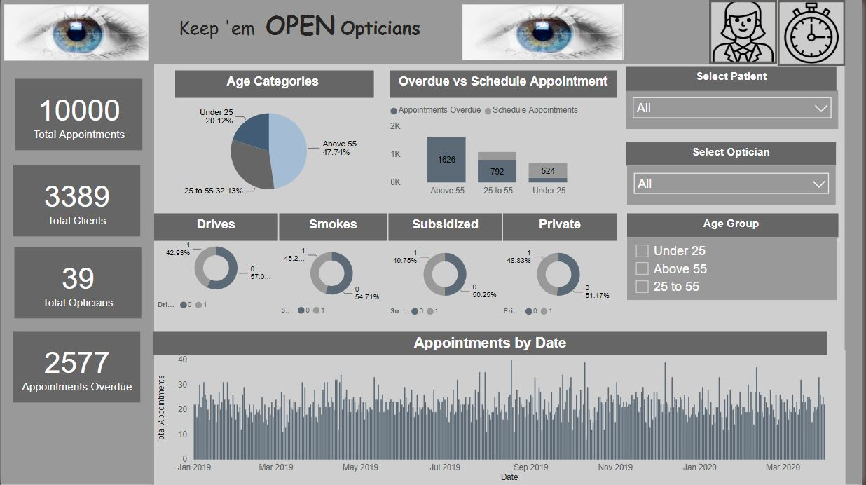
Here’s Harsh Nathani’s entry for Power BI Challenge 5. @harsh.nathani, would you like to share how you built this dashboard and what your inspiration is in building it?
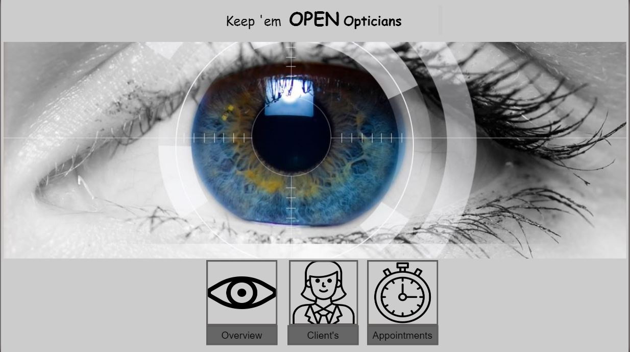
To learn about the real-life scenario presented for the challenge, be sure to click on the image below.

Well done on your submission here Harsh. I see a lot of inspiration from Brian’s submission to the challenge.
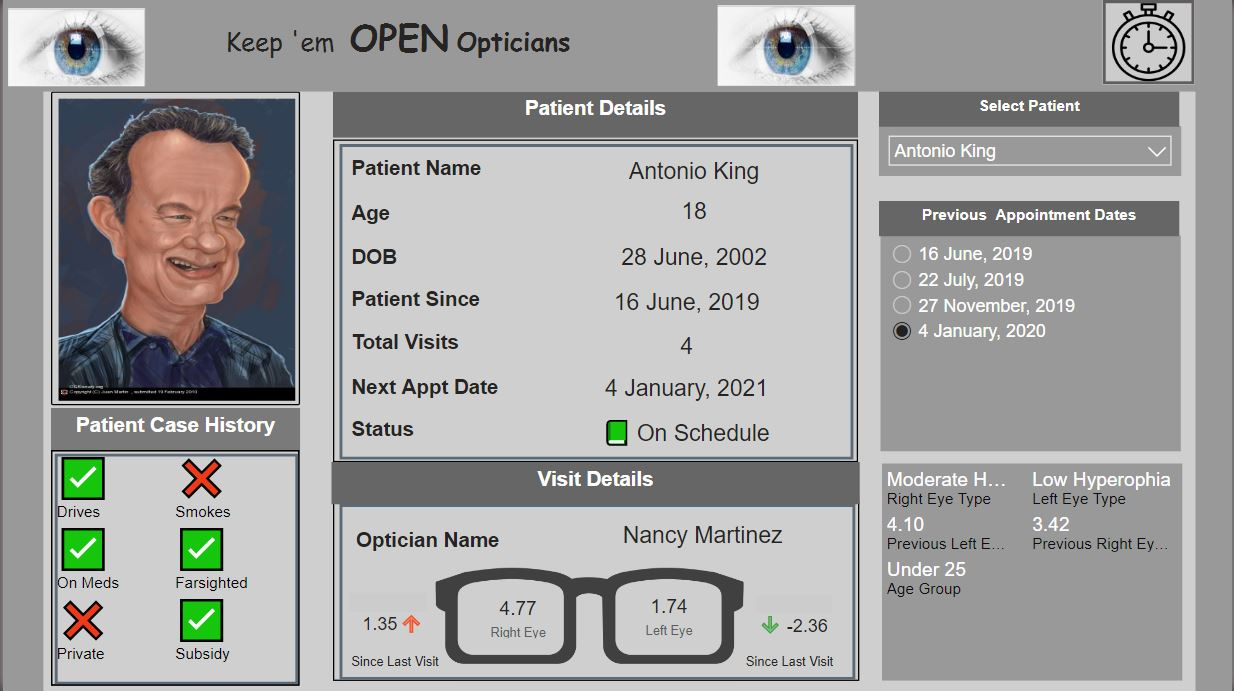
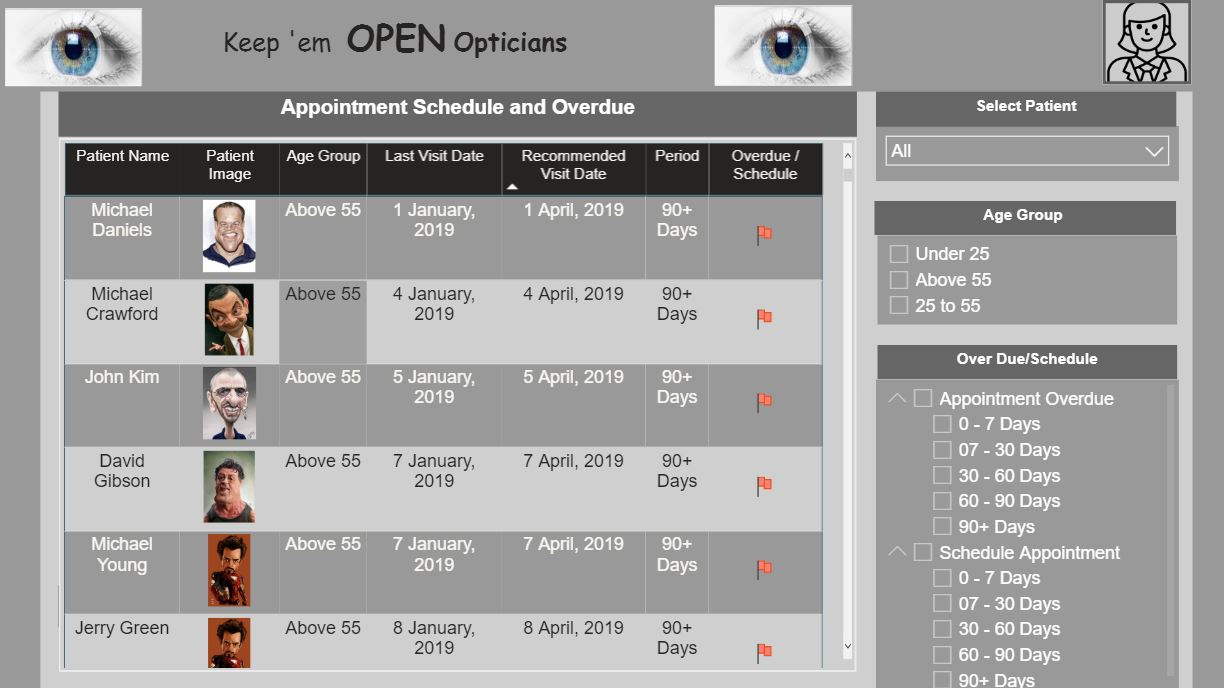
I presume you decided to do that because you wanted to challenge yourself around how to place dynamic images inside of your report pages and also inside of tables. It’s great that you’ve decided to do that, it’s something that I might challenge myself a bit more on in the future.
I really like all of the detail and how you have really thought about the navigation around your report. It just makes it that much more compelling I feel.
Overall I really really like your submission. The only thing I can recommend is maybe just trying to create a cleaner visual experience. There is quite a lot of rectangle shapes around every card around every table etc. One of the great things I took for from Melissa‘s submission was the fact that you can keep things really simple and still showcase a grid like report. Something to consider trying out next time anyway.
Awesome work.
Sam