Here’s Daniel’s entry for Power BI Challenge 5. @uriah1977, would you like to share how you built this dashboard and what your inspiration is in building it?
To learn about the real-life scenario presented for the challenge, be sure to click on the image below.

I took 2 angles for the report and made 2 report pages: Planning(or Scheduling) and Medical.
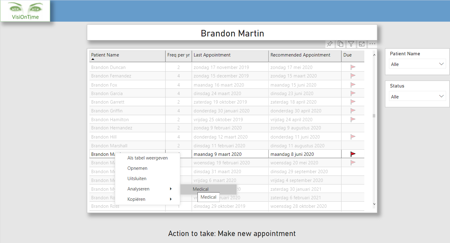
Planning
For this page I have started with grouping of the patient ages by using a supporting table. I have used the logic from the eDNA course Solving Analytical Scenarios w/Power BI & DAX. In the supporting table I have added a column with the recommended frequency of appointments per year. By combining that frequency and the last appointment of a patient I could create a measure to get the next recommended appointment etc.
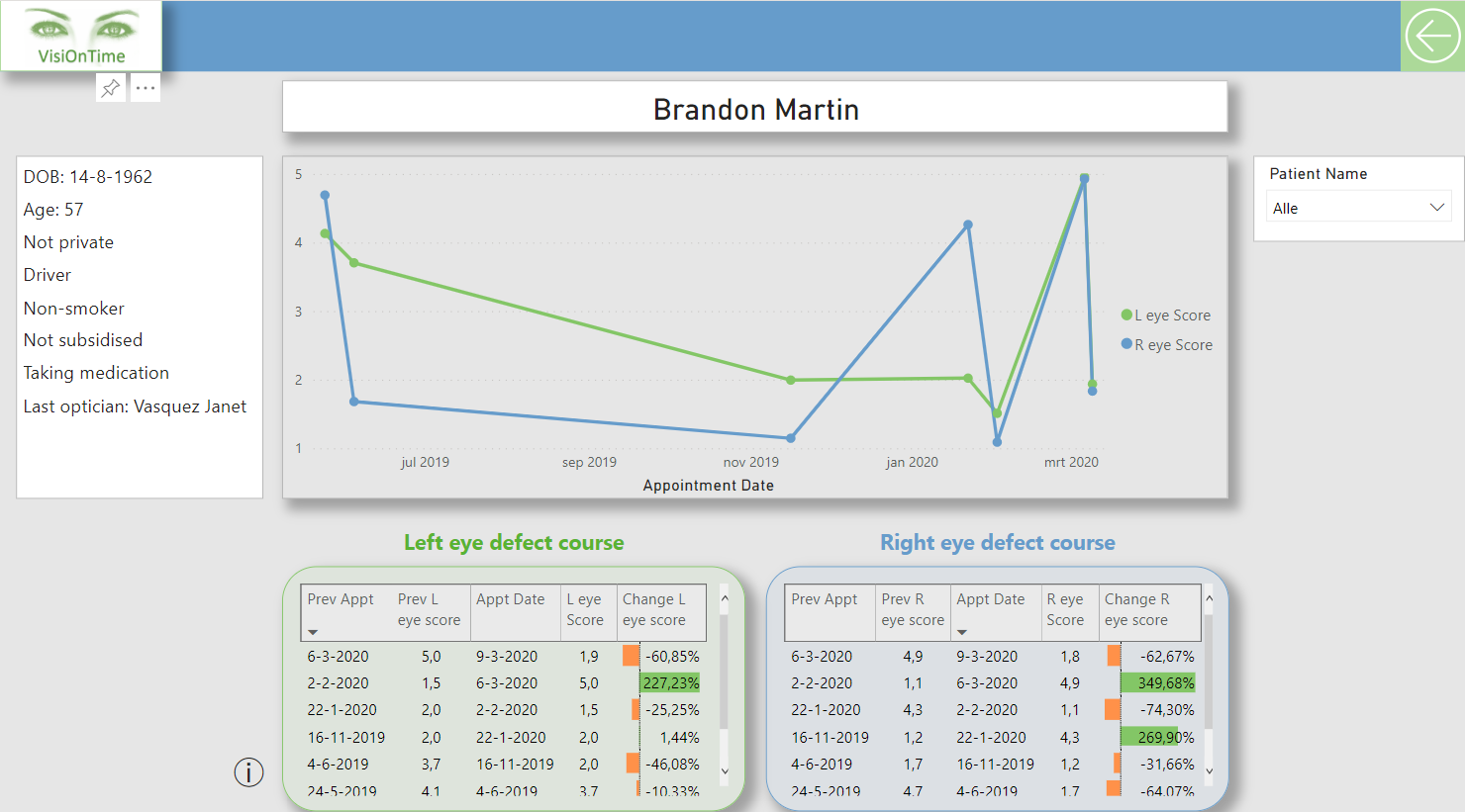
Medical
For the medical page I used a multi-row card to display the patients details. Further I have used some measures to calculate the eye defect course between every appointment and placed them in table visuals. In that tables I have used conditional formatting, but later on I realized I have used the color green with the positive figures. That could be confusing in this area because I have also used the color green for the left eye information.
Design
I have used a template from the Power BI Community called ‘Tiled Theme’ and used a few different colors. I have set up a drill trough from the Planning page to the Medical page.
1 Like
I love the way you’ve used the dynamic grouping technique in your report. This is a really powerful analytical technique that can bring insights to your data that ordinarily don’t exist in its rawest form. I think starting off at that point was a good idea because it can showcase new insights that the consumers maybe haven’t even thought of before.
I also really really like the simplicity of your report. I’m a big believer in not overburdening the consumer with charts and visualizations if the same insights can effectively be showing with a summarized and easy to consume verion.
I think you’ve also looked to be unique here and break things down with your planning, medical pages. Again is simple an effective.
And the colors work really well, also the fact you have broken out the left I and right I results with the change in score, which not many submissions actually had.
Overall this is actually a really compelling submission.
One really small thing maybe to have a look at is the difference in border shapes on the medical page. I would have just gone for all rectangle borders rather than mixing in curved rectangular borders around the left eye and right by data. With UI design you would rarely mix these two together I feel. This is just a small thing but just really one of the only small areas that I can see for improvement here because in reality this is a superb report which answers everything in the brief.
Nice work.
Sam
@sam.mckay,
Thank you very much for your feedback. It’s very encouraging. I really appreciate your time because I can imagine you have a busy schedule.
It’s a good lessen for me to not mix all rectangles and curved rectangles from a UI design perspective.
I can’t say often enough Enterprise DNA is the best out there. The way things are taught is fantastic and the community is loaded with very skilled people.
Daniel
3 Likes