Here’s Chad DesMarteau’s entry for Power BI Challenge 5. @ChadD, would you like to share how you built this dashboard and what your inspiration is in building it?
My inspiration is fun, learning, discovery, and collaboration.
Here, Penny does not know when patients or opticians have appointments or which patients are due or past due for appointments. One can speculate based on their aging patient population and days since last appointment, and in the era of COVID-19, she may not know if the patient is even still alive!
People move on and circumstances change for any number of reasons like moving, new eye care provider, and sadly even dying. She needs to be able to actively manage the patient records to know which are active patients and ensure proper care. She needs a report that lets her see patient detail and history as well as manage opticians’ schedules and staffing.
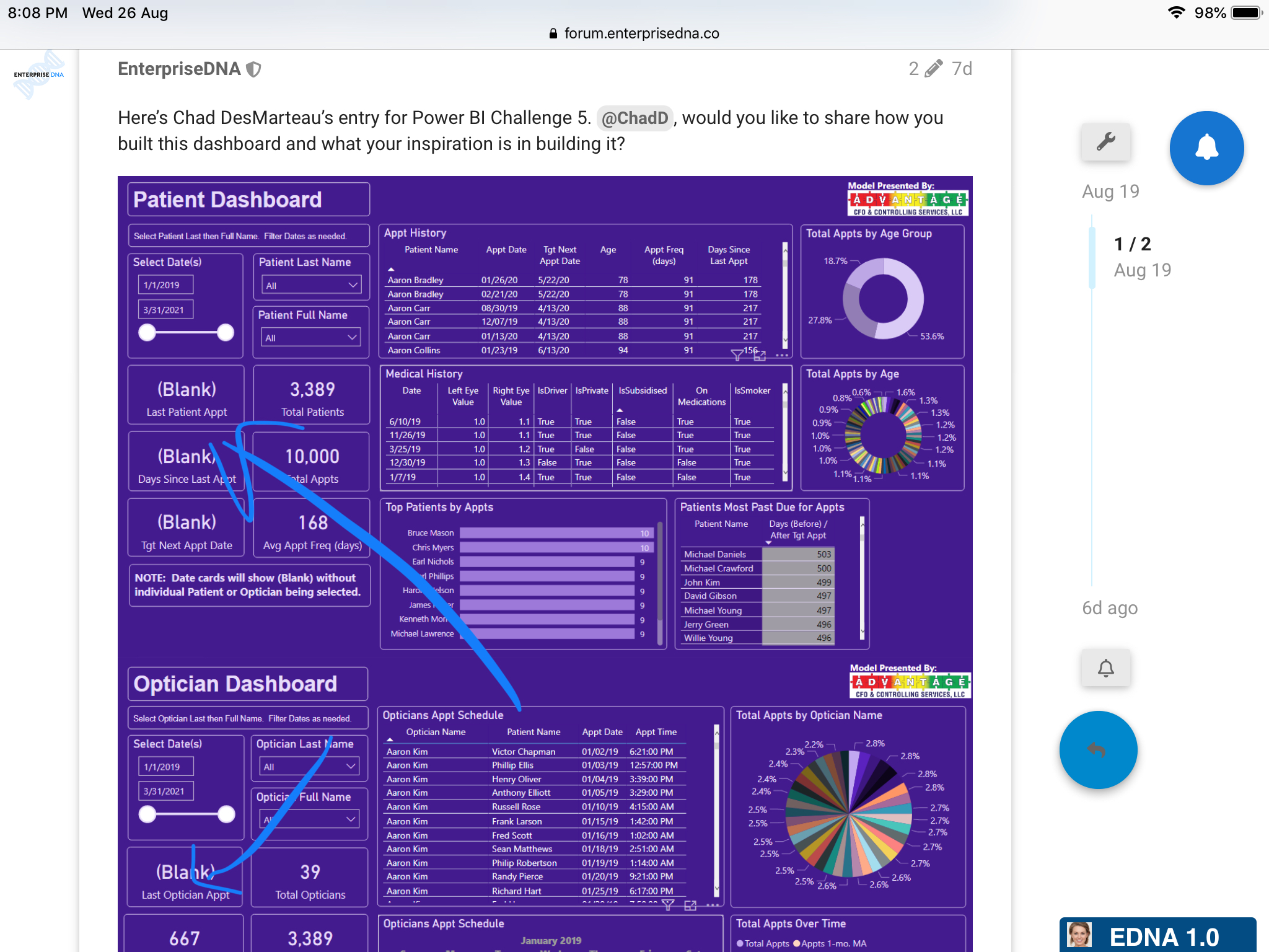
My report has two pages, one each focused on Patients and Opticians. These have the same look and feel on the filter options and allow detail at a practice level by selecting All and at a patient or optician level by selecting one. Penny can filter a Date and see all scheduled appointments on any given day.
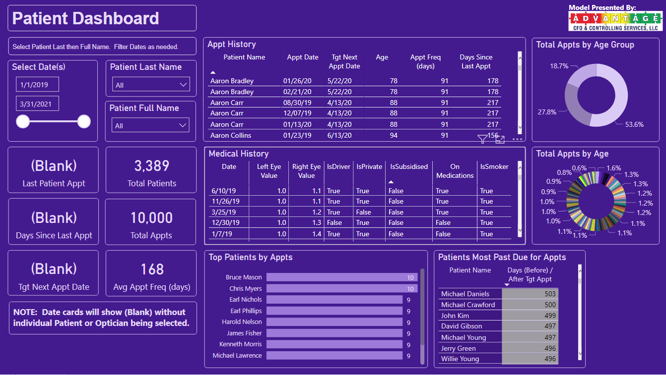
The Patient page provides Appointment and Medical history, info on most frequent patient visitors over time, Patients most past due for appointments, and the age demographics of the Patients.
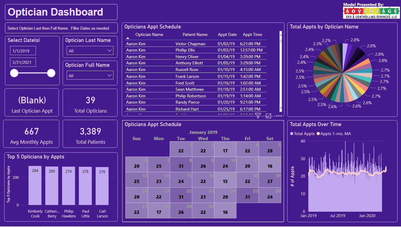
The Optician page shows scheduled appointments for each Optician with Date, Time, and Patient Name. It includes an interactive calendar that filters with Date and Optician to show a month-at-a-glance and the number of appointments on that day. In hindsight, including a hierarchical slicer including Month in addition to the Date would make the calendar easier to filter and use but it works. The other visuals highlight volume and workload, showing the busiest opticians, the volume of appointments over time, and the distribution of patient appointments across the staff. It looks to be pretty evenly distributed but there may be opportunities for workload balancing and adding new patients.
I like your submission, and I feel that it really covers a lot of the areas in the brief that were asked for. If a stakeholder asked about something in the data there’s a comprehensive amount of information for them to go and look at and filter down to if they need it.
I definitely feel there’s a couple of enhancements that could be made though. And none of them are really that difficult, just extensions of what you’ve already done.
One simple change I would suggest is maybe add some contrasting colours to the main colour that you’ve decided to use. These can be used to showcase different sections or grids in your report, or maybe break out the title and filtering sections etc.
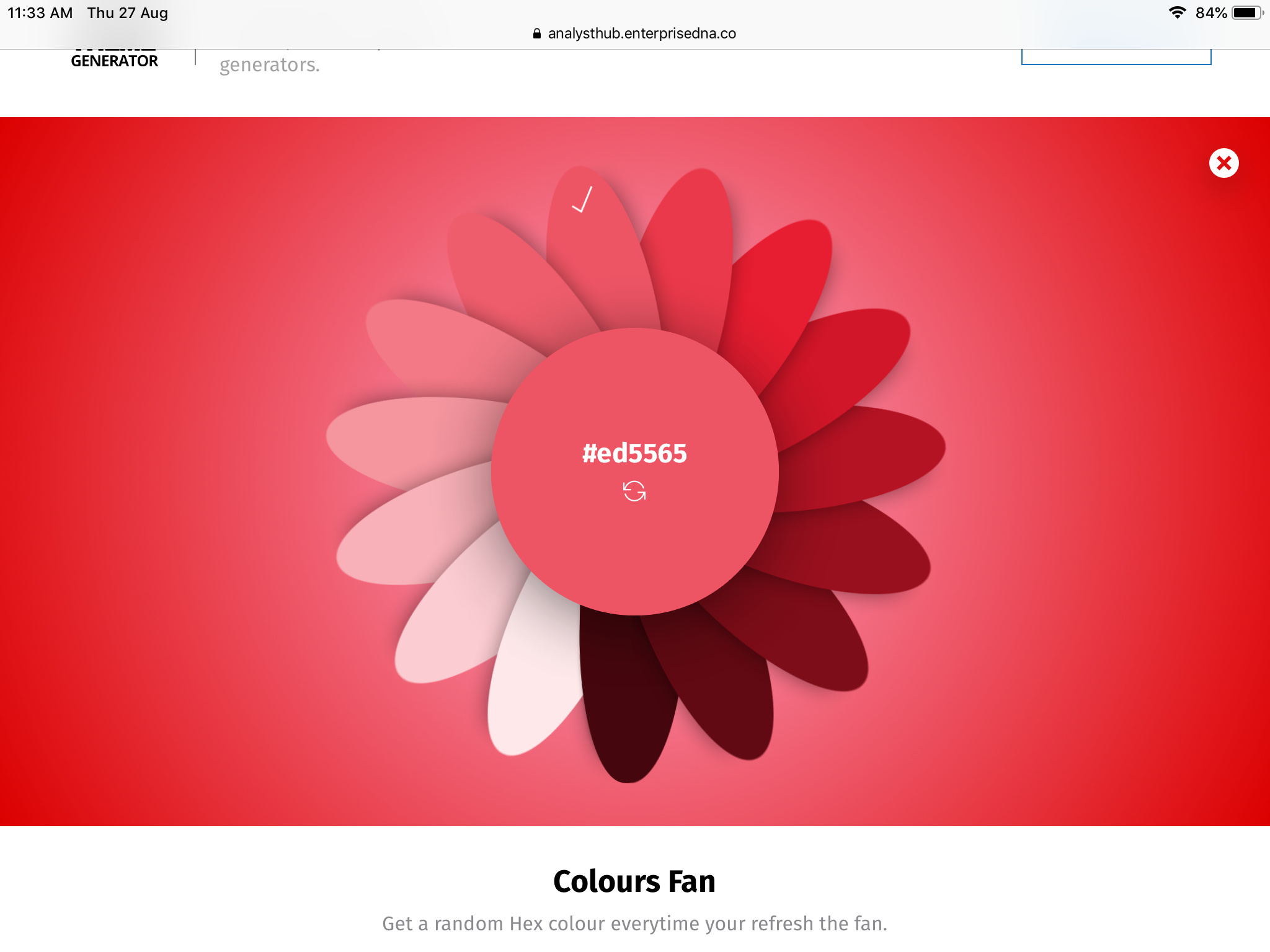
Definitely check out the colour theme generator for some easy to use pallets that have simple variations on a main colour.
Also one of the other visualisation I don’t love is the way that you’ve stacked a huge amount of information into some donut charts. To me this is just a little bit overbearing and I would try and stay away from visualisations like this. You’re better off using either a column or bar chart for visuals that need to represent lots of different results.
Also try to avoid situations where blanks appear in your reports as well. Consumers will think something is wrong as soon as they see this. There’s simple formula techniques you can use to change these to something else
I recommend having a good look through some of the other challenge submissions that cover a lot of my ideas that I’ve mentioned above. There is sometimes real beauty in simplicity. Have all of the extensive calculations and logic going on behind-the-scenes, and only represent to the consumer the most relevant information based on their requirements.
Nice work though, couple of tweaks and I think this would be really really compelling.