Here’s Amdi Silword’s entry for Power BI Challenge 5. @Amdi, would you like to share how you built this dashboard and what your inspiration is in building it?
Here is the link:
Power BI Challenge 5 - Optical Data.pbix (697.3 KB)
To learn about the real-life scenario presented for the challenge, be sure to click on the image below.

Thanks for the submission once again Amdi.
I can see things are improving at each iteration of the challenge.
To me this is simple and easy to navigate and certainly covers all parts of the brief.
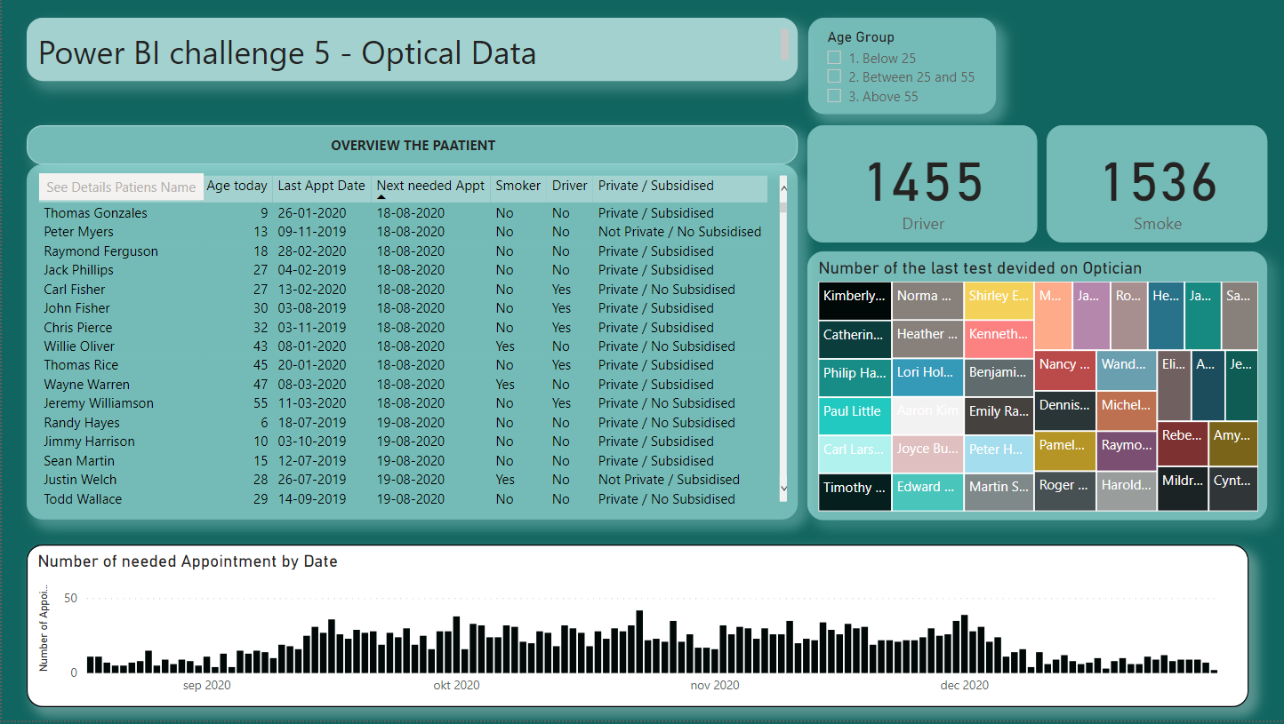
Personally I’m definitely not a fan of the multicoloured tree amp I think they’re called. I try to avoid visualisations where you have to use so many different colours to represent something. It’s just in my personal view so hard to comprehend anything when there’s that much information.
So maybe have a think about just keeping things simple where you can. Simple with the visualisation’s, simple with the colours, simple with the layout etc. Less is more I think in a lot of cases.
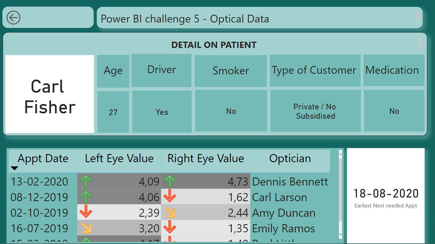
I like how you’ve used the arrows on the table on the second page. This is really effective at showcasing important insights easily within the report page. I like how you’ve obviously built some logic into the background that is feeding these icons.
Nice work
Sam