Hello all,
This week’s challenge was really great. Just by reading the requirements I knew it will not be easy. But that’s the beauty of the challenges. If you are too confortable, it’s not a challenge.And if it’s not a challenge, you are not willing to push yourself as much to test and learn.
Logo/Image/Colors
I started with an imagination exercise. I wanted to build a report with a good mix of visual appearence and analysis. Penny had to be convinced, so the report had to answer her needs first hand and being presented in a easy, comprehensible way.
My first idea was to look for a real existing company. I searched for a well established optician. I searched for information, looked for applications, searched for photos, tried to understand better the optician’s universe. I wanted to understand what Penny does not say, the extra detail that I could implement in the analysis that will totally convince her Power Bi is THE solution!
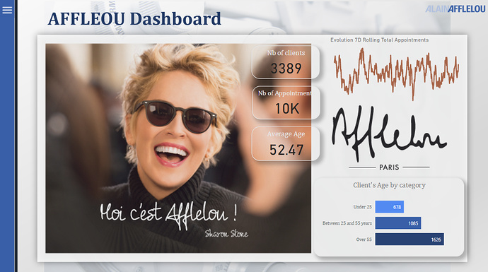
I searched also for images/logo/colors that puts the viewer in a good and relaxing mood. I searched for something modern, and with soft colors. I easily extracted afterwards the color palette from the logo and images.
The Menu
My second idea concerns the menu. I already built a menu in the past, but just for testing the fonctionality. I had the chance now to spend more time and this challenge gave me necessary motivation to really go and take care of the small details. I wanted a menu that takes into consideration all the errors a user might do. For example clicking around a button. If you do not set your menu correctly with the use of bookmarks and groups, the menu buttons will go under the menu shape which will ve very confusing for the end user. The second detail about the menu is how it closes. When surfing on a webpage and seeing a “burger menu”, I expect to close it either by clicking outside the menu or by clicking on the menu logo itself. So I wanted my menu to function this way.
Another aspect about this menu is the evolution aspect. I knew I will not build to many pages, but as a Power Bi designer I need to anticipate and adapt. I suppose that when Penny will see the report and what Power Bi can do, she will probably ask for more.
I could add a page with more Statistics, or analysis about the opticians etc without changing my design or overcrowding the existing pages.
Last aspect about the menu. The time I spend building this menu, I will gain when I will work on a future report in the professional world. Using a menu for buttons, or filters, or even KPI is very very oftenly used.
What days is TODAY?
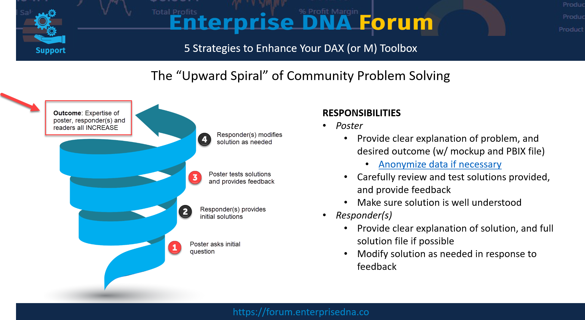
At this point, I had a logo, an image, the menu and 3 pages I wanted to develop in the following order: Overview, Appointments, Patients. I read again the assignment, the needs and all the questions/ answers on the forum. I always find extra information from the questions in the forum. Many users start the challenge from the first day and ask some very good questions.
This time I related to the question of @ChadD who asked about TODAY’s date. The answer was to asumme TODAY is the 17th of August 2020 (which is 1 day after the challenge is over).
So I started to use 17th of august as today but while advancing in the creation of my report I realized that there is an incoherence with the date. The last appointment that was realised was on the 31st of March 2020. All the appointments beyond these dates were future appointments. For me Today needed tp be 1st of April.
As I did not want to be the only fool considering today as Fools day,  I took the following decision: My TODAY will be dynamic. My decision was reinforced also from the following information: “IT have manged to take an extract of data from the appointment system for the proof of concept.”
I do not know at this stage how much time it will take to put the proof of concept into production and what is the bandwith of the IT teams to extract the data every day. Better safe than sorry, I considered that putting a dynamic TODAY’s date is a good idea.
Calculate the future Appointments
I think here was the main difficulty. How to calculate the future appointments? I decided that I do not want to calculate 1 future appointment, but appointments for the following 12 months. I decided to do that because I was not sure if based on the historic, opticians can handle such an important volume of appointments. The problem was the following: Every patient, based on their age are in a category. Based on the category you can calculate the frequency and based on the frequency, calculate the future dates. The problem are the patients that are changing the age category. I found 18 patients, that will have 55 years old in less than 6 months. That means that the future appointment in the following 12 months will look like this: 1 future appointment in 6 months, 2 other appointments afterwards every 3 months.
And I wanted to do this in Power Query… Which is probably my weakest point in Power Bi… I had to abandon the idea of doing this in Power Query (I was pretty sure it can’t be done,…until Melissa came and proved me wrong )
I did not stop here. Maybe Power Query is my weakest point, but I crunch data all day with other ETL I did my work outside Power Bi and integrated it in the data source.
I had to do 5 versions of my report though, because I was not sure on the data model I wanted to use. Finally I found what I consider the most adaptable data model for what I wanted to build. I added my date table, calculated the age, the age category, replaced medication with 0/1, added a column with the full opticians name, created a client’s table.
Design
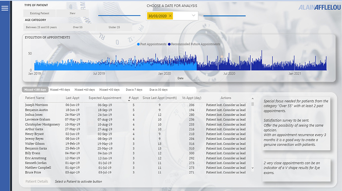
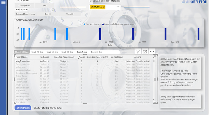
The most important page of the report is the appointment page. I chose to simplify it as much as possible. Some filters, my Dynamic Today in the middle, buttons to switch the view and the actions to be taken.
Simple design is always difficult. Because you need to concentrate on what is essential.
I have basically only one chart and 1 table on the page.
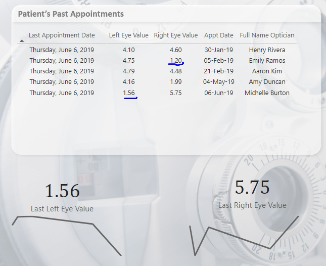
I concentrated on the details. When the end user clicks on one name, he/she will activate the chart above and will easily follow the behavior of the end user in terms of past appointments and the calculated future appointments. The end user will easily see that many users that I consider lost (Overdue +180 days) have something in common. Close appointments in the past. You can use a drillthrough button to go to patients page. And you can often see the “Result Shock effect”, the V shape of the results that pushes probably the client to churn.
Another information I thought is important is the number of past appointments for the clients. It is very important if you want to understand the behavior. I suppose the stategy is to focus on patients over 55y old as they are expected to come very often. So a new patient Over 55 is very important. I proposed some solutions to focus on the fidelisation part.
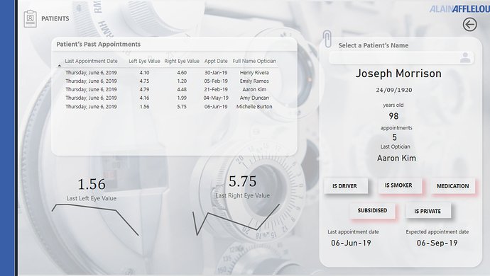
Last but not least, on the patient’s page, I used the shadows to highlight if a user takes medication ,is smoker etc. I spent literally less than 1 minute to build this. It was a happy accident to discover it.
That is all, I hope I was not too long…
Best regards,
Alex
P.S. If you want to dig further into the details of any of this, here’s a link to my PBIX file (too big to post directly):
https://drive.google.com/file/d/1Rrpuj5vGW0tTicflhbZKnukI7Tq6xLKZ/view?usp=sharing