@BrianJ, thank you! I saw that blue Jupiter photo from the Juno spacecraft and decided I absolutely had to use it on a report. And it was much nicer than the last report background I made myself. I also used the color theme generator to get some colors off the image, then to get more colors I used coolers.co to get more colors and hues. I also used paint to lift the yellow color.
Ah do you mean , the “Region only”, “Region & Title”, and “Title only” buttons? That is my super secret lazy technique of choice at the moment. (I used it on mass in the complaints challenge too). It’s a bookmark that only affects that chart, which has both region and title.
- The top level is region, which I bookmarked and limited the bookmark to only affect that chart, as region only.
- I then drill down “Go down one level in the hierarchy”, or the parallel two arrows, which I bookmarked the same and named “title only”.
- Then the last one I got back up again, and “Expand all down on level in the hierarchy”, or the forked down arrow, which I bookmarked and named “region and title”.
- Then I create the buttons, and assign each the respective bookmarks.
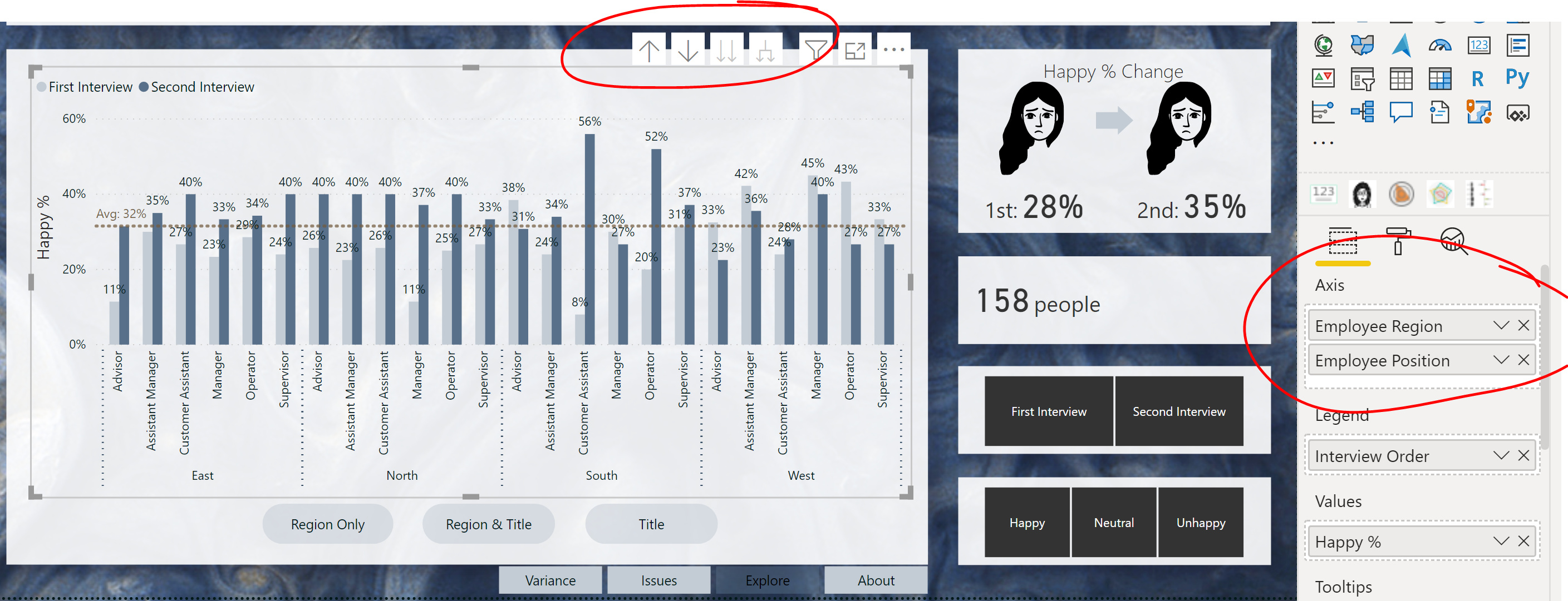
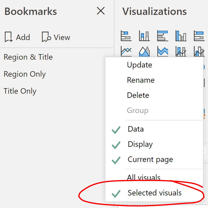
So, you can do it without the bookmarks or buttons, but it’s a little too hidden for most users.
Anyway, at this point I know how to switch out measures and I know how to switch out axis – so maybe I’ll try a challenge with only ONE chart!