Here’s Tim’s entry for Power BI Challenge 19. @tweinzapfel, feel free to add other details of your work.
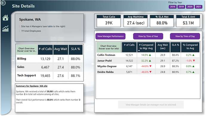
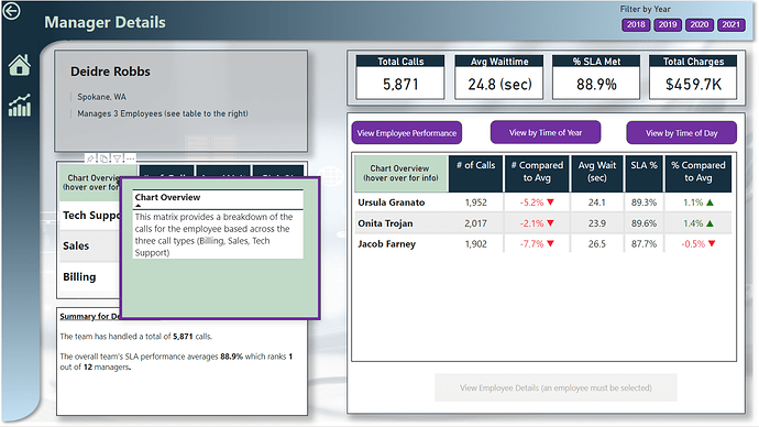
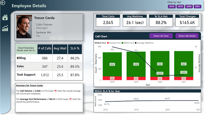
Here’s how Tim described it:
Everyone,
Attached is my submission for the challenge. Some key notes on this:
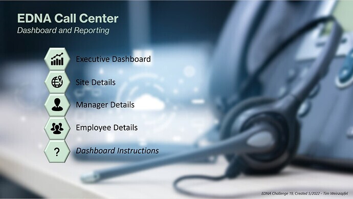
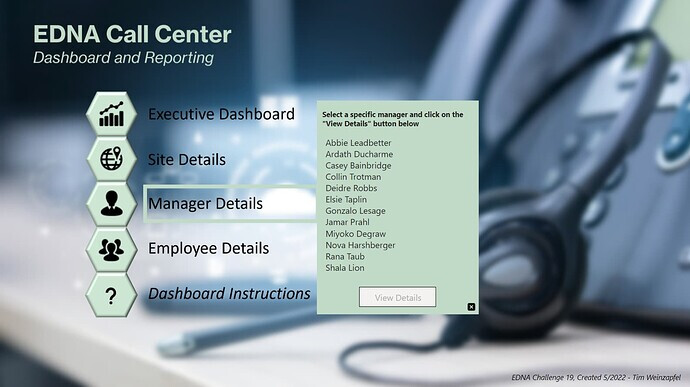
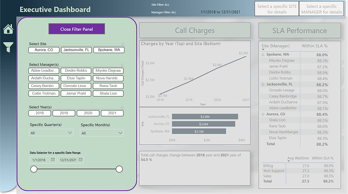
- For purposes of this challenge, I focused more on user experience (navigation, providing information, etc.) versus a lot of custom visuals. This was done by having an overall switchboard page and then buttons to go to specific areas. I’ve also included brief instructions as well.
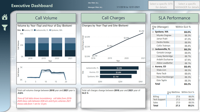
- Several of the pages have drill-through buttons enabled to take the user to a difference section. For example – on the executive dashboard, by selecting either a specific site or a manager – buttons are enabled that take the user to the Site specific or Manager specific page
- A new technique that I used to provide a user with information on a visual was providing instructions by hovering over a section of each matrix visual. For example – the Site, Manager, and Employee Detail pages all have two matrices providing a breakdown of calls. Each matrix has a section in the top left where a user can hover over to get information about the table. The information shown is dynamic to each visual. I’ll be showcasing this technique in the upcoming Virtual Summit as it was an way to provide information across many visuals without having to create multiple bookmarks. (This is shown in the 6th picture)
- For consistency, you will notice that the format when looking at the Site, Manager, or Employee pages will all be very similar. However, some minor differences in visuals provided (for example - getting a specific list of all the calls when looking at an employee.
- Lastly, the use of smart narratives throughout to provide a few key callouts.
As a side note, I was able to hack into the employee directory to provide pictures of each employee. Hopefully @FPastor won’t get upset with me.
Here’s the link to the report:
To learn about the real-life scenario presented for the challenge, be sure to click on the image below.
