Here’s Jose’s entry for Power BI Challenge 19. @jafernandezpuga, feel free to add other details of your work.
Here’s how Jose described it:
Hello everyone,
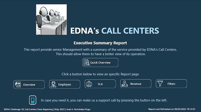
This is the report development process for EDNA Call Center analysis.
During the process of developing this report, I have attempted to apply the knowledge learned in the Report Development Best Practices course taught by @Greg.
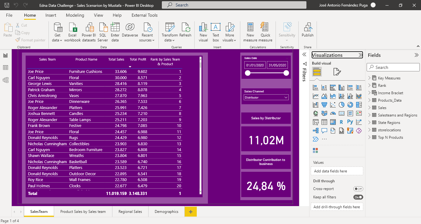
First of all, I have created two pbix files:
- DS_CallCenterDataReporting_JAFP.pbix: File that only contains the Report Dataset, that is, the data and the data model.
It is created from a pbit template file containing the settings suggested by @BrianJ in the video (70) The Four Horsemen of the Power BI Apocalypse - YouTube along with the date table created by @Melissa for EDNA.- DB_CallCenterDataReporting_JAFP.pbix: File that connects to the previous Power BI Dataset and contains only the Graphical Interface.
It has been created from the same previous pbit file, eliminating the date table.The development process consists of the following steps:
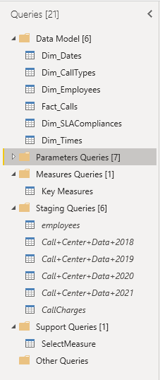
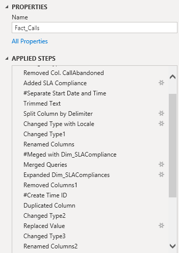
- Loading and cleaning the data from Power Query.
• Organization of consultations in groups
• Rename the steps followed in the transformation process of each query.
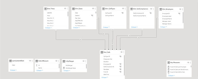
- Data Modeling
• I have followed the Star Scheme to model the data.
• For its graphical representation I have used the cascade design.
• The modification of the metadata of the columns of the queries, I have done with the external tool Metadata Mechanic Pro belonging to the set of external tools that Greg Deckler has developed for EDNA.
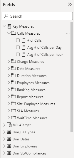
- Creating DAX Measures
• All measures have been organized in folders within the Key Measures table.• The Dax code of all the measurements I have formatted using EDNA’s DAX Clean Up.
• To display Duration and Wait Time in hh:mm:ss, I used Chelsie Eiden’s Duration measure developed by Greg Deckler in the external tool Quick Measures Pro.
- UI design.
For the design of the report I have used the flaticon iconography and the theme has been generated with the EDNA ColourTheme Generator tool.The report consists of the following pages:
• Home
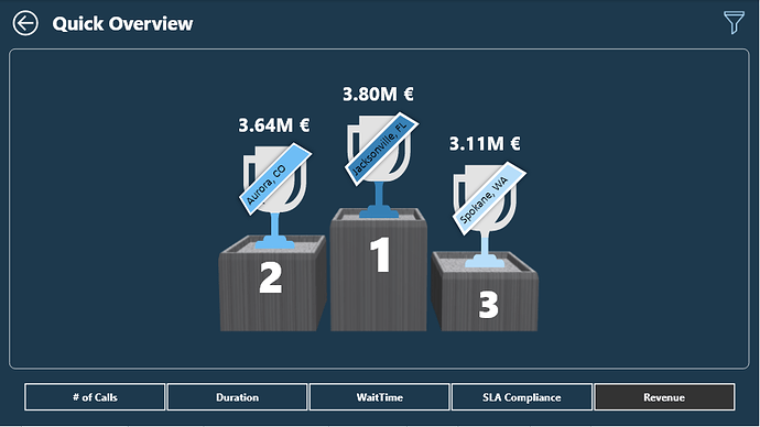
• Quick Overview
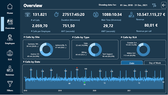
• Overview
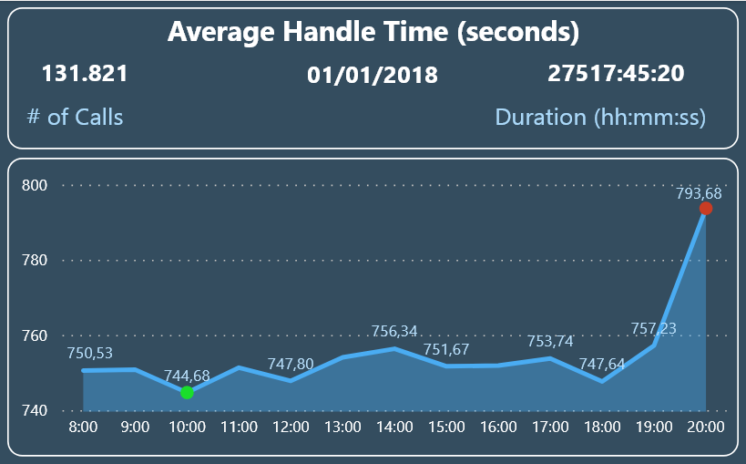
• Tooltip Calls by Date
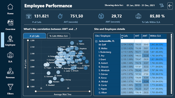
• Employee
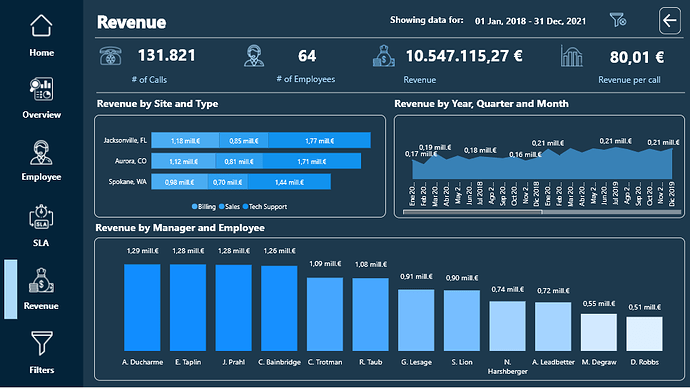
• Revenue
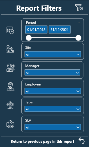
Filters
I have used Bookmarks to switch tabs within the Overview and Employee pages. Initially I used a Bookmark Navigator but when calling the Bookmark to clear the filters, the Bookmark Navigator did not return to its initial state. @Harsh confirmed it for me on the forum and told me how to do it with individual buttons.
Each of the report pages has a button to clear the filters and another button to the right of it to display highlighted information using the Smart Narrative visual.The custom visual objects that I have used have been:
- HTML Css Viewer from K Team Solutions, with the free 1-month license. With the help of the video (70) How To Ace Your Power BI Challenge 19 - YouTube by Pascal Kiefer, I have added a button on the Hpme page that allows the user of the report to make a phone call to the support center in case need.
- PureViz Infographics and the free license that allows the animation of infographic elements only in design mode.
I have created a video so you can see the animation:
- Sparkline by OKViz to see the monthly evolution of the SLA by Type of Call.
Here’s the link to the report:
To learn about the real-life scenario presented for the challenge, be sure to click on the image below.