Here’s Bernat’s entry for Power BI Challenge 19. @BernatDuran, feel free to add other details of your work.
Here’s how Bernat described it:
I’m excited to deliver my submission to the EnterpriseDNA Challenge19 Call Centres Data Reporting.
My aim has always been to accomplish the main request: “ to prepare a report that summarise, the overall service provided by EDNA’s Call Centres and enabling its senior Management to have a better view of its operations.”
I’d like to explain in a detailed way how I built the report, so there are some features that can be unnoticed at first sight.
I hope you will find this information useful (not just long!) and of course, I hope you will like the report, a lot of effort has been put into it!
Visualization level
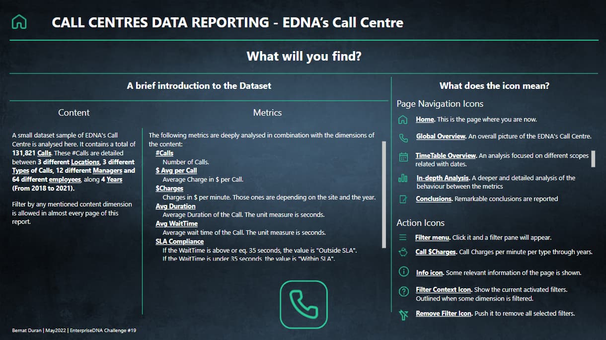
Home Page
The aim of this page is to give to the user some information about the Dataset and a legend about every navigation and action element used in the report.
The big “Call” icon, leads the user to the Global Overview page, the first of the four pages dedicated to the analysis.
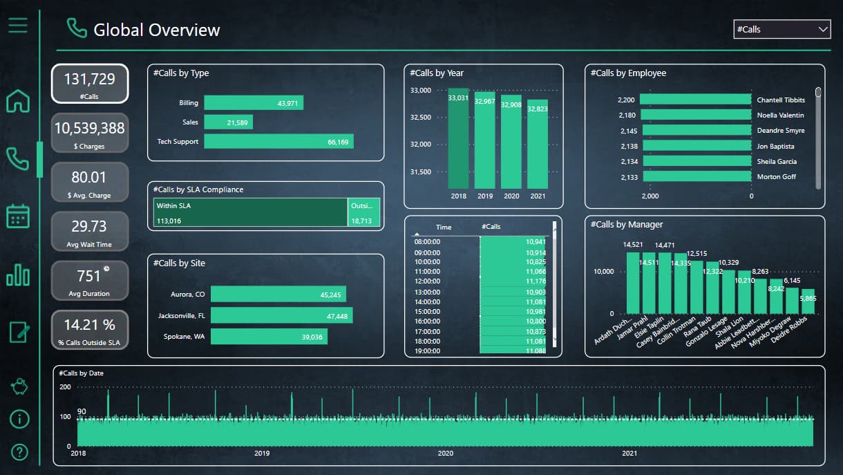
Global Overview
This page shows a big picture analysis of the dataset. Every existing dimension of the dataset is shown here and can be analysed easily. It’s important to change the main metric on top right of the report in order to analyse the data from a different perspective.
Slightly hidden features
Once the main metric is selected, the appropriate card will be outlined.If there is some filter in any dimension, the most left bottom icon will be also outlined. It can be useful because that’s a quick way to know if something is filtered without having to check every possible filter.The Y Axis of the Year visual object is changing dynamically in order to make the changes about the data more noticeable between years.(The following picture is filtered by “Billing” Type, in order to show the outlined in the filter icon)
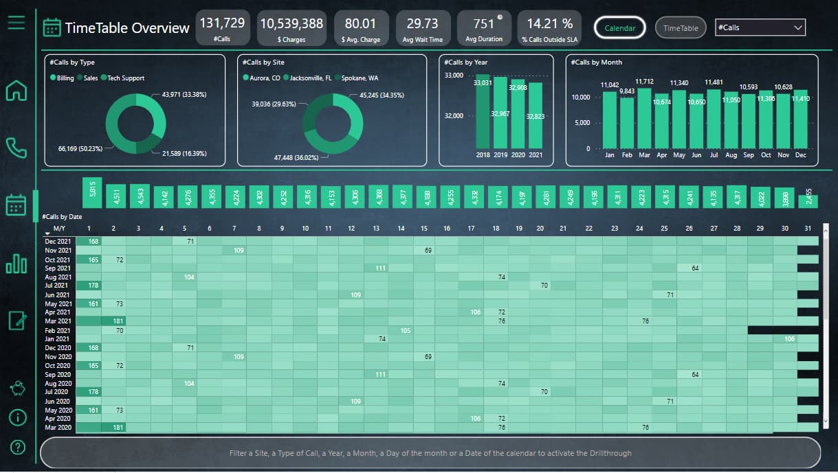
TimeTable Overview
The aim of this page is to show a Calendar and TimeTable centered analysis, as detailed as possible from time and dates perspective.
That’s why we can thresh the information from almost every possible useful way related with time and dates (from my point of view, of course):
YearMonthDay of the month (from 1 to 31)Day of the weekDateMonth of the yearHourMoreover, to allow the user the ability to check quickly further information, a tooltip from every dimension shown in the page is enabled just hovering the mouse on the data.
In addition, if the user needs to analyse the data shown in the tooltip in a deepest way, drill through button on the bottom of the page can be used.
Slightly hidden features
In the Calendar grid, there are shown just 2 numbers per row: the maximum and the minimum per Month-Year. That’s because if all the data was shown, that could be overwhelming for the user. On the other hand, showing no data was not a good decision because in that case the user would not have any kind of reference but the intensity of the color.In the TimeTable grid, there are shown just 2 numbers: the maximum and the minimum per WeekDay-Hour. As the grid is smaller than Calendar once, it is enough to have a good referenceDynamic titles on every kind of tooltip analysis.Dynamic titles on drill through button when some dimension is filtered.In-depth Analysis
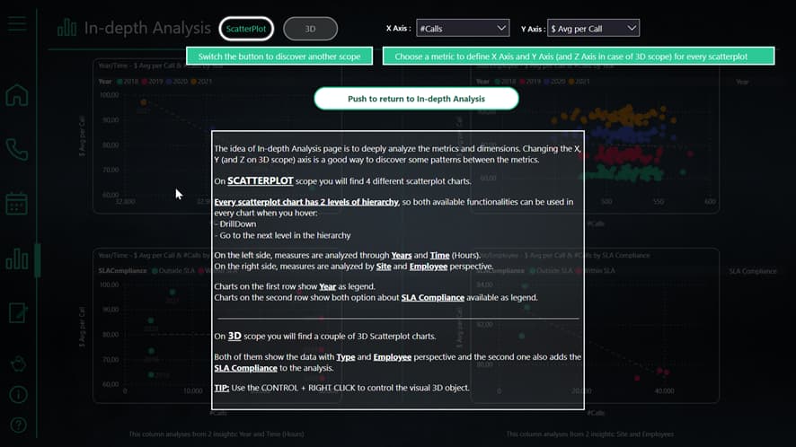
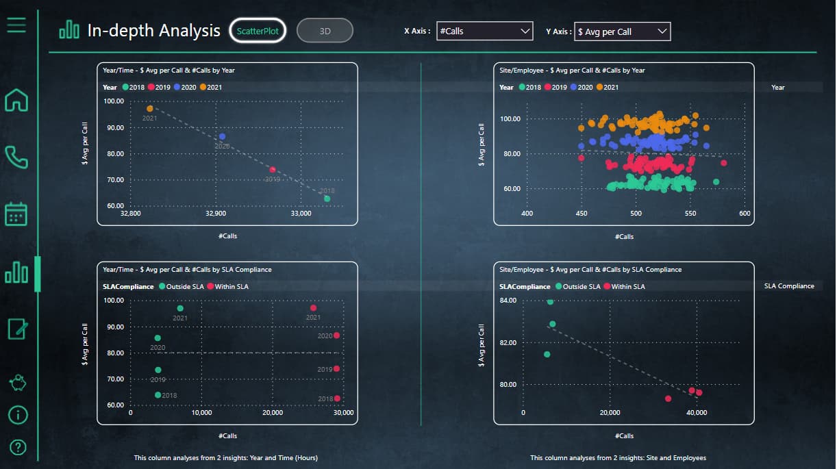
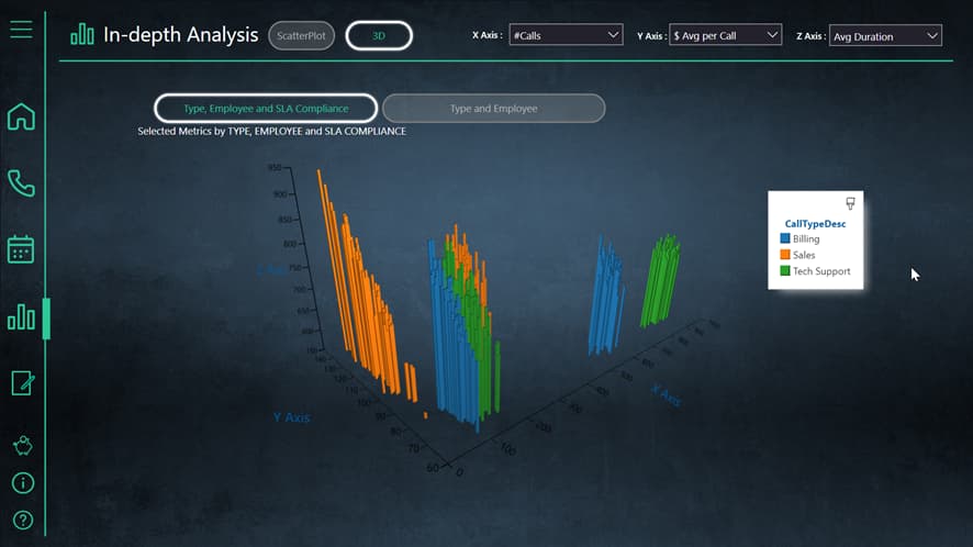
The idea of this page is to offer to the user the capability to deeply analyse the data and discover any pattern between the metrics, that’s why the X and Y Axis of the scatterplots are dynamic and for the same reason I decided to use an Scatterplot3D visual.
Although the info pane is useful on every page, in this page is really recommended to open it and read it up.
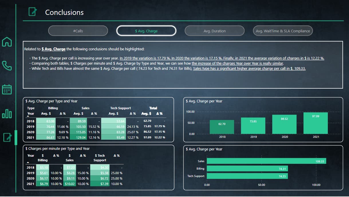
Conclusions
Some non-obvious conclusions are shown in this page
Here’s the link to the report:
To learn about the real-life scenario presented for the challenge, be sure to click on the image below.
