Here’s Alvi’s entry for Power BI Challenge 19. @Alvi, feel free to add other details of your work.
Here’s the link to the report:
To learn about the real-life scenario presented for the challenge, be sure to click on the image below.

Here’s Alvi’s entry for Power BI Challenge 19. @Alvi, feel free to add other details of your work.
Here’s the link to the report:
To learn about the real-life scenario presented for the challenge, be sure to click on the image below.
Hi everyone
I last participated in Challenge 15 (Formula 1) so it was a gap of 3 challenges since I last participated. Major reason for skipping the previous ones was time management at my end. This challenge was interesting as it gave more time than the previous ones so time management was less of an issue and I started early as well 
The core areas of my submission are around the 4 pillars of PBI Report development. One thing on which I spent more time for this submission was the story telling part. I had been reading material on data story telling for some time and the story telling course by @alexbadiu came at just the right time as well. I think it helped me to develop a consistent story for all my report pages and I was more focused in showing the results.
Data Story telling
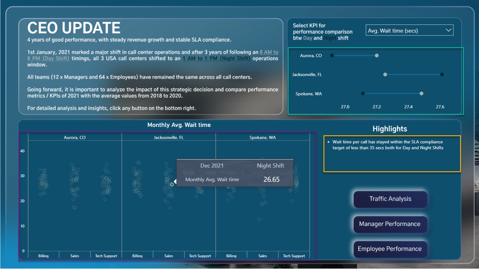
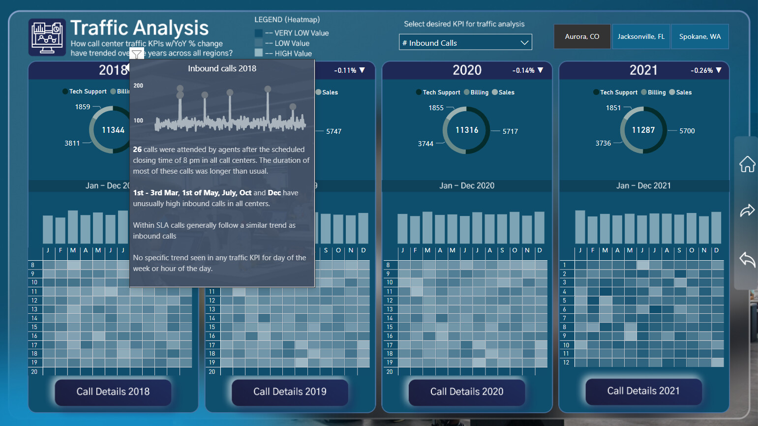
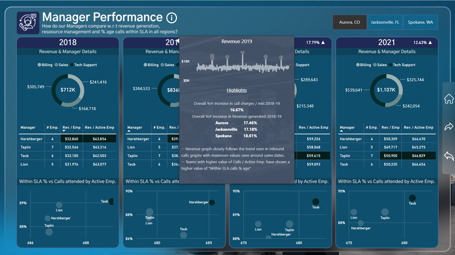
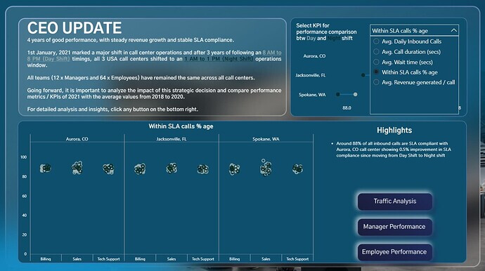
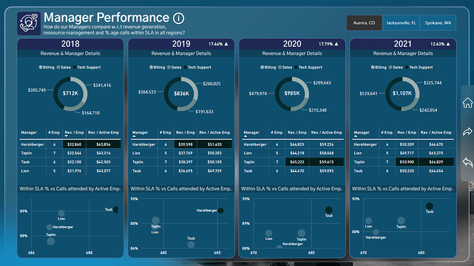
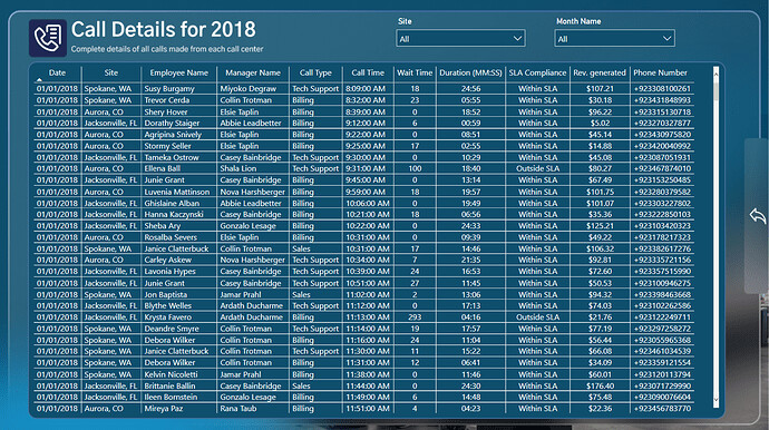
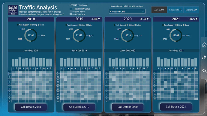
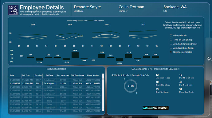
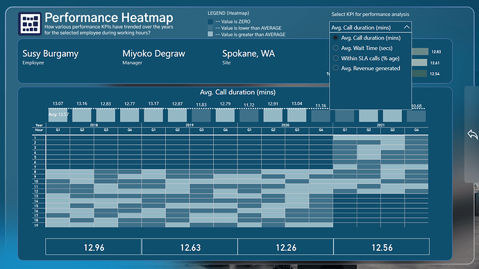
The story that I tried to develop from the data was the fact that all call centers switched from a 8 AM to 8 PM working time (Day Shift) in 2018 to 2020 to a 1 AM to 1 PM working time (Night Shift) in 2021. I tried to build my analysis on this story and selected metrics and KPIs to showcase a comparison between these time periods and how center traffic, center Managers and Employees performed around this theme. The first page titled “CEO Update” highlights this aspect and KPIs like Inbound calls, SLA compliance, Call duration, Wait duration, Revenue generation are used to showcase this comparison in a dot plot and a scatter plot. Rest of the pages are just a deep dive into traffic patterns, manager and employee performance with the yearly comparison becoming more detailed.
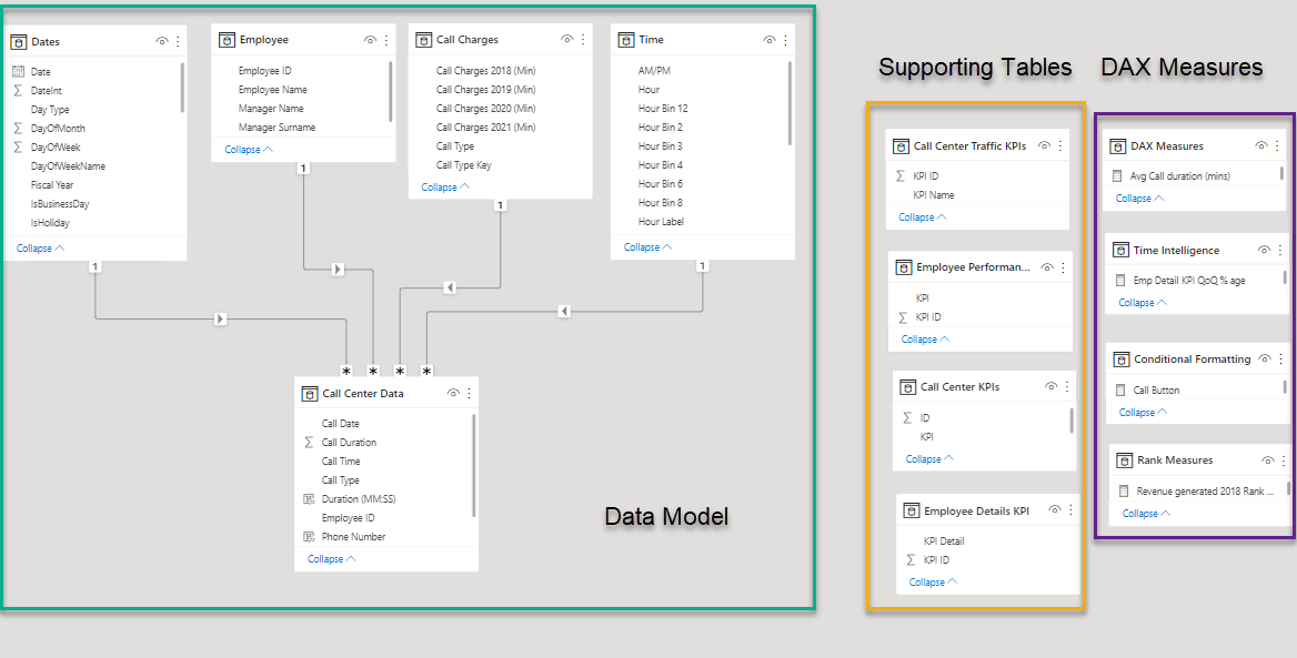
Data Modeling
The data modeling part was straightforward and I used supporting tables for KPI selection of each report page slicer along with tables to organize my DAX measures
DAX Measures
The report had plenty of DAX measures developed for calculating KPIs as well as conditional formatting for some of the visuals. Some of the KPIs that were developed are
Inbound calls (Total and Avg)
SLA compliance %age
Wait duration (Total and Avg)
Call duration (Total and Avg)
Revenue generated (Total and Avg)
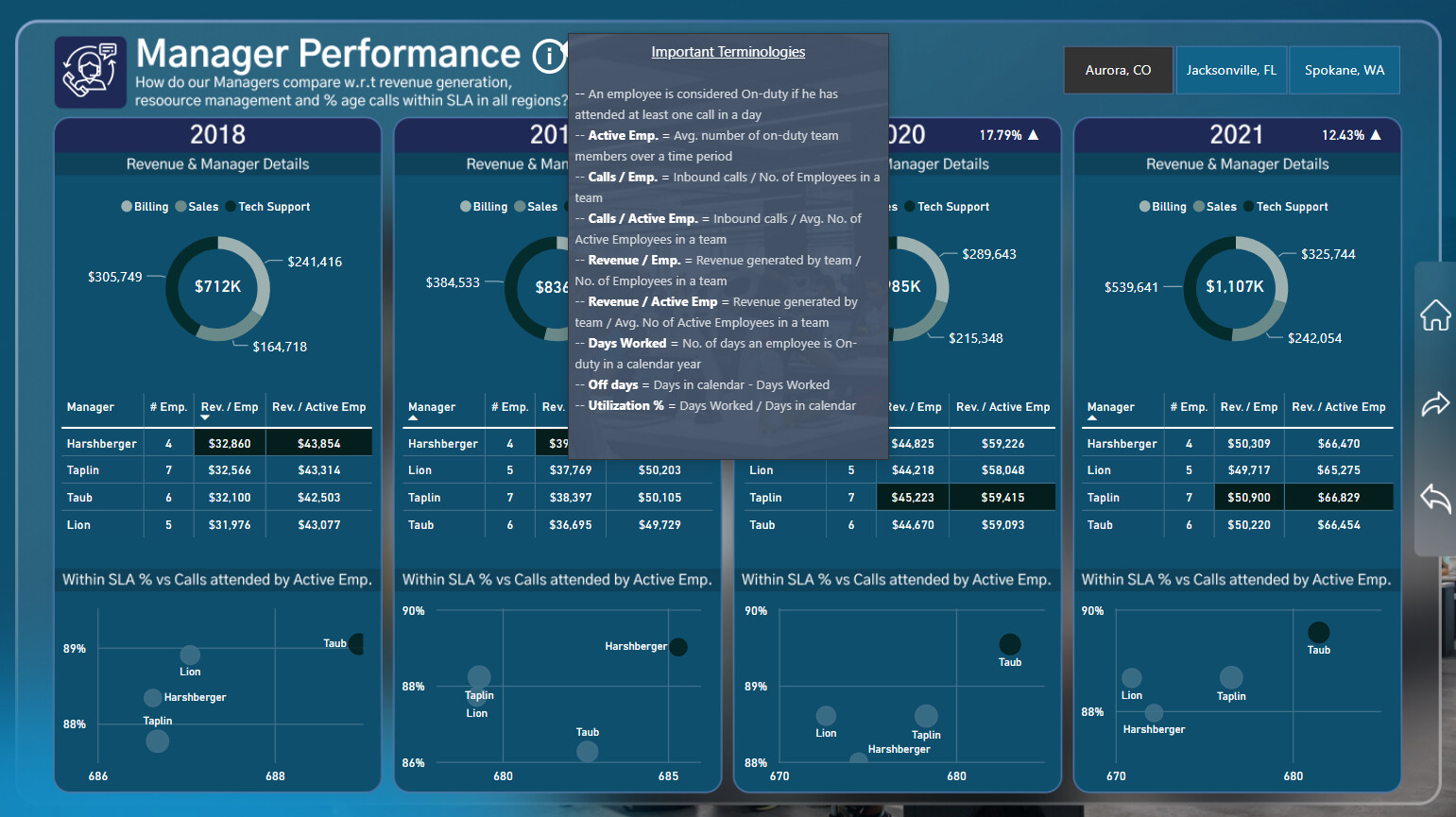
Some of the measures which I tried to compute based on my own understanding of data but not very clear from data dictionary were around the employee status. Some of these measures are
– On-duty Emp. : An employee is considered On-duty if he has attended at least one call in a day
– Active Emp. = Avg. number of on-duty team members over a time period
– Calls / Emp. = Inbound calls / No. of Employees in a team
– Calls / Active Emp. = Inbound calls / Avg. No. of Active Employees in a team
– Revenue / Emp. = Revenue generated by team / No. of Employees in a team
– Revenue / Active Emp = Revenue generated by team / Avg. No of Active Employees in a team
– Days Worked = No. of days an employee is On-duty in a calendar year
– Off days = Days in calendar - Days Worked
– Utilization % = Days Worked / Days in calendar
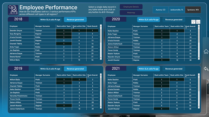
Report pages on Manager and Employee Performance use most of these measures to mainly compare the performance of Managers over these different metrics.
Report Design and Visualization
This was the first time I used Figma to design the background for my report pages. The glass morphism effect seen on some of the pages was easier to handle and manage in Figma and allowed me to learn a new tool in the process.
One of the requirements in the challenge was to use custom visuals in addition to the native visuals. I used 3 custom visuals in the report and all 3 can be seen in action on the CEO update page. The inspiration comes from the Jira Report of @MudassirAli for 2 of these, Dot plot by MAQ software (highlighted in purple) and Deneb visual (highlighted in green) to show the comparison between average KPIs of Day and Night shift. The 3rd visual is the HTML / CSS viewer (highlighted in orange) from K-Team to display the selected text. I will spend more time on learning HTML / CSS (purchased the license) and exploring Deneb in future.
Another inspiration in the report is on the use of tooltips from one of the reports from @sam.mckay and Time Utilization submission of @BrianJ . The tooltips do not filter a visual but highlight the text area on the report. I have used it on 2 pages to showcase some of the highlights for each year.
Last bit on the visualization part is the use of drill-through functionality on two of the report pages related to employee performance. The report user can select any Employee and drill into various performance KPIs. The other bit is from the video posted by @PascalKiefer on including the functionality of making a phone call. I have used the HTML and CSS viewer visual for the same from the sample sheet posted on their website. I will explore this visual in detail surely.
Overall, I have tried to stay consistent in my design and focused more on the story telling part. Also got the opportunity to learn and play around with some new features and visuals, which I will definitely explore in detail soon. I loved working on the challenge as it was after a gap of few months. So, I am happy to be back on the forum and will try to remain a regular in future challenges as well.
Please give your feedback and suggestions and best of luck to all participants!!
Regards
Abu Bakar Alvi
Hi @Alvi
It looks like the “Calling Now” button that you have created with the HTML & CSS Viewer doesn’t work, right?
Please post the DAX you have used for the button so I can help you solve this issue.
There is no call functionality implemented behind the call button as the PC I was using was not mine due to travel and it did not have any utility which could be used for the call function. My goal was just to showcase the drill-through function using HTML / CSS Viewer. Apologies if it did not meet the end goal.
EDNA Challenge 19 - Abu Bakar Nisar Alvi updated.pbix (24.5 MB)
Here is the final PBIX file for my submission.
Regards
Thank you for your entry to the Enterprise DNA Challenge @Alvi and being the overall winner of challenge 19!
All entries can now be accessed inside the Enterprise DNA On-Demand Platform
Power BI Challenge 19 - Call Center Data Reporting | Enterprise DNA
See you on the next challenge!!
Hi Alvi,
Great presentation!.. I have a similar task but totally new to call center data, much less how to model the data in a database before using for reports. Is it possible to pick your brain on how to do so?!.thanks
Hi
Thanks for the comments! @sauer.cara
Please let me know how I can help you further on this.
Regards
Alvi
Thanks Alvi for responding!.. Is there anyway to contact outside of this forum to share data?
It’s awesome to see you diving into Challenge 19 after a little break. Time management can be a real challenge, but it sounds like you’ve got a good grip on it this time.
Your approach to storytelling is spot on! Having a consistent narrative throughout your report makes it more engaging and informative.
By the way, I stumbled upon some cool info about cloud call centers at this link https://www.mightycall.com/cloud-call-center/. It’s not a sales pitch but more like a helpful resource that might add some value to your data reporting journey.