Here’s Tim’s entry for Power BI Challenge 17. @tweinzapfel, feel free to add other details of your work.
Here’s how Tim described it:
Some Key Report Features:
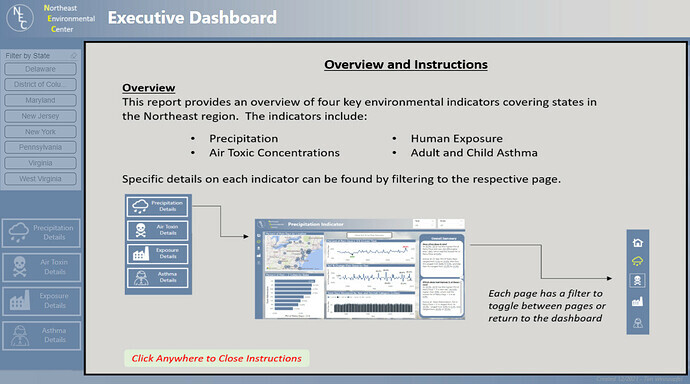
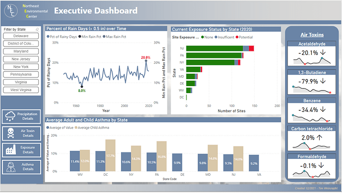
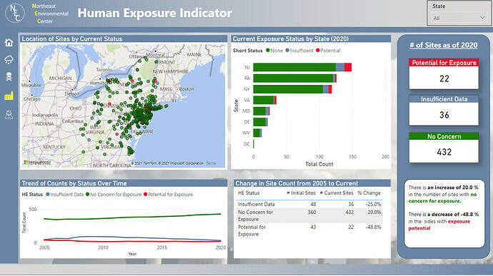
- Even though each indicator is separate and not related to each other, the overall summary page can be filtered to specific states which then filter through all indicators on this page.
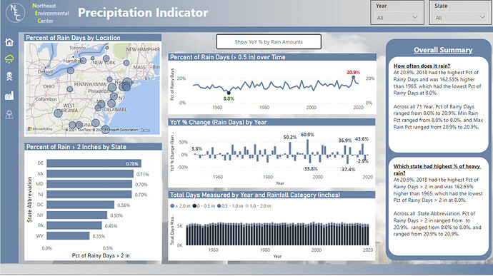
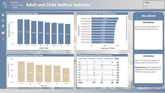
- Most pages include smart narratives to provide some key callouts to various topcs
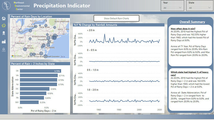
- For the Precipitation analysis, there is a button to toggle between various rainfall trend charts. This was done to provide additional information without forcing the user to go to separate pages. Another key point here is that my analysis looks mostly at the percentage of rainy days versus the actual count. Because the data did not track rain amounts with a consistent number of days per year, I felt that this was a better comparison.
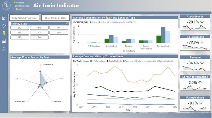
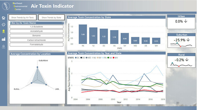
- For the Air Toxins analysis, I wanted to provide the user with the ability to toggle between looking at the data from a State perspective (which would look at trends for all toxins in the respective states) or from a Toxin perspective (which would look at trends across the various states). Buttons were added which would toggle the visuals between these two comparison approaches.
Lastly – some special credits for resources used in the development:
- Icons used through were obtained from https://www.iconsdb.com/white-icons/
- Idea for the cards used in the Air Toxics section was taken from Havens Consulting (https://www.havensconsulting.net/) using both a standard Card visual along with the custom visual Sparkline by OKViz
- Radar Chart used on Air Toxics page done through the custom visual Radar Chart 2.0.2
To learn about the real-life scenario presented for the challenge, be sure to click on the image below.
