Here’s Sebastian’s entry for Power BI Challenge 17. @Slipper, feel free to add other details of your work.
Here’s how Sebastian described it:
Hi together,
Here’s my entry to the challenge, it’s my first time participating so don’t be too harsh
Colour theme:
I had the idea for the theme before I read about the requirement for the colourblind friendliness,
I checked and got a supposely suitable colour theme which I used for the visualisation,
while maintaining my initial idea in the background theme & navigation.Approach:
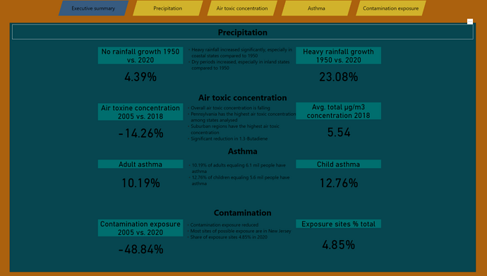
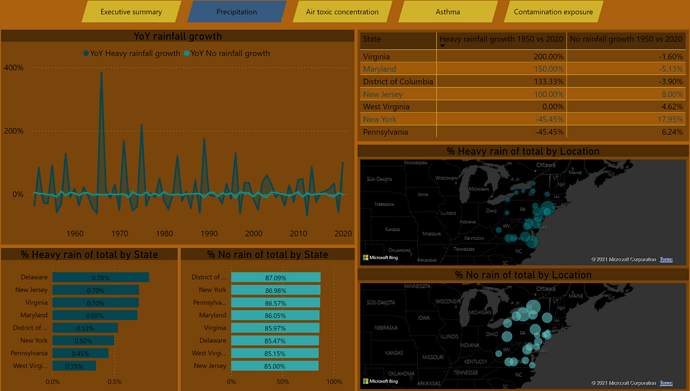
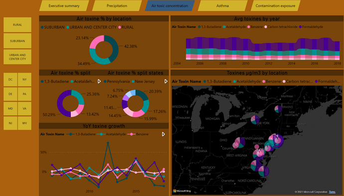
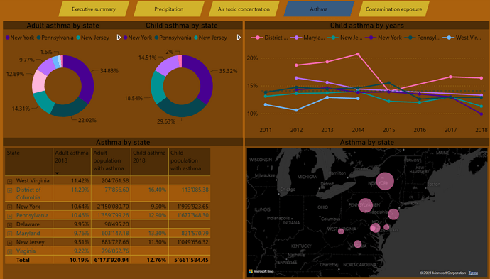
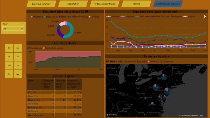
Looking at the data and the topic I knew I wanted to incorporate the geographical aspect so I decided to add a map to each page, I decided to show state values over location for contamination and asthma, and kept the location level for rainfall and air toxines.
Then I look into other angles and filter which could be useful to apply and tried to incorporate this to each page. For rainfall I struggled with the days analysis/harmonization so I decided to leave this out and just went with %. For asthma I left out the race component in the analysis.
I added some filter buttons on the side where I believe it may be useful.
Other than that I just went with the flow, added some growth rates, distribution charts etc. what seemed insightful. For some results I defer from other entries, so my DAX maybe a bit off in some cases.Hope you like it, appreciate feedback and suggestions how to improve.
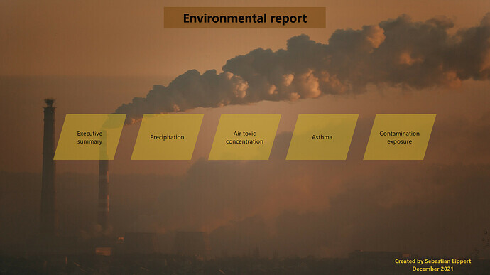
To learn about the real-life scenario presented for the challenge, be sure to click on the image below.
