Here’s the entry from one of our non-member participants, Hafiz.
To learn about the real-life scenario presented for the challenge, be sure to click on the image below.
Here’s the entry from one of our non-member participants, Hafiz.
To learn about the real-life scenario presented for the challenge, be sure to click on the image below.
This post is part of the Enterprise DNA platform improvements. Through these posts, members and non-members can showcase the resources and inspirations on how they come up with their challenge submissions. We hope all members can utilize it efficiently.
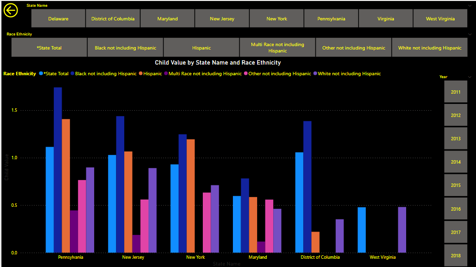
thanks for getting involved this time round. the colors really pop in your report which I don’t mind at all. on some of your pages though I do feel you’ve overused slicers and one of the things that I really recommend is try to underuse these as much as you possibly can I think it’s better to have a user click through visualizations rather than having to select multiple different slicers in one page.
think if you start to take that approach more you might actually find that the insights you’re showcasing are a lot clearer to the user and you almost are forced to attempt to tell a nicer story of the analysis rather than just having charts and slices and having the user create their own story.
Maybe something for next time but really appreciates your efforts and can’t wait to see more
Hafiz,
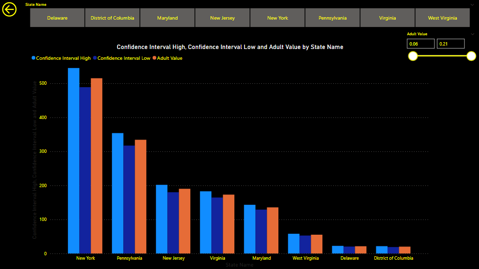
I think you did a nice job highlighting some key trends on the first page, and I like your choice of the dark background – not an easy thing to pull off. This was definitely not an easy one to jump into as your first challenge, and I applaud you doing so in a way that attempted to address all aspects of the data provided.
In terms of things to keep in mind for the future:
One of the first things I would suggest is to look at how the best entries in this round used color in a very intentional way. The most effective reports in this challenge (and any challenge for that matter) used only the minimum number of colors that they needed to in order to convey the information desired, and each color chosen was done so with a specific concept in mind. Use of too many colors (like on your second page) is very distracting and makes the report difficult to read.
In addition, I would definitely dial back your use of slicers. Again the best reports use very few slicers, relying on other visuals to provide the needed cross filtering. A slicer in and of itself provides no useful information, whereas another visual can serve the same purpose while providing much higher analytical value.
Finally, I would think about the use of space – unless it is a very complex visual with a lot of unique, detailed elements having one large visual take up the entire page (other than slicers) is not an effective use of “real estate” in your report.
Thanks very much for participating! I see some very nice elements in this report that you can build upon, and definitely hope we get to see more of your work in future challenges.