to gain experience with the Deneb custom visual and the Vega-Lite language
to maximize the time available to learn the Deneb custom visual and the Vega-Lite language,
minimize the data analysis by restricting the dataset to a single parameter (air toxins), making this only a partial solution
minimize the “normal” Power BI work (data loading and transformations, data modelling, DAX calculations)
to create all visualizations using the Deneb custom visual and the Vega-Lite language
What needs more work:
I was able to use Deneb/Vega-Lite bar and column charts as slicers with either overlapping labels or reduced opacity for unselected items, but the Vega-Lite syntax to enable both proved elusive; I chose to implement the reduced opacity and defer the overlapping levels
my basic implementation of the 3 Deneb/Vega-Lite bar and column charts (years, states, toxins) with the intent of them being completely separate slicers was unsatisfactory, and each selection in one slicer overrode the selections in the other two slicers, so I had to resort to using the filter pane to restrict the years and states available
I was unable to find the correct Vega-Lite syntax to set the text colour of the input widgets in the “multi-row card” (metrics) for font size and vertical gap; I had hoped to show white text on a dark background instead of the default dark grey, which led to poor visibility
Deneb/Vega-Lite:
composed standard Power BI measures for report title, report subtitle, and report info
used report title and report sub title in a left-aligned text visual at top left
used report info in a right-aligned text visual at top right
used a bar chart with bar marks for [Years] as a slicer; used dedicated hard-coded measure to set bar size to 1; exchanged X and Y to turn bar chart into a column chart
turned off tooltips
turned off chart border by adding [“style”: { “cell”: {“stroke”: “transparent”} }] block to [Config] section of visual
used a bar chart with circle marks for [States] as a slicer
turned off tooltips
turned off chart border by adding [“style”: { “cell”: {“stroke”: “transparent”} }] block to [Config] section of visual
used a bar chart for [Toxins] as a slicer; used dedicated hard-coded measure to set bar size to 1; exchanged X and Y to turn bar chart into a column chart
turned off tooltips
turned off chart border by adding [“style”: { “cell”: {“stroke”: “transparent”} }] block to [Config] section of visual
used text visual with 12 layers of text marks to simulate a multi-row card
used parameters for text colour of category, separator, and data to ensure each “card” was coloured consistently (the use of “grey” as separator colour did not contribute to the usefulness of the visual but rather was an exploration of one of the available customization features of the Vega-Lite language)
used standard Vega-Lite input widgets for font size and vertical gap and bound those widgets to the visual (this did not contribute to the usefulness of the visual but rather was an exploration of one of the available interactive features of the Vega-Lite language)
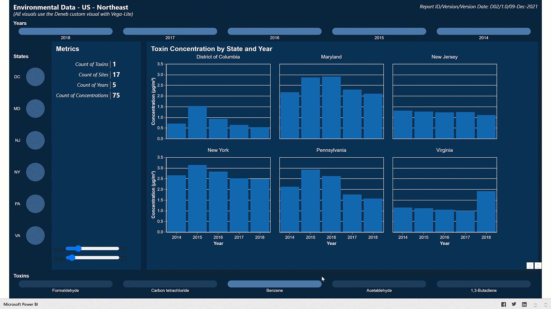
used a bar chart faceted by state to show toxin concentration by state and year
used a parameter for text colour to ensure all titles and labels were coloured consistently
used a custom tooltip to show state, year, toxin and concentration [with title of “C (µg/m³)”]; set concentration tooltip to show only 2 decimal places
used ALT codes for special characters for micro symbol (µ) [ALT+230] and cube symbol (³) [ALT+0179] to set the concentration units
Setup:
disabled “Auto date/time” option
disabled “Auto detect relationships” option (both “Import relationships from data sources on first load” and “Autodetect new relationships after data is loaded”)
enabled “Change default visual interaction from cross highlighting to cross filtering”
General:
there were duplicate data entries for site 240053001 (Baltimore/Essex), so deleted the 2nd one
Data Loading:
loaded [Air Toxin Concentrations] Excel sheet; moved to [Staging Queries] group; disabled load
create reference of [Air Toxin Concentrations] as [Toxins]
kept only [Toxin] column, removed other columns, removed duplicates, added index from 1 as [Toxin Key]
create reference of [Air Toxin Concentrations] as [Sites]
kept all “site” columns (removed other columns - Toxin, Concentration in Year), removed duplicates, renamed [Site Code] to [Site Key]
set data category of city, county, state, latitude, longitude columns
create reference of [Air Toxin Concentrations] as [Years]
kept only [Site Code] and […Year] columns, selected [Site Code] column, un-pivoted other columns, removed [Site Code] and [Value] columns, renamed [Attribute] to [Year], removed duplicates, sorted by [Year], changed type to [Whole Number]
create reference of [Air Toxin Concentrations] as [Concentrations]
merged with [Toxins}, kept only [Toxin Key], removed [Air Toxin Name]
removed “site…” columns (e.g., city, county, state, latitude, longitude, type)
selected [Site Key] and [Toxin Key] and un-pivoted other columns;
renamed [Attribute] to [Year], set type to “whole number”
renamed [Value] to [Concentration]
Data Modelling:
used “Advanced” section of “Properties” pane to set “Summarize by” value for all fields to “None”
used [… Key] columns to link [Concentrations] and [Toxins]
used [… Key] columns to link [Concentrations] and [Sites] (unsure why Power BI insisted on a relationship with cardinality = many-to-many, direction = both; will certainly give suspect/wrong numbers, but as the goal is to learn Deneb/Vega-Lite coding, errors in the data model are not important for this exercise)
used [Year] columns to link [Concentrations] and [Years]
To learn about the real-life scenario presented for the challenge, be sure to click on the image below.
This post is part of the Enterprise DNA platform improvements. Through these posts, members and non-members can showcase the resources and inspirations on how they come up with their challenge submissions. We hope all members can utilize it efficiently.
really love this Greg and really appreciate your efforts in showcasing the deneb functionality. what a incredible tool and it is really opening up some new visualization opportunities that the world doesn’t know about just yet.
I definitely feel you’re at the forefront here. and it’s amazing how many unique insights you were able to showcase in just one visualization. really creative and super impressive how you organize to this.
maybe another video could be on the cards showing your process in creating this visualization in its entirety?
thanks for getting involved once again and for being a stalwart in the challenges!
As usual, my hat’s off to you for how you use these Challenges as your own “learning lab” and the effort you put in to sharing what you’ve learned with the rest of us. I am certain that months from now we will look back on this report as being extremely important and influential.
I truly believe that Deneb is going to be a game-changer in how we use and think about custom visuals in Power BI, and also how it addresses the one area, visualization, where some people (not me…) believe that Power BI’s capabilities are still lacking.
Thanks for the unique path you took on this Challenge, and the great writeup that accompanies it. I completely agree with @sam.mckay that a video where you further explain what you’ve done here in Deneb and how you did it would be terrific.
Thanks for participating and for a hugely valuable entry!