Here’s Fernando’s entry for Power BI Challenge 17. @fernan95, feel free to add other details of your work.
Here’s how Fernando described it:
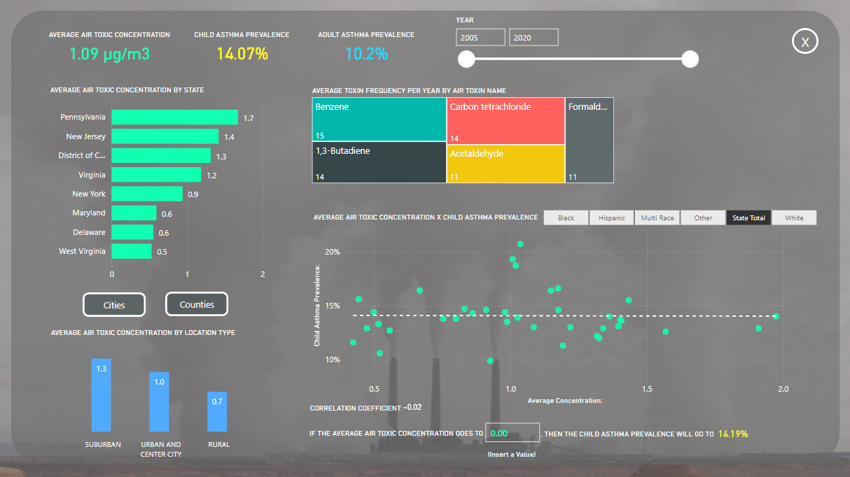
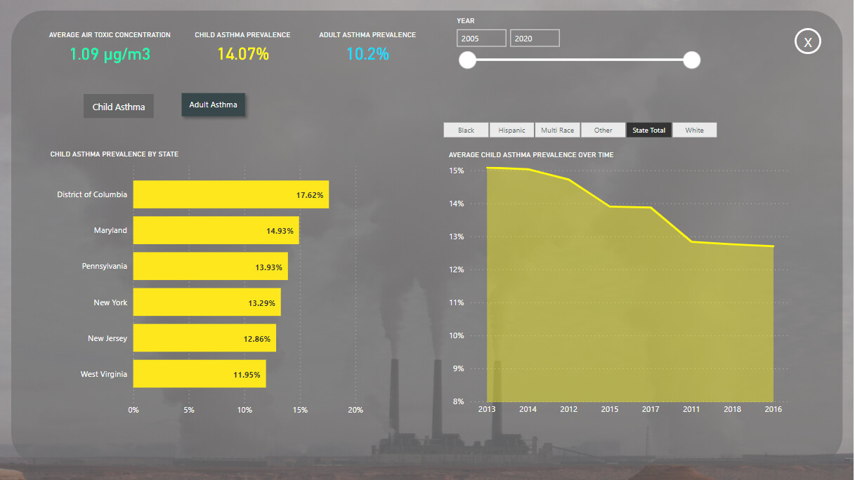
I want to talk about the correlation of those two pages. Holding CTRL and clinking on multiple visuals, you can create multiple scenarios to see how strong the correlation is and statically predict the behavior.
For example: you can establish a correlation between the average air toxic concentration of Butadiene in the state of Maryland and the Child Asthma Prevalence in the White or Black community. After that you can insert a new average air toxic concentration of said toxin (butadiene in this case) to see how the child asthma prevalence would behave on the selected community. You can create multiple scenarios and do multiple tests.
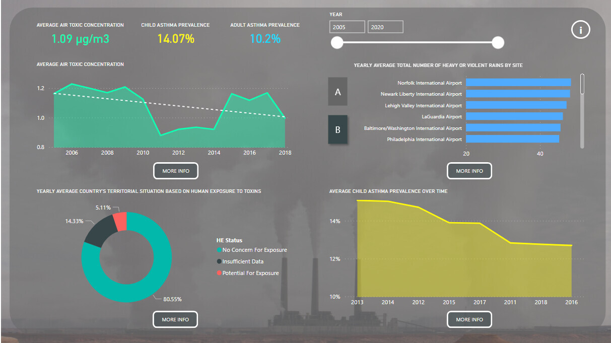
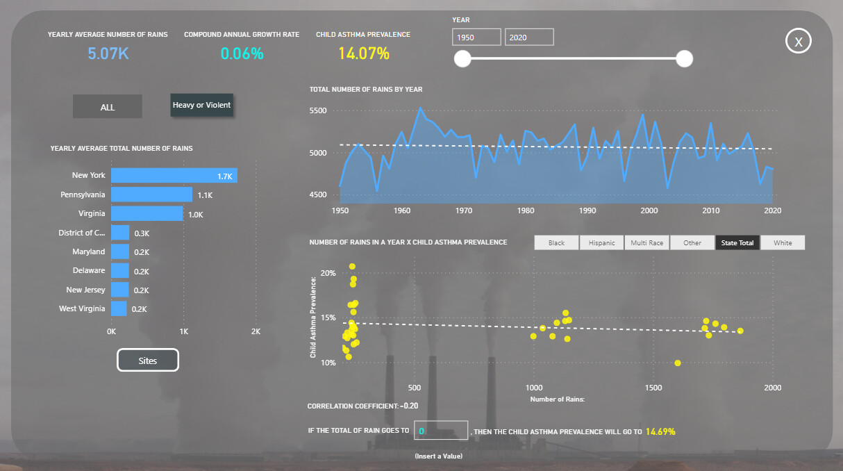
This same thing can be done for the precipitation report.
I’ve created a category named “heavy or violent rain” based on the classification that I’ve found on wikipedia.
Ps: I don’t trust the correlation to be 100% correct. I’ve created the report to be as automatic as I could make for now (the only thing that needs to be manually updated is the year table and clicking to refresh the tables). The correlations utilizes a table that I’ve created through power query utilizing reference and other things in order to make it automatically update by each database update (I hope
). There’s some nuances in it and more revision would be good.
To learn about the real-life scenario presented for the challenge, be sure to click on the image below.