Here’s Federico’s entry for Power BI Challenge 17. @FPastor, feel free to add other details of your work.
Here’s how Federico described it:
Here it is my take on Challenge 17 “Environmental Data Report”.
Report Commentary
I am terrible at writing reports commentary so I hope this will be OK with you.
Theme and Colour Palette
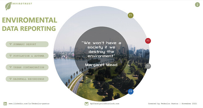
I went through 3 different layouts and colour palettes finally setting for the one hereby presented. The circle in the intro page try to represent Earth with the photo representing the environment.
While picking the theme and palette seemed an easy task, considering the data in analysis, it presented a number of challenges i.e. happy green “all is OK” or polluted greyish “we must do something about it”. I went for a mixture of the two represented by the photo in Intro page displaying a park in first line and the city with polluted sky in the background. The photo took well over 2 hrs to be picked between another 20/25 photos.
Approach
I decided to go for a “all end-users” must understand the numbers with the idea of normal passing by users to know what the report is about it. I am no sure I do achieve this but with the use of simple charts and KPI/s the report presents a clear and informative storytelling of the data analysed.
Data Analysis
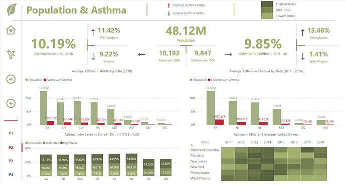
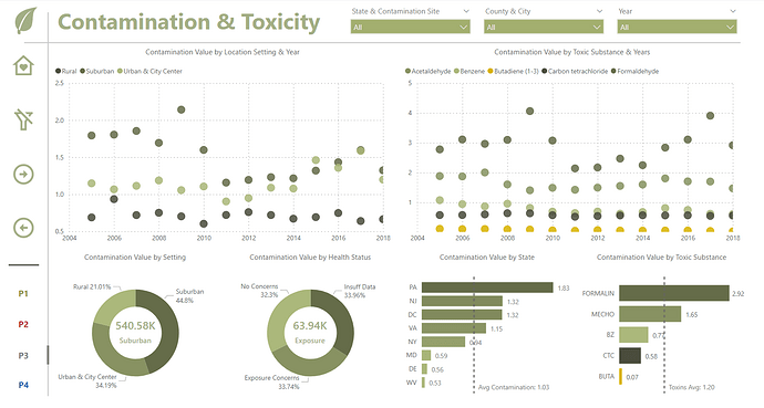
Presented with 5 different or interrelated tables, the first hurdle was how to set up a model. I decided to go with 3 mini-models with their own dimensions’ tables i.e. Asthma (Adult & Children) as fact tables and Year and State as dimensions table. In hindsight I could have done better but this is also part of the learning, discovering better processes or quicker ways.
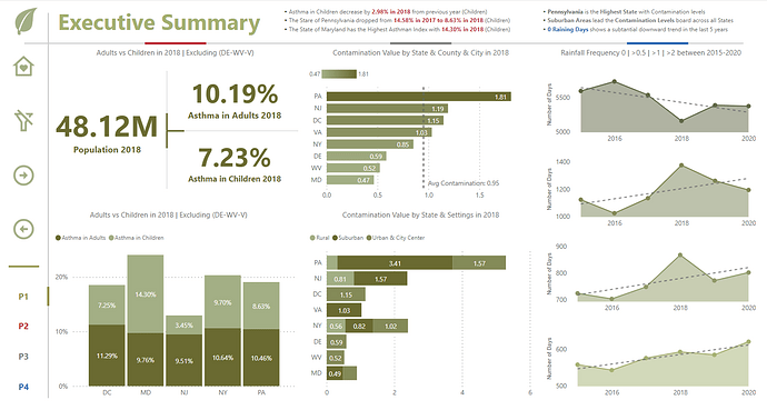
There are 4 pages of data analysis in my report, the summary, Asthma (Adult & Children), Contamination & Toxicity and Rainfall Recordings. I use normally a 1400-750 pixels page size packing enough room for a few viz.
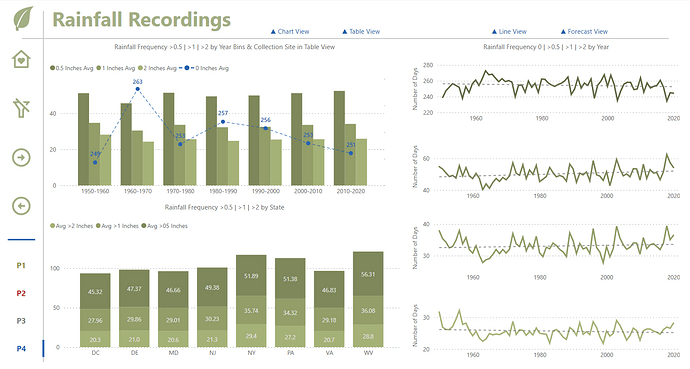
I have added the population in the presented States for 2018 and for the rainfall recordings, where days were not summing up to 365 days a year, I found out the number of missing days and share them equally between the 4 different frequencies.
DAX is uncomplicated, averages and a couple of calculates and filters measures with the addition of some extra additional columns enhancing the report analysis.
Well, I hope you like it.
F Pastor
To learn about the real-life scenario presented for the challenge, be sure to click on the image below.
@FPastor Great description of your thought process. I’m in the position now of what more can I show in my report. At first I thought there is some sort of correlation between toxicity and asthma. But now I want to somehow find out number of adults in the population that have asthma in that particular city. Always great to see your work. In the future, my goal is to become a “regular” on here.
@Paul.Gerber , thanks I have to improved this I must say!. I think there is a correlation between the tables in the report, maybe no one that we can measure based on the data provided but as an overall idea of how to tackle the report. If Air contamination/toxicity is high thus more asthma and so on… I tried to see it this way.
Can’t wait to see your report and what best way to practice your skills in Power BI than exercising with Report Challenges
Before going down that road, be sure to give the initial brief another look. The submitter speaks directly to the issue of correlating the different indicators.
This post is part of the Enterprise DNA platform improvements. Through these posts, members and non-members can showcase the resources and inspirations on how they come up with their challenge submissions. We hope all members can utilize it efficiently.
You were right when you told me that I will like your report. I am a big fan of simplicity with sparse and intentional use of colors in reports.
I like the simplicity of the graphs, the attention to details and the overall page composition you used. Also, the font used brings a special touch to the overall look & feel. Brilliantly done!
I also enjoy the navigation and the user journey. You did a great job !
In terms of improvement I think there are not so many things to improve. I identified some aspects though that I hope will help you declutter even more your reports.
For the page Population & Asthma, the use of direction icons for highest/lowest Asthma index is making the design a bit overloaded. I think I would try to see how it looks like without the directions, and use instead the color legend provided: for highest % use a dark green, lowest % - light green. To make things perfectly clear for the population block I would complete the title to: Adults with asthma per 100k. These modification would simplify the page without losing any important information or changing the story.
For the page Rainfall recordings in order to simplify the screen, I would make the button chart view almost transparent when the chart view is selected. In this way you gain some negative space, which is very important in any design. I would also try to change slightly the design of the buttons, maybe with a toggle as I think that at first sight the buttons Chart/Table view & Line/ Forecast view are not so visible because of the number of page navigation buttons, the logo & blue line chart with round shape that catches our eyes first.
What I usually do in order to check my design is to ask someone, like my wife or a colleague to comment out load my page report without providing them any information. What do they look at first, what do they understand? And most importantly, what are they not seeing?
Overall, I think this report is really great and most certainly one of the reports to consider for 1st prize
absolutely fantastic report created here. Easily one of the best with everything a consumer could want regarding insights, visualizations and navigation experience. play commend you on your efforts here.
plenty of other things that I really like. I love the dynamic text that you’ve added and arrange your different places. The interesting use of cards particularly with your asthma analysis. also the way you’ve used an X&Y scatterplot to showcase the toxicity report page.
plenty of great decisions across all of these different pages.
hello scheme is also great and easy on the eye. and I love how you’ve used simple lines to outline grids within your reports.
this is honestly superb work. everything is right and following best practices. very well done and can’t wait to see more you’ve obviously got some real talent.
They called James Brown “The Hardest Working Man in Showbiz”and I think you may be “the Hardest Working Man in BI”. I see you submitting fantastic entries not only in our challenges, but all the other ones as well and I think putting in all that time and hard work has paid off tremendously.
Your reports are a beautiful balance of style (like @alexbadiu’s, no two look the same) and analytical substance. The front page graphic and navigation are striking in their creativity, and your use of color is exceptional. Even without looking at the specifics, just a glance at the color and the style of the report lets you know it is environmentally focused.
One thing that really struck me in this report was the exceptional use of native visuals. The next time I hear someone complain about how limited the Power BI native visuals are, I’m going to show them this report is evidence to the contrary. One technique that stood out to me that I’m definitely going to “borrow” for my future reports are your “line-less line charts”. Also thought you made great use of the constant lines and trendlines to add additional context and information to your visuals.
One really subtle but wonderful thing about this report is the near absence of slicers, and the way you instead relied on visuals to filter other visuals.
One minor suggestion - I really like how you used the smart narrative to create dynamic summaries of key points in the Executive Summary. However, that page is already doing so much analytically and communications-wise, that I think I would have preferred having the text summaries pulled onto the cover page in the empty right-hand space to give them more prominence and room.
Overall, an absolutely masterful entry that conveyed a lot of information in a very accessible and attractive way.
Magnificent work, that we all can learn a lot from. Thank you for the obvious time, thought, expertise and care that went into this report.
@alexbadiu - Merci beaucoup. Nothing makes me happier than receiving a thumb up review from you. Your improvement points are duly noted and will be put into practice in incoming reports.
Perhaps one thing I learn with every report I create is how important the closing stages are. It is here where you need to become your best critic and have another look at you report. What I mean is you still need to put a couple of more hours just closing it down.
@sam.mckay Thank you for your review of my report. One thing perhaps everybody must know about me is “I give always 100%” - this does not mean that it is perfect and could be a lot better but you can be absolutely sure that I put my mind and heart in it.
Thank you and please keep making Enterprise DNA the top platform it is. You are surrounded by an excellent team which I admire!!
@BrianJ - Before I thank you for my report review allow me to THANK you for your support and guidance in and out of these platform.
I remember you telling me about the nature of this challenge, I sent you a happy emoji face… and I do remember very vividly my face when looking at the dataset and how my emoji happy face turned to “what the hell I do with this” (No emoji face for this I think) but I, somehow, have pointed out to you that I will participate and one think Federico does not do is quitting. This report has over 40+ hours of work but what I really wanted was to make sure you were not disappointed with my entry. I think to some extend I achieve this.
This is only my third entry in an Enterprise DNA Challenge, it is not a cute screen shoot like other platform challenges but a full report, even if the report is not the best of them all your professionalism as a report creator MUST show. The under the hood work even if it, can be improved “always can be improved”, is as important as the visualisation.
Thank you for your comments, improvements duly noted and I am very glad you like my report.