Here’s Erika’s entry for Power BI Challenge 17. @ErikaLoz, feel free to add other details of your work.
Here’s how Erika described it:
Attached is my very late submission. I realised I have missed the deadline, but I wanted to submit a report at least once this year
I have wanted to build a dark themed dashboard for a while now, but never got the chance at work and finding the time and interesting data for side projects can be difficult. I’m happy that this challenge was very interesting and gave me plenty of opportunities to try a different theme.
I would have like to spend more time adding some context around the different pages, an creating some narrative to help audience navigate dashboard. Next challenge, I’ll give myself more time to implement this.
To learn about the real-life scenario presented for the challenge, be sure to click on the image below.
hey Erica I really like what you’ve done here. first of all I really like your color theme and the way that it really leaps out at you from the report pages. it’s also consistent which is very important. there’s no problem going out there with your color choices but you just need to make sure that you use them really effectively and you’ve done exactly that.
I love lots of small aspects from the navigation bar to the icons you’ve used and also the neat way you’ve used tooltips.
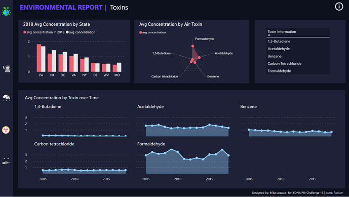
I also really like some of the card visualizations that you’ve used and also the small multiples particularly on the toxins page.
overall this is a super submission to the challenge and really impressed by your creativity and design feel to your reporting application.
Very impressive entry. I wish it would’ve come in under the deadline, since I think it would be quite competitive in a number of categories.
Really like your choice of the dark background. I’ve tried that in past challenges and found it difficult to pull off, but I think it really works well for you here and makes the key conclusion numbers really “pop”.
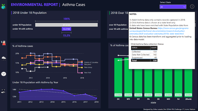
Like your use of the Smart Narrative on the summary page to make your conclusions clear and prominent, rather than forcing the viewer to navigate through the report details to find them.
Nice use of Python to clean the data, and I applaud the initiative of pulling in additional census data to support your analysis.
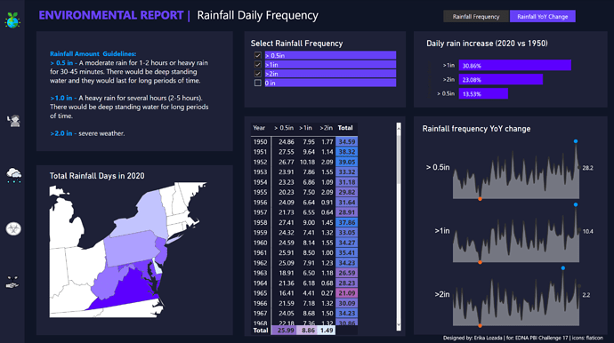
I thought your use of small multiples for both rainfall and air toxins was very effective, and also liked the choice of radar chart to show the average concentrations by toxin
Two minor suggestions for improvement:
I’m not sure the funnel chart was the best choice to depict the relative asthma levels. The 100% bar is implied, but its explicit presence draws attention away from the key figure, which is the population with asthma.
Also, instead of the standard tooltip I would’ve preferred the use of the modern visual tooltip which would make better use of the excellent color theme you have chosen and just overall gives a more polished look.
This is a really impressive debut in the Enterprise DNA Challenges, and I very much hope that we will see many more entries from you in future challenges. Thanks for participating!