Here’s Alex’s entry for Power BI Challenge 17. @alexbadiu, feel free to add other details of your work.
To learn about the real-life scenario presented for the challenge, be sure to click on the image below.
Here’s Alex’s entry for Power BI Challenge 17. @alexbadiu, feel free to add other details of your work.
To learn about the real-life scenario presented for the challenge, be sure to click on the image below.
once again Alex fantastic submission with many small visualization techniques that are out of this world.
firstly that tooltips are insane that you’ve used. just so beautifully designed and informative. almost like we could create a course just on how to create incredible tooltips honestly!
colors and the dark backgrounds are compelling and also the way you’ve built the simple navigation into your report as well in the top right hand side is really beautiful.
this is like a work of art on some pages but at the same time provides a ton of information that a consumer can take and action
I think some of the nice small multiple visualizations you’ve created as well are a fantastic way to showcase some of these insights particularly the trends overtime. so I commend you on your creativeness there.
I know it’s been a ton of time on this so really appreciate your efforts as always.
really would love to see you create some videos to showcase some of these techniques because they’re absolutely brilliant and I would say most people don’t even know how to create these.
Awesome stuff!
This is an absolutely brilliant example of expert technique meeting virtuoso data storytelling.
The report truly looks like something that might have come from a special feature in the Washington Post science section. One thing that immediately jumps out to me is the amazing use of color, or lack thereof. The black and white theme along with the font/text choices conveys to me the gravitas of a scientific report, and where you do use color those aspects jump off the page shouting “this is important! pay attention!”
I also love the use of extensive text in this report. To me, a top-flight report explicitly conveys what the analyst thinks is important, backs that up with data and analysis, and provides actionable recommenations - none of which the viewer should have to look hard to find.
Your report also has some major technical innovations within it that people can learn from - the finer granulatity of analysis you’ve achieved by incorporting census tract-level maps and analysis, the use of the Icon Map and Mapbox custom visuals, innovative navigational elements and many others.
I do have a number of suggestions for improvement:
LOL. Who am I kidding? I have no idea how this report could be any better. Thanks so much for your dedication in regularly putting together these remarkable Challenge entries that the rest of us can learn so much from.
Hello all,
Brian did it again! With this challenge, I was pushed far away from my comfort zone.
This challenge was hard! I spent more time on it than any other previous challenge.
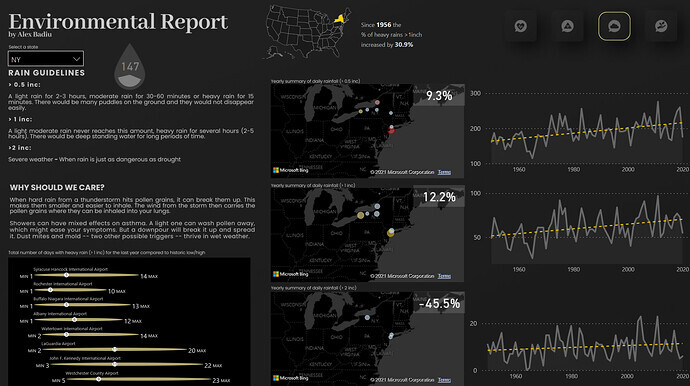
I found it hard because there were a lot of different information, at different granularities, sometimes at census tract level, sometimes at state level, sometime a specific location (airports). We also had different time frames, sometimes one year, sometimes 70 years.
We can add to that my 0 experience with IconMap, QIGS, mapping polygons, prior to this challenge.
And my 0 experience with environmental data. I had 1000 questions about the data, about what it means, and needed to read, search and understand. (thank you Brian, Jarrett, Federico for the questions & answers, clarifications and websites shared on the challenge discussion.)
I always found maps extremely interesting, but I very rarely find a use case in my daily work for geo spatial & maps. This challenge was a wonderful opportunity to learn, test, adapt, and integrate maps in storytelling.
Talking about storytelling & design, I learned that maps are very powerful but can work against you as a designer. Maps by default are visual and attractive to most end users but they have two main disadvantages that people should pay attention:
1 - the size. We use generally maps on report pages (I have a past challenge submission where I use them in tooltips too, but that’s a rare use case).
When we use them on the report page we usually make them big. It can take a lot of real estate on the page. That is an important cost, because the more you have space filled with a map, the less you have space for context. Without paying attention, with maps you can lose context very very fast.
After this challenge I admire more geo spatial & maps experts like @Paul. I re watched his training course on eDNA, and also had the chance to directly discuss with him and have his advice and help directly. I understand better now his examples showcased through his course. And the analytical power of his reports is spectacular. The energy spent on making maps clear and useful is very important
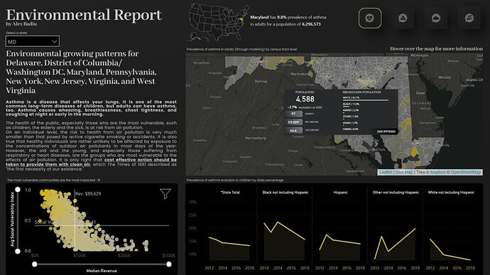
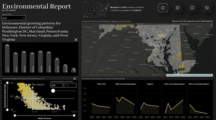
2- the Context. For a difficult topic as we had for this challenge a Map would not be enough to tell a story. There was a paradox with the data. We had too much of it and my mind had difficulties to focus and in the same time I thought it was not enough. I remember exactly the moment when I had this feeling. I was thinking of how to visualize children with asthma by ethnicity. Black afro americans had higher rates than white children. What does it mean? Black afro Americans are more predisposed to having asthma? Leaving the data as it was it would have encouraged the viewer to understand it as such. But I did not think that. So I wanted more detail. For confidential reasons, we had data for children at state level… But we had adults data at census tract level. So my idea was the following: Find out (if possible) for every census tract what is the breakdown of the population and find information concerning the median revenue of those regions. Is asthma more predominant in vulnerable census tracts? Are black afro americans more numerous on those regions? Is the density or evolution in the population or placement playing a role?
By the placement of my visualization I also created an indirect related link between children and parents by ethnicity. (Gestalt perception principle of proximity)
So… context is important… And sometimes context is not enough to build with data provided. So in order to create context and build up my story I spent many hours looking for data. (I managed to webscrap at census level with Power Query +14k sites in 48 hours. I also had a plan B and extracted dozens of files from Census Tract to stich and crunch with Alteryx.)
Conclusion: Always think about context in visualization. Pay attention to that even more when using maps. And learn Icon Map - so interesting & powerful!
I wanted to use maps effectively for this challenge. I have to admit that at some moments it was so complicated that I was thinking to give up… Too much time invested, to difficult as a ‘novice’, I am finance guy, not an expert in geo spatial. It’s the end of the year and all the finance guys & girls out there know the end of the year is a particular busy period… But I did not quit. I continued trying, I contacted Brian and got some help & useful advice, than I contacted Paul and got even more help and advice. I want to thank them for doing that! Without them I would not have finished this report on time or I would not have pushed my ideas as much.
The true satisfaction I have when I finish a report is when the ideas I have are implemented or at least I tried to implement them. It was a great adventure!
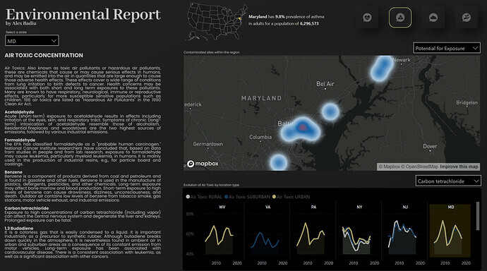
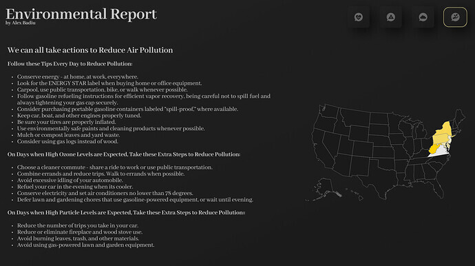
I had a big difficulty on finding a story for this report. I wanted somehow to link the different KPIs but no specific order or link was to be found. There is no direct proven link between the KPIs was said in the challenge description. So, I had to improvise. I made a connection between the KPIs from the perspective of someone having asthma. First I talked about asthma for adults & chidren and through text I pushed the conclusion that the most vulnerable people are the ones who suffer the most. Than I continued with air toxic concentrations because they have an important impact on the vulnerable census tracts shown before (I show this time a heat map to better visualize the air toxic - as it is not related to just a specific point). I continue with rain analysis that has also an impact on asthma (explained with text). And I finished with a conclusion, more personal and probably a bit outside the scope of this challenge of how we could all contribute to reduce air pollution.
I also used a lot of text in this report. I did this because I think there was a lot to say, to give more context, to explain the data. I used Figma for all static background images. For text as well. I needed to make text readable, so I used size, orientation, space, alignment to make text more “visual”.
I used many visual tips in my report. I spent hours to build tooltips and would have spent even more to create custom tooltips for all the pages…
I also used even more than before Charticulator. I am starting to incorporate it more and more in my reports. It is easy when you see them done, but it can take hours and many tries to imagine & create. It’s fun, but it’s time consuming.
I don’t want to make this post very long and of course I could detail many different approaches but what I wanted to note about this challenge is the following: Search for context, search for more data if needed and always put yourself in the audience’s shoes. What do they understand? Perception is important, and without planning and design thinking, they will draw the totally wrong conclusions.
Wish you all a great end of the year,
See you to the next challenge,
Best regards,
Alex
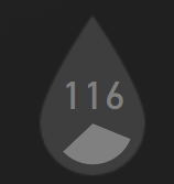
P.S No one saw my oriented pie chart??  was so happy to find an use case for that!