Great one Diana!!!
F Pastor
Great one Diana!!!
F Pastor
Amazing report! @FPastor I am a big fan of your reports and the colors that you choose!
Wow !!!
Impressive.
Another Wow report, impressive. I love it. Looking forward to trying it out.
I knew this was a great idea, lot’s of consultant (incuding myself) will be using this.
and it will be a nice tool for everyone.
Still working on my report…
The compétition is fierce !
Federico,
Fantastic! Really great mix of visuals, all used to good effect - I particularly like the “mega-KPI” cards on the first page. Terrific use of color and white space. All-around great job. 
Would you like me to publish this to web for you and add the link to your post?
P.S. Happy Cake Day!
Thanks Eric 
Federico,
If you’ve already PTW, you can just add the link in to your main post. I always encourage people to include that (or let us know if they don’t have PTW access), since I think it’s really helpful to experience each report as the client would, especially like in your report where you’ve added some excellent navigational features that are just not done full justice in a screenshot.
F Paator, Please remove name and email from your title page and replace it with your name. It’s your report not mine. You deserve the credit.
Terrific report. I love that you went outside the box and used features we don’t typically see in these types of reports - Infographic Designer, AI insights, etc. Also really like the bright color choice and the inituitive what-if analysis.
If I could make one constructive suggestion, it would be to make the drillthrough more obvious to the viewer. You’ve got an excellent monthly detail drillthrough page, but it relies on the viewer noticing it via the mouseover. In these situations, I like to place a drillthrough button on the visual that activates when the viewer selects a given month. (whoops! I just noticed the drillthrough highlight text you placed…  )
)
The early reports are setting a high bar! Thanks for participating!
Done!
F Pastor
Done!
F Pastor
Great report and yes there was a duplicate row, I have removed it here.
Thanks for pointing it out.
Here is the updated file
numbers-export-atwork.csv (51.9 KB)
It error was the
2019-06-07 8:00:00 AM
2019-06-07 8:00:00 AM
That’s very good you spotted this error in the data
Great work, once again.
Thank you Brian! Your words mean a lot. I struggled a bit with the best link to the monthly drill-through. A button would be a great approach. It is fun to use more colors and styles in the challenges than ‘regular’ work. It is a great opportunity to experiment!
Diana
Thanks! LOL, I actually thought the duplicates were part of the challenge! Analyzing and cleaning data is the first stop.
Diana
No, in this case it’s my error I prepared the data but in real life it is, always check your numbers I usually balance my number with a SQL select. A fancy dashboard with bad numbers just removes all credibility to everything you do. In fact it’s the most important thing to do. Step #1. So my hat off to you for catching this duplicate.
I couldn’t agree more. I think one of the best parts of the challenge is to treat as your own personal test lab to try out techniques, visuals, UX features that you’ve never used before, and see how they might (or might not ) work in a real-world context. For my DC 16 entry, I’m trying to build it almost entirely from visuals I’ve never included in a prior report. We’ll see how it goes…
Can’t wait to see that @BrianJ 
Hi,
I was hesitating to post my report yet, as there is still one more week to go and I was afraid to miss the opportunity to do more or tweak the report a little further. However, I am happy with the result, so here we go!
I have to admit, I spend at least the same amount of time in Procreate as in PowerBI, but I couldn’t help but to make the report look just the way I want it.
First, I decided upon a color theme. I am a girly person, so there had to be something pink in it. Next, I had the idea in mind, that one consultant works for many clients, which makes a one to many relationship (If you can see, how I implemented that into my design, you are my favorite person!)
After working a lot back and forth on the design, I came across those cute icons. I adapted my background to work with the icons and I have to say: I am happy, how it turned out!
But everyone knows, this is not a design challenge, so let me say something more about the calculations.
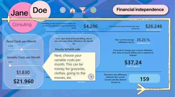
Quite early in the process I noticed that Jane doesn’t earn enough money per year to make a living from it. So, I provided her with a “Financial Independence” calculation. I can tell you: this took me way too long!
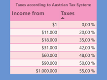
The idea about this page was to have a fully customizable way to enter fixed and variable costs to calculate how much Jane wants to earn. That was the easy part. But then I noticed, no matter how much she wants to earn, she must pay taxes from it. As I am more familiar with my local tax system (I am from Austria), I decided to use this instead of working my head around another country’s system.
When calculations are done, you can see 2 charts in the middle: one calculating the optimum utilization rate with a variable hourly billable rate, and the other will tell you how much you should bill per hour to keep your current average utilization rate.
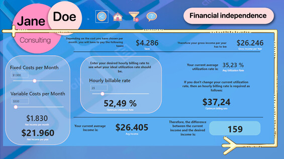
Just in case, you are curious, there is a tooltip on the Austrian tax system!
Last step on this page was, that probably nobody will understand, what I did there. So, I made a walk-through tutorial.
This page is the heart and center of my whole entry to this challenge.
Obviously, there is the obligatory landing page .
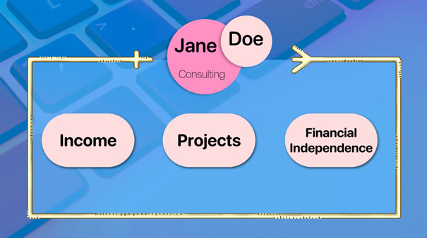
Then we have the general Income page . To the right, I wanted to try the small multiples visual, and I have to say, I like it!
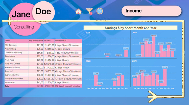
To the left there is a summary of client, average hourly rate, income, and duration FTE. The duration FTE represents how much time you have spent on a project considering a normal workday of 8 hours (just in case you forget, there is a tooltip!)
The projects page is quite straight forward. In the lower right corner, I’ve put a comparison between the cheapest, the most expensive and the selected project.
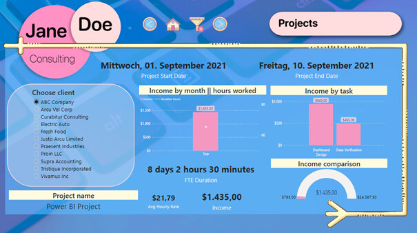
And yes, the dates in the screenshots are in German, as I didn’t want to change my settings (sorry for that!).
It was a lot of fun to work on this project and I am so happy how it turned out. I hope you like it and I can’t wait to see all the other amazing entries!
Love how you embrace a totally different look! To me, design is a important element.