Here’s Uma’s entry for Power BI Challenge 16. @UmaSuresh, would you like to share how you built this dashboard and what your inspiration is in building it?
To learn about the real-life scenario presented for the challenge, be sure to click on the image below.

2 Likes
This post is part of the Enterprise DNA platform improvements. Through these posts, members and non-members can showcase the resources and inspirations on how they come up with their challenge submissions. We hope all members can utilize it efficiently.
Hey Uma, nice work on the challenge.
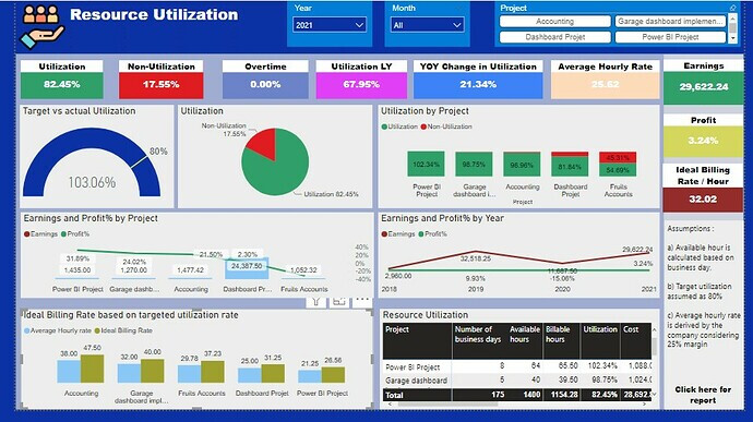
I really like how you’ve thought through the problem here and looks to create a solution answering as much as possible on just one page of the report.
I think you’ve also followed a lot of nice design best practices particularly in sticking with grids in your report page.
Definitely a small improvement here is on the colours that you’ve used. I think there’s too much variation in the colour palette. To try and simplify it down and you’ll find that your work will just be that much more compelling to the consumer.
I think also maybe next time explore some of the other visualisation features like bookmarks and tooltips. You can do some pretty interesting and crazy things when you combine these two features and they can really enable you to tell a story that you would otherwise not have been able to historically. They also just enable you to craft a different visualisations and reporting applications when used effectively.
Nice one, look forward to seeing more next time.
Sam