Here’s Robert’s entry for Power BI Challenge 16. @robert.maembe, feel free to add other details of your work.
Here’s how Robert described it:
Couple of comments on my report:
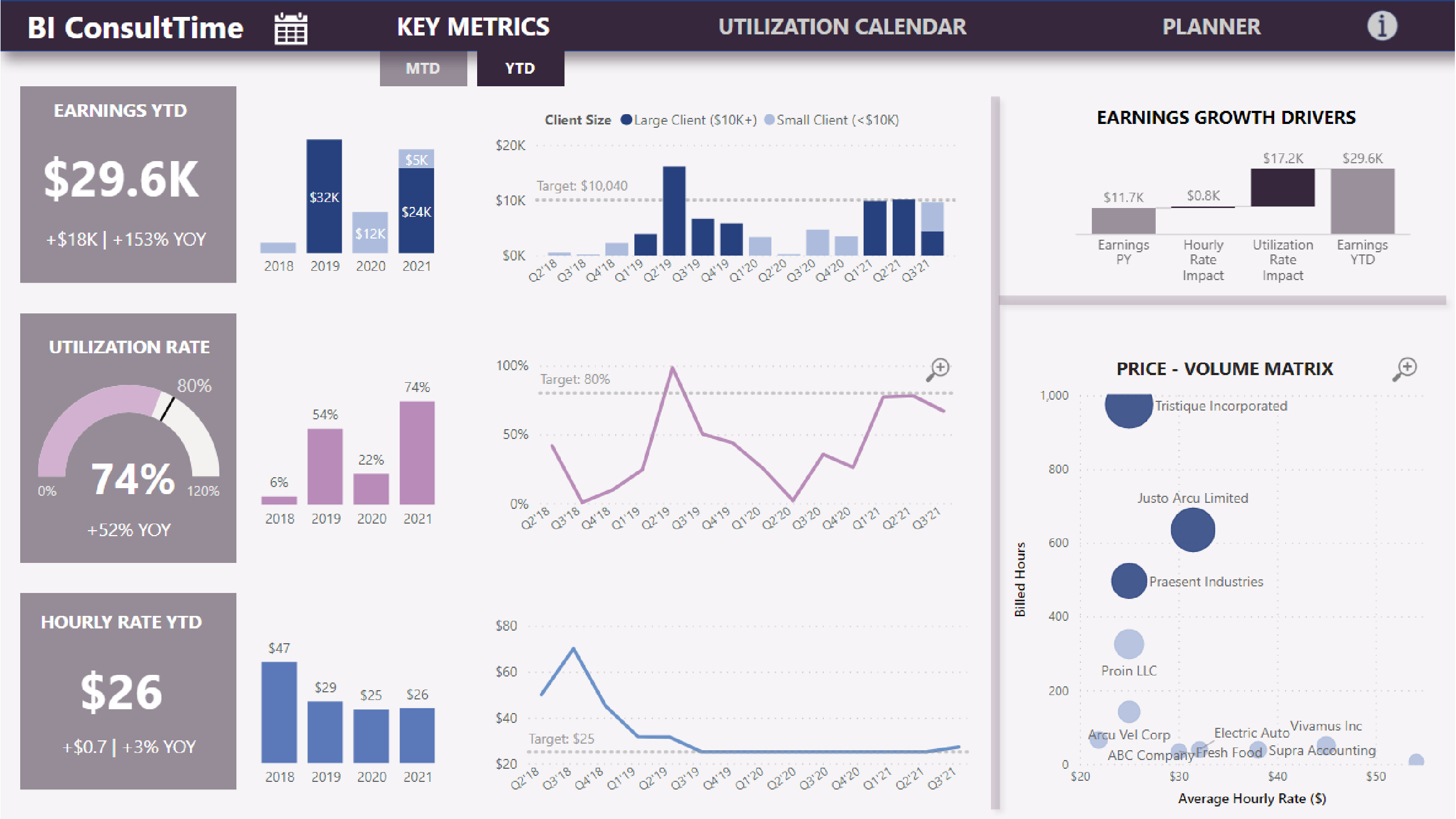
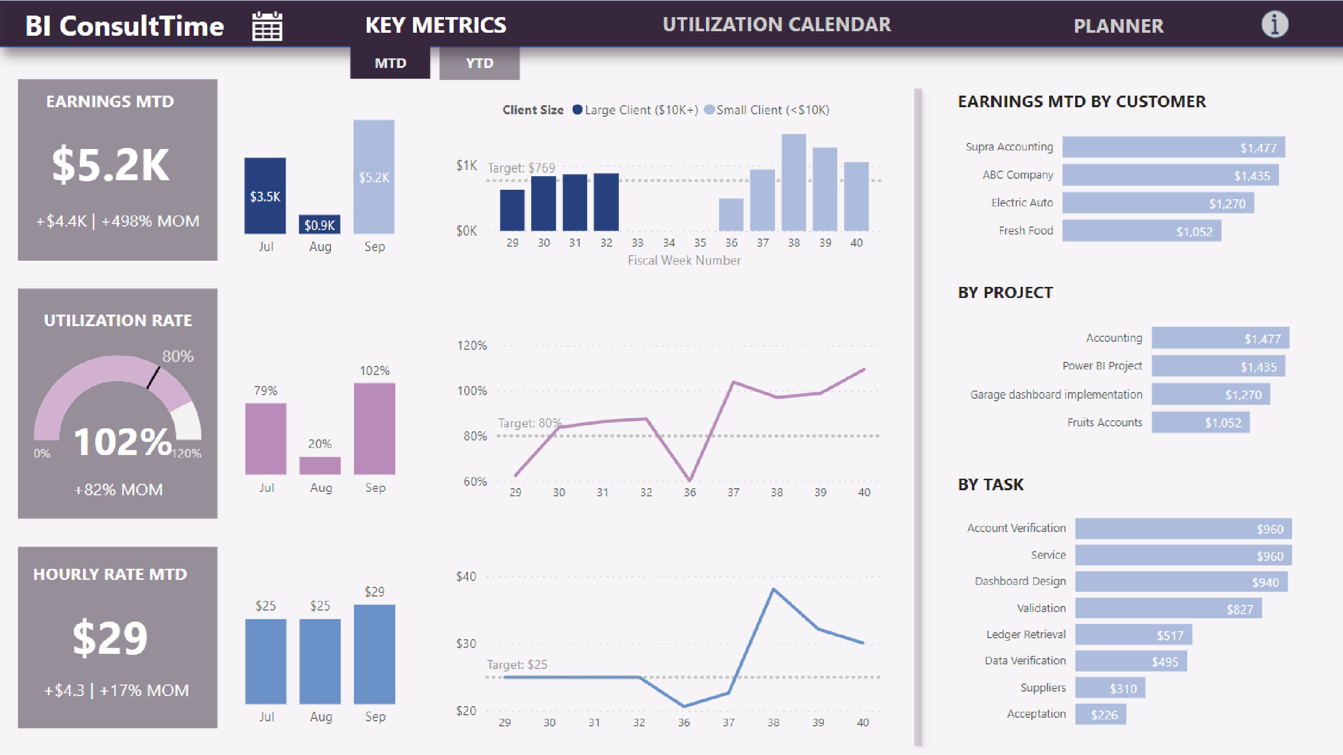
- The report focuses on both short term (month-to-date) and longer term (year-to-date) performance to support both strategic and tactical planning. Both views provide context, trends and additional details to better understand earnings drivers.
- I have introduced a new dimension – client size: small (< $10K annual sales) and large ($10K+) as high utilization rate were highly correlated with big clients / projects. Therefore focus on large projects should be motivated.
- The Price – Volume matrix illustrates the current pricing structure where small and big projects tend to have the same hourly rate. The company should re-evaluate it’s pricing policy and implement a pricing structure that is volume-driven. In addition, it should evaluate implementing a dynamic pricing model similar to airlines and hotels to maximize utilization rate and average rate per available hours.
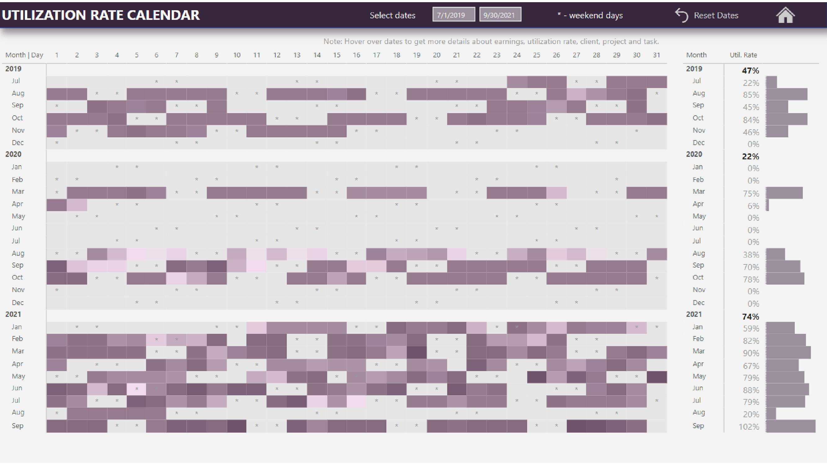
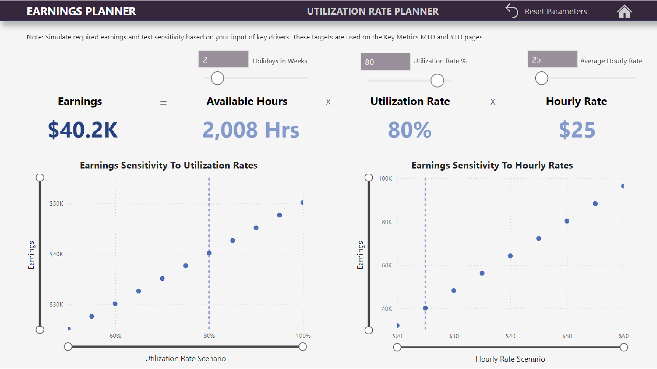
- My objective was not only to create a classic report that only provides historical information, but to use it also a strategic planning tool . The Planner allows users to play with the various variables and see not only the result but also the sensitivity of results to variances in inputs. These new targets are then used to track performance over time. As the environment is changing, these targets can be adjusted accordingly, thus providing management the ability to adapt quickly to market reality instead of a rigid annual planning process.
To learn about the real-life scenario presented for the challenge, be sure to click on the image below.
