Power BI Challenge 16 - Timesheet Utilisation Reporting from Nadeem (Non-member)

Here’s the entry from one of our non-member participants, Nadeem.

Here’s how Nadeem described it:

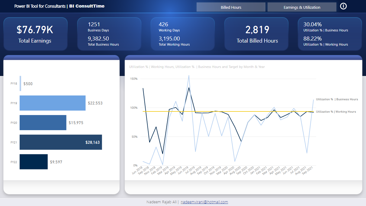
I have converted the Date table to Australian Fiscal year and also included Victorian Public Holidays.

Below are presumption I have made around my workings.

Working Days & Hours : These are calculated from the Time Sheet presuming that these are the only days consultant have worked.

Business Days & Hours : These are calculated where Business Days are True in the date table.

Based on the data, excluding FY18 & F22 there are hours underutilised or there is overtime where no penalities were charged.

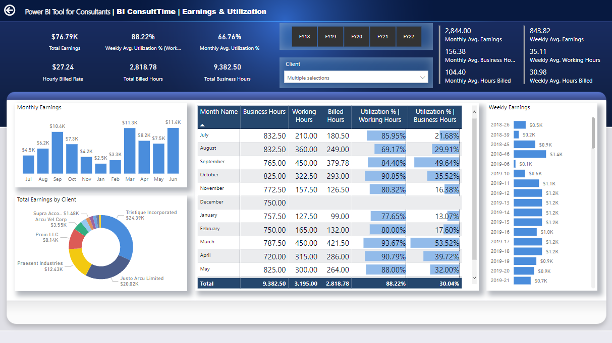
Sorry I am still new in Power BI therefore cannot make scenarios to show what would be an increment to income if 75% of underutilised hours are utilised.

Also, If Weekend and Public Holiday penalties are introduced there is an extra potential for income increment.

Key Learnings:

  1. Home page should be most interesting and storytelling piece of work. Need more practice.

  2. Our analysis must highlight important findings and recommendations that would stem from them - In my work, analysis is present however there is a lack in highlighting important findings and recommendations - On my must have list for all reports.

  3. Interaction between visuals is a key. There should not be a blank in your visuals - Double checking is key!

To learn about the real-life scenario presented for the challenge, be sure to click on the image below.

power-bi-chal-1

This post is part of the Enterprise DNA platform improvements. Through these posts, members and non-members can showcase the resources and inspirations on how they come up with their challenge submissions. We hope all members can utilize it efficiently.

Hey Nadeem, thanks for your submission.

Really like what you’ve done here particularly with the nice clean design. Really effective visualizations and way that you’ve built your reporting application. I like the innovation in the header area and how you’ve layered different shapes to create a really compelling look.

A lot of really interesting information and analysis that you’ve effectively put together here as well. One of the unfortunate things that stands out for me is the donut chart colors. If you just had some slight variations on blue I think it just would have looked so much nicer in the brilliant overall visualization that you created in each report page. So really simple change and just make sure to have a consistent color palette as much as you possibly can instead of having random reds and yellows and greens etc.

Overall this is a high quality power BI report. Really impressed by many aspects including the insights and also the navigation experience. Particularly also the drill down that it looks like you’ve implemented as well

Well done this round.

Sam

2 Likes