Here’s Japjeet’s entry for Power BI Challenge 16. @jps, feel free to add other details of your work.
Here’s how Japjeet described it:
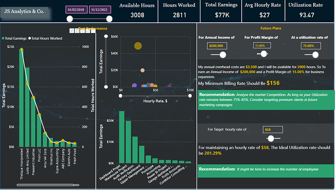
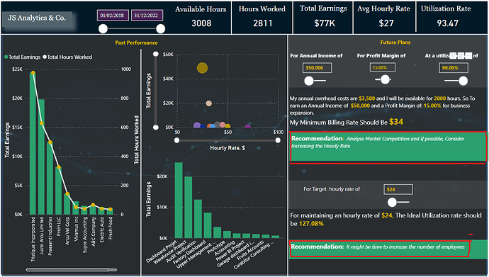
When preparing the dashboard, I found the resources that explained the concept of Utilization to be very helpful. As I had no prior idea of the concept.
The dashboard consists of some basic bar charts, scatter plot and KPI cards. This part was easy.
Planning and thinking about the future scenario analysis is what took me some time to figure out what I wanted to do and how I wanted to share it.
My biggest learning was to be able to use text editor and embed it measures and be able to format the text, font size and colours etc. particularly the Recommendation area, where the suggestions are dynamic . Before attempting the dynamic text, I wasn’t sure if this would work, But then the Switch function came to my rescue.
Another thing that I always find a bit difficult is to figure out a correct background, and a colour scheme.
Although I am satisfied with the outcome overall, I find there is too much text in relatively small space as per my liking.
Thank you, Team, – for this great challenge. It really helped me put my skills to a test.
To learn about the real-life scenario presented for the challenge, be sure to click on the image below.
