Here’s Jan’s entry for Power BI Challenge 16. @deltaselect, would you like to share how you built this dashboard and what your inspiration is in building it?
Here’s how Jan described it:
Hi everyone,
Please receive hereby my workout of the Challenge 16 - Timesheet Utilization Reporting.
It is a three page report: Utilization, Utilization defined and Sales analysis.Straightforward Data Model and very limited data enrichment
- The data model exist of a date table, connected to the provided “ActualWorkData” of one consultant.
- A date column is added, derived from Start(time) for the connection with the date table, the Revenue column is deleted and calculated with a measure (Work * 24 * Hourly Rate + Bonus)
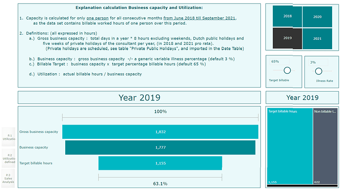
“Utilization defined” explains Business capacity and Utilization, with the Target settting.
- Capacity is calculated for only one person for all consecutive months from June 2018 till September 2021, as the data set contains billable worked hours of one person over this period.
- Definitions: (all expressed in hours)
a) Gross business capacity: total days in a year * 8 hours excluding weekends, Dutch public holidays and five weeks of private holidays of the consultant per year, (in 2018 and 2021 pro rata).(Private holidays are scheduled, see table “Private Public Holidays”, and imported in the Date Table)
b) Business capacity : gross business capacity -/- a generic variable illness percentage (default 3 %)
c) Billable Target : business capacity x target percentage billable hours (default 65 %)
d) Utilization : actual billable hours / business capacity
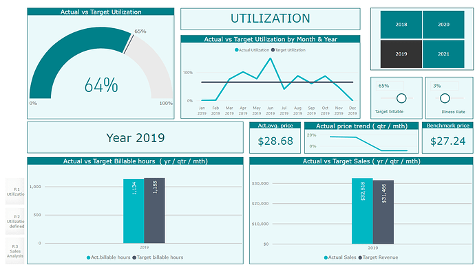
(Capacity Measures setup accordingly)“Utilization” reports actual billable hours against target, with rate trends and revenue development
- Main KPI is the utilization rate (gauge report), comparing actual versus target utilization.
- The target billable hours can be varied by changing the Target billable (default 65%) and the illness rate.
- Actual Sales is calculated at “worked” hours x hourly rate + bonus.
- The Avg act.sales price is derived from the Actual sales divided by the actual billable hours and is dependent on the chosen period
- The Benchmark price is calculated as total actual revenue over four years divided by total worked hours, and is used for target revenue, being the benchmark price x target billable hours.
- Act price trend is calculated as the percentage price difference between Avg act. sales price and benchmark
- Actual / target comparison in the two clustered column charts at the bottom have drilldown possibilities, starting with annual figures to remain overview.
- The year, or multiple or all years can be selected, which is valid for all three pages
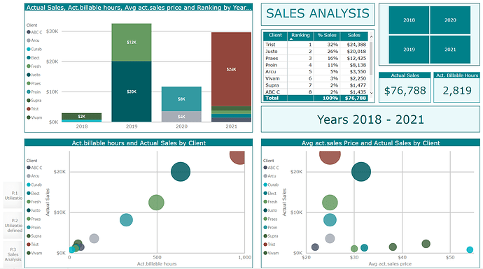
(Actual and price measures set up accordingly)“Sales Analysis” gives insight in billable hours, price and sales per client
- Focus is set on customer sales analysis.
- Insight in sales per customer, ranking on base of sales, average price per customer and actual billable hours per customer, important to know if high utilization delivers also high price and sales.
Possible future utilization insights
- Comparison with previous periods
- Comparison utilization with other colleagues
- Utilization per project or task
- Actual billable hours versus average price per customer
To learn about the real-life scenario presented for the challenge, be sure to click on the image below.
