Here’s the entry from one of our non-member participants, Filip.
Here’s how Filip described it:
Model:
The Data model has been expanded with some minor dimensional tables - mostly slicers and what if parameters tables.
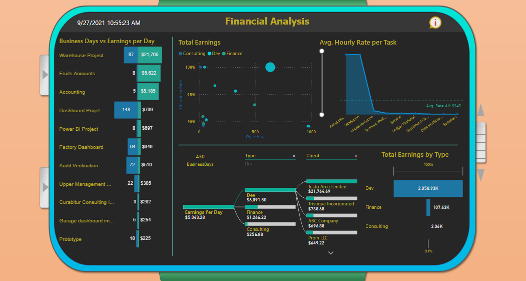
Projects are focal points of the report. They have been divided into 3 main types: Consulting, Finance, Development.Due to many gaps and high inconsistency of dates time intelligence analysis is rather simple.
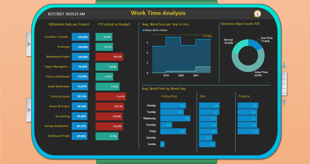
This is also the reason for selected Utilization Rate formula. I decided to simply take into account only work and break time
as the base of available time per project, because project-oriented operations are much more versatile than steady 9 to 5 jobs.I have decided to include FTE calculations for extra insights. Budget FTE is calculated as follows:
(Business days per project * 7.5) / 37.5 which is a standard US formula. Then actual FTE is simply: The actual Work Time per Project / 37.5Altough, hourly rates and booked billable hours could be perceived as cost for the organisation,
thus compared further on with earnings - this idea has been rejected, because I wasn’t sure if that’s a good lead.
Instead, more pressure has been put on the earnings/revenue part in different scenarios.Design:
Since the topic of the challenge is time analysis I decided to design a smartwatch-like report, which in the end is pretty satisfying.
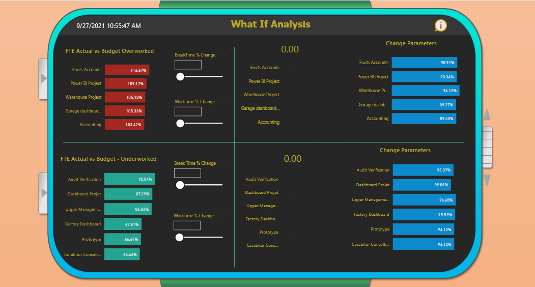
Overall UX shall resemble an actual smartwatch, thus all the buttons and navigation are easy to folow.What If Scenarios:
Some of the projects have no booked non-billable hours (breaks) - there is an optional choice for user in the settings to fill the missing
gap with 6.25 % of the work time per project, since normally 0.5 hours of break in 8 Hrs.day would be this much.Break parameters don’t affect Earnings, only Utilization. WorkTime parameters affect both Earnings and UR.
When a user changes this parameter - appropriate measure evaluates each of the Earnings per Hour value in the given project context and then sums everything together.
To learn about the real-life scenario presented for the challenge, be sure to click on the image below.
